

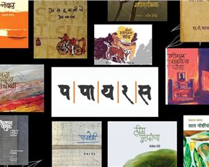
Book Printer of the Year (Education): Trends and innovations
Day One of the PrintWeek Awards Jury Meet on 9 September saw 11 industry leaders from the printing and publishing sectors come together to evaluate more than 71 entries across seven categories. A review of the submissions for the Book Printer of the Year (Education) award reveals several key trends and impressive innovations in book production.
17 Sep 2025 | By Dibyajyoti Sarma

India's USP: Managing logistics and dispatching for fast-turnaround jobs with large print runs
First things first. One key trend was the staggering production numbers. Many of the book entries showcased high print runs, with some exceeding 100,000 copies, alongside runs of 1,000, 10,000, and 20,000, particularly for education books and guidebooks. Numbers like 25,000 and 50,000 runs were common for textbooks. Upon opening the book and flipping through the pages, what struck my eye was how book printers have demonstrated an innovative use of two-colour printing, combining black with a Pantone colour to highlight text and enhance visual appeal.
In view of the supply-chain crisis, we saw diverse paper grades and suppliers: While Holman was a common name, an increasing number of book printers are utilising paper from Indian suppliers such as BILT, TNPL, Khanna, and JK. There was also a notable use of paper grades, including 60 gsm and 50 gsm, particularly for UPSC and NCERT textbooks, demonstrating excellent production quality with no show-through. Uncoated paper was specifically deployed for medical books to allow students to jot down their notes on the pages.
What stole the thunder was advanced finishing techniques. Jurors concurred that there was a solid emphasis placed on post-press processes. The finishing techniques that I observed were: gloss lamination, UV coating, cover pasting, section-sewing, perfect binding, YAP, corner gilding, debossing, round back finish, head and tail bands, intricate debossing, edge gold gilding, and slip cases. Hot foil stamping, embossing, and varnishing were also prominent.
The shortlist has been published, and without focusing on specific book print firms, what I would like to point out are a few book formats that impressed me:
Education books: Often featured text in two colours and graphs in four colours to clearly highlight concepts. Most importantly, the weight of the book was light, and the size of the book was easy to handle.
Children's books (exports): Showcased standard ink densities, eye-catching jackets, and text pages often in a single colour, with four-colour covers and embellishments. Lots of pop-ups and 3D fabrication, which were rendered with aplomb.
Playful kits: Examples included sets of six books in one kit. This was designed like a carry bag book box, requiring complex fabrication and a fun vibe.
The Armour of God example: An 1,500-page book with a 55,000 run, featuring a PU cover, 36 GSM text paper, and an intricate cover design involving a flex board, slip case, top load, four-colour printing, perfect binding with YAP, corner gilding, and debossing. In addition to the production of the book, what was mind-boggling was the herculean coordination and resource management in the book factory.
Children's Bible: A smallish run of 5,000 copies but with over 2,000 pages, using PU cover material, 40 GSM text, and heat burnishing on the PU, along with screen printing for added effect. Simply divine!
24 min-hardcase books: A collection of 24 titles, 20,000 copies spread across six categories, emphasising accurate case work and precision. A collector's item.
Children's puzzle book: This featured complex craftsmanship with layered Kappa board, die-punched layers for puzzle pieces, back-to-back pasting, hardcase binding, and rounded corners with soft foam for child safety. This demonstrated significant out-of-the-box creativity.
Fantagraphics book: Highlighted the printer's ability to provide solutions, resulting in the award of an entire series. It combined multiple paper types and special covering material, section-sewn hard-case binding with a square back on 3mm board.
Dictionary: Featured perimeteric stitching on a 2.5-mm board case-bound book, requiring extensive trials, combined with foiling and gilding for a premium look. The point is, book printers are increasingly providing comprehensive solutions to publishers and universities, including flexible books, rounded covers, elastic closures, sticker sheets, and overall flexibility within the book design.
Key trends to keep an eye on are: the use of 56- to 60-gsm paper for durability and low cost, particularly for revision notes, tables, and facts, ensuring books are light and easy for students to carry. Also what got a nod from the jurors was the conversion from RGB to CMYK, plus the expertise of bookbinders working with diverse materials (grayboard, art paper, metallic finish end sheets), and the precise execution of finishing processes like size trimming with a three-knife trimmer, ensuring no delta difference of even 0.10-mm, were deemed crucial for a premium contemporary finish.
The ability of printers to handle large-scale production and ensure tremendous coordination between various departments (press and post-press) was highlighted as key to successfully integrating complex features like hot foil stamping, section sewing, hard case binding, rounded spines, and ribbon insertion into a single functional and durable book. The shift from traditional behemoth machines to more sturdy, potentially less expensive, made in India machines was noted. The perfection of paper engineering, folding, book sewing, and book block creation were emphasized as critical advancements.
To sum up, the submissions for Book Printer of the Year (Education) demonstrated a blend of large-scale production capability, sophisticated finishing techniques, creative material usage, and meticulous craftsmanship, all geared towards delivering high-quality, durable, and often innovative books. The emphasis on post-press processes, meticulous coordination in the book factory, and problem-solving for a specific publisher's needs stood out significantly.


 See All