

How Please See defies the norms
In a conversation with Please See, a creative agency that specialises in building brands, Mansi Gupta talks-the-packaging-talk with Karno Guhathakurta
25 Aug 2022 | By WhatPackaging? Team
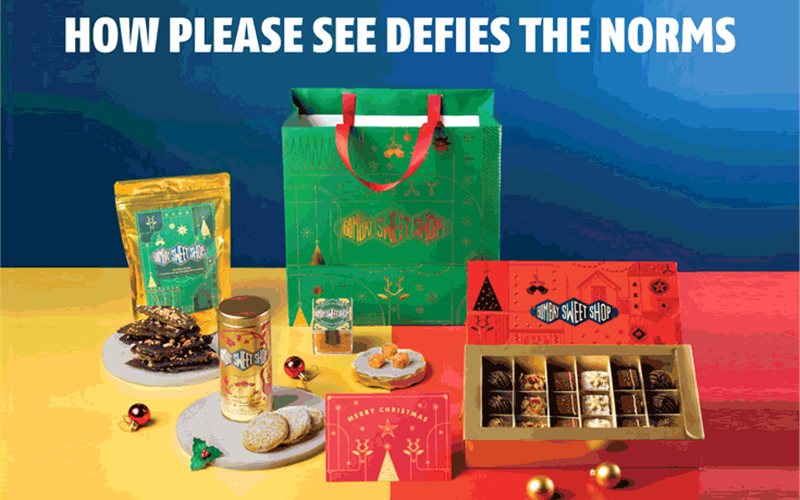
The Delhi-based company started in 2011 has worked with over 160 brands and built 37 businesses across 11 sectors. The company builds brand identities with the help of strategies, packaging and design experience. They have also partnered with The Bombay Canteen, Blue Tokai, Nivea, Ananda, Shunya, and aim to bring more companies onboard with their packaging journey. As the Please See team says, “We think about the box.”
Mansi Gupta (MG): Describe your company's journey?
Karno Guhathakurta (KG): Please See was created to celebrate Indian brands and creators, through design. We have worked with brands that have helped shape the past, present and future of our diverse cultures - from Portside Cafe, a furniture studio and the very first brand we’ve worked with, to The Bombay Canteen, Jupiter Neo Bank, Pine Labs and Stranger & Sons Gin. Our core value has always been to put our soul and mind into work . Our process is always immersive and detail-oriented.
MG: What steps do you take while creating a brand's packaging?
KG: The first step is to identify and strategise which category does the brand fits into, and create a voice that would help to set themselves apart in retail or DTC. There is a visceral truth to a product that we focus on and we try to apply it onto the packaging. This helps our teams discover 'The Box', and find ways with which we could step outside of it, through materials, forms and structures.
MG: What about designing?
KG: Designing requires a brand to communicate with the user. This includes the information hierarchy on the pack, colour palette and typeface.
MG: What are the things you look for?
KG: We look at what exactly the brand represents, what they are aiming for and what is their purpose.
MG: How did you come up with solutions for Shunya?
KG: Shunya promotes hydration drinks with an active and intense lifestyle. We changed the bottle to make it smaller and more on the go. And the design brought up more of the ingredients, as active health cues.

MG: What were the key design aspects your team took for Nivea Milk Delights?
KG: The goal was to develop a clear information system and visual aesthetic by looking at the uniqueness of the bottle, the product, and the target audience. We wanted the label to convey a feeling and we achieved that by adding gradients and visuals of the core elements. We worked with two typefaces to distinguish the functional and emotional pieces of information for the consumer.
MG: Your brand follows an Indian touch to its designs. Can you explain your journey with The Bombay Canteen's takeaway packaging?
KG: With The Bombay Canteen, our strategic thought was to recreate India. While the brand was rooted in the Indian diversity, the outlook had to be contemporary. That particular thought was applied to the delivery bag. Looking at the world of food delivery around us, we wanted to defy the norm of plastic boxes and opt for a more sustainable and environmentally friendly solution.
MG: How so?
KG: We went back to our roots, and realised that the traditional format to carry a meal was a potli- a piece of cloth in which food items were folded and wrapped. We recreated the form to make it ergonomically sound, and allow space for multiple boxes to fit as well as reuse the cotton fabric of the potli. Each touchpoint was rooted in the brand idea of recreation.
MG: In what way?
KG: The boxes are biodegradable and the bag is supported with a cardboard base to provide a sturdy support to help carry the meals. The cutlery is tied in newspaper napkins. When the potli is opened, it forms a tablecloth to provide a mess-free meal experience.

MG: Your team launched Blue Tokai's Easy Pour for supermarket shelves. What challenges did you face?
KG: The Easy Pour had a timely launch that coincided with the lockdown. The challenge was to ensure that the ethos of the brand stood out on retail shelves, and we achieved that by adding colour and animating the peacock. A first for the brand.
MG: What was the response?
KG: As a lot of consumers brought the Easy Pour home; and the sales outdid their expectations. Blue Tokai is a trusted homegrown brand, so we realised that we had to simply leverage this trust.
MG: Your team has worked with spa and resort brands like Ananda. What are the things you implemented for their product packaging?
KG: Ananda was looking to expand into retail with their existing range of oils, creams, scrubs, lotions and hair products that were currently only used in their spa. Therefore we used varying textures and colours based on the product and its function – softer colours and textures were used for moisturisers, while scrubs had a deeper, rougher texture on their packaging.
MG: Your objective was served?
KG: Our objective was to create a design and packaging structure that could be extended into B2C retail and into their line of products.
MG: The pandemic has impacted many businesses. How did your company manage to stay afloat? How well did you manage your brand’s identity?
KG: When the pandemic spread, brands were trying their best to work with the crashing markets. Packaging brands' relevance expanded from physical stores, to an online audience. So our team consciously shifted our thinking similarly.
We worked intimately with each of our brands to make sure their businesses were running. We believed in creating and fostering relationships with each of our brands, and that definitely saw us through. We understood the growing needs and quickly adapted to those evolving needs.

MG: From a print design standpoint, which technologies do you use in your printed work, and why do you do so?
KG: Our teams collaborate with printing houses, packaging vendors, and creative practitioners, which helps create a wider understanding of the industry and its innovations in the field. Depending on what works for the effect - we use them. We rely on our printing partners to share the latest options.
Please See’s sustainability mission
- More than 50% of Please See’s clients are moving to sustainable solutions. Karno Guhathakurta says, “We hope to get it to 75% by the end of this year.”
- With each packaging project, Please See starts by thinking of a sustainable solution. Guhathakurta says, “We push our clients and vendors to make that a possibility, and thereby create an impact.”
- If the aspect of sustainability in the packaging design isn’t possible, Please See tries to influence audiences to take conscientious steps.
- After all, every baby step counts!


 See All