

What a French currency exhibition tells us about notemaking
Rukmini Dahanukar, researcher and numismatist, has spent years collecting stories about global currencies and how their print design forged a path for trade, alliances, and institutions
15 Jul 2025 | By Sai Deepthi P

Did you know, notes issued by the Bank of Indochina were adorned with Asian motifs? The notes issued in Pondicherry (now Puducherry), erstwhile capital of French-occupied territory in India, bore Tamil script that translates to Puduvai (Pondicherry), fifty rupai (fifty rupees). It also uses the symbol for rupees. Not just that. A 1936-issued note features ornamental borders with a portrait of Governor Joseph Francois Dupleix, with a Greek goddess in the circle. Interestingly, the watermark has a Chinese farmer. The note bore omnibus designs, that is, the same design in different regions, especially across Southeast Asia. That sheds light on the Chinese farmer embedded in the watermark.
These kernels of knowledge were gleaned from an exhibition that spotlighted banknotes from the former French territories. The French banknote design exhibition called Beyond Face Value was curated by Rukmini Dahanukar, founder-partner at the brand identity design firm Nirmiti. Her aim, to celebrate currency art and the science of notemaking. The National Gallery of Modern Art (NGMA) in Mumbai hosted the exhibition, in collaboration with Alliance Francaise de Bombay and Avid Learning. The exhibition showcased the artistry and innovation behind some of France’s most iconic pre-Euro currency.
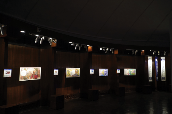
Banknotes, according to the exhibition, are about 350-odd years old, but more recent developments in printing technology enable the transfer of intricate engravings from a steel plate to a rolling press, allowing for the mass production of detailed banknotes. Additionally, the deployment of geometric lathes, or guilloche machines, allows for the creation of complex, interlacing patterns that are both aesthetically pleasing and difficult to replicate, making the banknote a perfect example of design-form (art) and function (security).
French banknotes have long been celebrated for their sophisticated printing techniques. Institutions like the Banque de France employed methods such as intaglio printing, which involves engraving images onto metal plates to produce raised prints with rich textures. This technique enhances the tactile quality of the notes and serves as a deterrent against counterfeiting. Watermark windows are one of the unique features of French banknotes, along with banknotes that have stories and front and back mirroring, a particularly tough method to achieve, considering the limitations of technology in the pre-digital era.
.png)
The highlight of the exhibition was the 500 Franc note featuring Marie Curie and her husband Pierre Curie, introduced in 1994. Designed by Swiss artist Roger Pfund, this banknote is a fusion of art and security features that were considered way ahead of their time. They bore design elements signifying their contributions to the world of physics. Security features on this note include elements such as microtext, colour-shifting inks, and optically variable inks (OVI). OVI, in particular, displays different colors when viewed from various angles, making counterfeiting exceedingly difficult.
Additionally, the note includes a watermark of Marie Curie’s portrait and a security thread embedded within the paper. The choice of the colour palette is a martian green, extremely hard to replicate, an embedded security feature. Another striking example is the 5,000 Franc note from 1947, which features Marianne (a symbol of the French Republic) accompanied by three men looking northwest towards France, symbolising colonial ties and aspirations.
Completely ignored for their non-economic contribution, Dahanukar is writing a book on the untold story of banknote design. The history of the paper, print, and modern polymer technology, along with the cultural themes across nations and time. What started as her postgraduate dissertation twenty years ago has metamorphosed into her passion project with talks, exhibitions, and her upcoming book on this overlooked subject.
.png)
Face to face: Rukmini Dahanukar, who has a collection of over 3,500 banknotes from the 180 nations that issue their currency and even from nations that have since disappeared
.png)
Rukmini Dahanukar holds INR 100 note which features Rani Ki Vav stepwell at Patan, Gujarat
How was the response to the exhibition?
This is a travelling exhibition and it has travelled to Puducherry, Ahmedabad, and Delhi, but I was really excited because it was in Mumbai, which is my hometown. It was lovely that I could call my family, my friends, and all my colleagues to come and see this. More importantly, it was nice because of the alliance with Mumbai and the NGMA. It meant we had curatorial works ranging from nine-year-old students in the third grade to historians and researchers in their nineties. So, people from all walks of life and a diverse age group across the decades came to come and see it, and I was happy that I could share stories about banknotes and facilitate the journey of looking at the design, symbolism, and messaging inherent in them.
What is unique about French banknotes?
France’s culture permeated across industries, and the banknotes were no exception. All the artworks are intricate, making it a challenge, not only in painting, but the artist only puts it on an engraving plate and decides how these images get intertwined, because all the elements on the notes are cohesive. The designs don’t look like separate elements, and that is what is unique to the French banknotes.
What are some of the techniques employed for banknotes?
Since I am professionally engaged in the print communications space, I found that banknotes with stories were interesting because there was a connection to all the various images on the banknote. The second part is the front and back mirroring. Considering how this was the pre-digital era, to come up with this detailed and complicated kind of design, to even recreate or fabricate across, it’s not a single piece of art. The French had a monopoly on this. I don’t think they have a competition, apart from the digital interfaces.
Do you think the intricacies are reflective of France’s culture?
French culture is not only about the visual arts, it’s the performance arts, fashion, and even their food. There is a sensitivity towards preparing a more aesthetic version than just a simplistic, rational version of anything. I guess that kind of filters out into all of the areas, including their aesthetic subtlety, or nuances, or the importance that they give to everything around, including the banknotes.
How so?
A bank note could have been designed in a functional manner, with the denomination and one image or some security feature in it. But the French have made them so beautiful and intricate. That is why this exhibition and this chapter in my book are special to me. I think France’s monetary designs are right on top.


 See All