

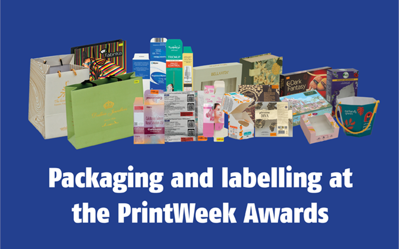
Packaging and labelling at the PrintWeek Awards — The Noel D’Cunha Sunday Column
Discover how past winners pushed boundaries in packaging and labelling. Ready to showcase your groundbreaking work and join the ranks of these industry leaders? Read on…
25 Jul 2025 | By Noel D'Cunha
The PrintWeek Awards are gearing up for their fifteenth edition in 2025, continuing a 14-year legacy of recognising excellence and setting standards in the print and packaging industry.
This year’s awards, themed "Print and Packaging That Pushes the Boundaries," aim to celebrate bold innovation and daring new approaches. We're looking for the pioneers and risk-takers who are challenging traditional methods with fresh, bold ideas in printing and converting.
With 33 categories across Performance, Quality, and Special Industry Awards, the PrintWeek Awards showcase the very best.
The 2024 event saw over 260 entries and 800 samples from more than 100 companies, with a panel of 22 industry experts recognising 55 winners for their dedication to quality. The packaging and labelling segments at the PrintWeek Awards fared well.
What the jury looks for: Insights from last year’s experts
The jury plays a crucial role in identifying the best in print and packaging, meticulously examining entries for innovation, quality, and impact. Here’s a look at what the experts on last year's panel focused on:
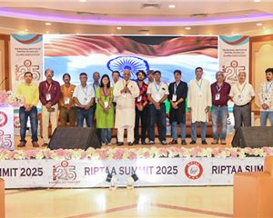
The jury to examine the samples included Amit Saurkar, Deepa Naik, Deepti Kshirsagar, Nitin Virkar, Peter KA, Rahul Nainani, and Sanjay Ghoshal.
.png)
(l-r) Rahul Nainani, Amir Saurkar, Deepa Naik, Peter KA, Nitin Virkar, Deepti Kshirsagar, Sanjay Ghoshal, and Noel D'Cunha
Amit Saurkar, group packaging development manager at Marico, a packaging professional with over 14 years of experience, highlighted the increasing importance of sustainability. He noted the shift that quick service restaurant (QSR) chains made from buckets with barrier coatings to those without, stating, “sustainability is now a bigger part of the conversation and that small choices like these, ones that make a lot of difference, are slowly being made by companies.”
Deepti Kshirsagar, co-founder and director of strategy and design at TCT Strategic Branding, with 15 years of experience, was particularly impressed by the finishing alignment. She observed the use of various processes like 3D drip and was pleased with the “structural alignment achieved through print on the packaging,” adding, “The samples I have seen so far have great finishing for these reasons.”
Rahul Nainani, co-founder and CEO of ReCircle, a clean-tech organisation driving the circular economy, emphasised the need for more sustainable choices. He specifically observed a “lack of sustainable choices, especially in rigid boxes,” despite knowing it's a client requirement. His comment, “I’m not seeing much sustainability,” signals a strong desire for more environmentally conscious packaging solutions.
Sanjay Ghoshal, head of packaging, packaging sustainability, and strategic packaging productivity at Diageo India, highlighted positive trends in sustainability and branding communication. He noted, “People are not using metPET so much anymore. I also think they are realising the value of packaging as a tool for branding communication.”
Peter KA, AVP of packaging development at Godrej Consumer Products, focused on innovation in texture and craftsmanship. He remarked, “Something I have noticed is the innovation in texture and craftsmanship in the samples. The finishing is great and impressive.” This indicates that tactile qualities and superior artistry in packaging are key differentiators.
Deepa Naik, general manager of packaging innovation for India and AMEA, observed a market shift towards rigid boxes. She found it “curious to see the shift to rigid boxes from mono cartons.”
Nitin Virkar, chief creative officer at Therefore Design, highlighted the importance of specialisation and quality execution. He said, “The companies that specialised in a certain thing did a far better job.”
Label Printer of the Year
In this category, judges look for outstanding labels printed using any process (letterpress, offset, flexo, digital). Of particular interest are the use and application of special colours and finishes, and printing on challenging or unusual substrates.
In 2024, Kwality Offset Printers, Letra Graphix, and Renault Paper Products were crowned winners in this category.
Kwality Offset’s Greater than Gin labels featured intricate Kurz copper hot foil stamping, reverse hot foil, and tactile UV for a raised effect.
The Bandarful Coffee Liqueur labels masterfully told a farm-to-bottle story through their design. Only Olympic Mixture You Needed mouth freshener labels stood out with matte UV, raised tactile effects, and Kurz special shade hot foil for a luxurious feel.
Finally, the Teller Coffee Rum Liqueur label featured stunning 3D layered foiling and CMYK print, creating an eye-catching mystical figure.
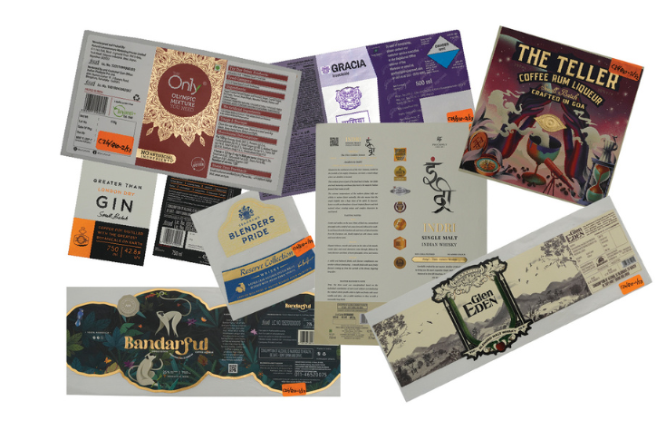
Kwality Offset's winning samples
Letra Graphix showcased innovation with a near-field communication (NFC) chip label designed to combat counterfeiting, integrating a chip directly and eliminating QR codes. Printed on a Gallus Labelfire press using three special colours, it offered enhanced security and a seamless user experience.
Their Galatea label, crafted on Maretele Blanc paper, featured screen embossing, silver foil, and highly intricate print techniques combining foiling, embossing, and tactile 3D effects.
Letra also produced two Kimirica Hunter International labels on PP clear substrate using the Gallus Labelfire, incorporating embossing, window matte varnish, gold foil, and flexo elements on both inner and outer sides. Notably, the Eiffel Tower on the Kimirica label was printed on the adhesive side for a subtle, see-through effect.
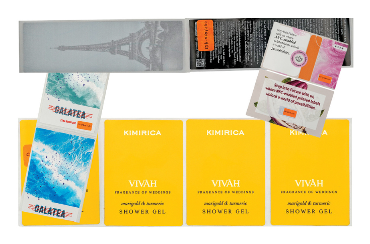
Letra Graphix's winning samples
Renault Paper Products demonstrated mastery with Mussafir labels for The Living Liquidz Spirits and Sports Bar, featuring deep, contrasting colours printed with special anilox rollers on uncoated substrates, and carefully selected foil areas for a premium appeal.
The Crafters Stamp label, designed by Alcobev UK, saw Renault expertly manage files from the design agency, creating bespoke textures and blind emboss patterns on the brand name while prioritising cost and production efficiency for a quick launch.
Their Varchas Bourbon label was a linework marvel for a double-headed eagle emboss, involving tooling for print, emboss, micro-texture, and die-cut on 240-gsm aluminium paper.
The Ruslan label for Vijay Distilleries was a complex mid-run job, combining two unique substrates – aluminium foil face material converted to PS label stock and PP clear precision-registered on 80-micron aluminium foil for one-pass bottling.
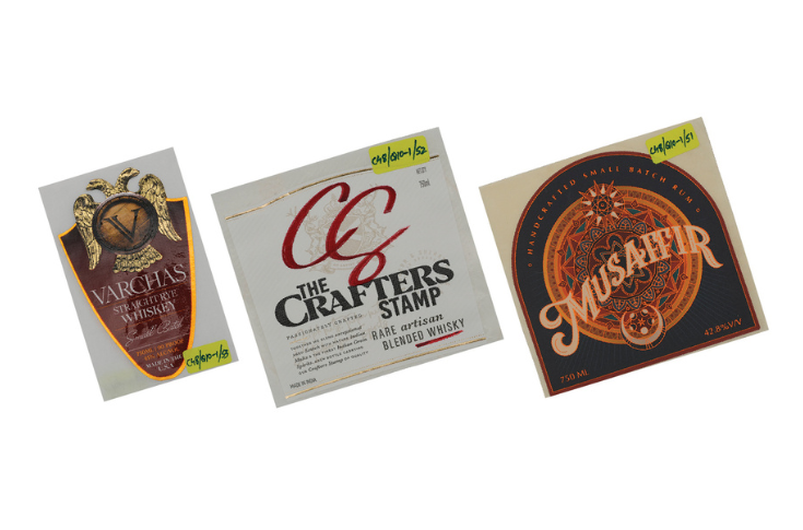
Renault Paper Products' winning samples
Packaging Converter of the Year (F&B)
This category covers all printed packaging for the food and beverage segment, including cartons, flexible packaging, pouches, boxes for food, wines, spirits, and presentation packs.
ITC Packaging and Printing took home the award in 2024.
ITC’s Burger King fries tub showcased an eco-friendly approach, replacing polyethylene-coated tubs with a compostable, patented BioSeal food-grade coating developed by the ITC Life Science and Technology Centre. These tubs, made from virgin folding paperboard, featured high deposition of two different grades of BioSeal coating applied via a roller coater, providing oil, grease, leak, and spill resistance.
The Antiquity Blue Ultra Gold whisky carton featured a blend of blue with a natural white-grey background reproduced through offset. Post-press treatments included coarse matte varnish, smooth post-glass texture, copper shade hot foil stamping, and registered embossing, enhancing branding and structural competence through a three-ply carton with a micro-fluted layer, top tuck-in, and auto-lock bottom.
Paper-based envelopes for Twinings are aligned with global efforts to reduce plastic waste, abandoning traditional packaging for sustainable alternatives. These designs, with detailed halftone images, were printed on a gravure line with base coatings and specified cylinder engraving depths.
The Oaken Glow carton combined different printing technologies to achieve a rich, sturdy look with value additions and rigid high-grammage board and reel lamination. Its graphic designs featured a high-resolution natural, burnt, and smoky wooden texture, with a solid black shade gravure-printed on the inner surface.
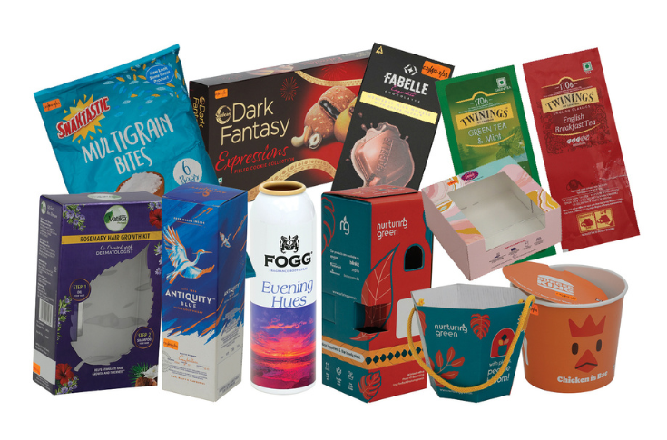
ITC PPB's winning samples
Packaging Converter of the Year (FMCG)
This category encompasses all printed packaging for the FMCG segment, including cartons, flexible packaging, and other containers. Last year saw joint winners: HBD Packaging, Letra Graphix, TCPL Packaging, and Bharat Containers (Nagpur).
HBD Packaging submitted samples printed on 300- and 400-gsm FBB on an RMGT 970 seven-colour press with LED and online coating.
The Tynor Patellar Support carton featured a top tuck-in and a hanger, with special features including reverse gold foil stamping and spot UV coating.
The Brufica Plus carton, with a reverse tuck, incorporated radium UV coating for security features, Braille, and embossing, notable for its glow-in-the-dark utility.
The Sharbat Sandal sample was a lock-bottom carton printed with LED ink, reducing ozone emission and featuring inline texture coating.
The Odonil Exotic room spray carton was developed and launched in just 12 days from final artwork, including proofing. HBD developed the lock-bottom in-house, enhancing quick assembly, and the five-colour (CMYK plus reflex blue) carton, printed on the RMGT press, featured gold foil, texture UV coating, embossing, die-cutting, and glueing.
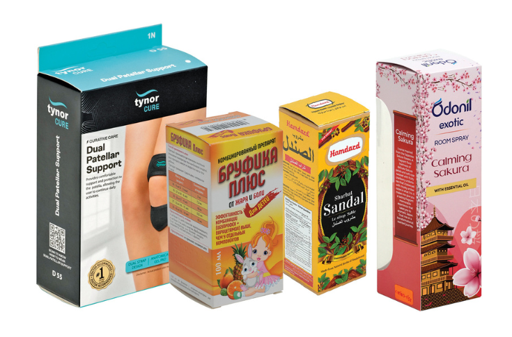
HBD Packaging's winning samples
Letra Graphix provided four label samples for an FMCG company, printed on PP clear and PP silver on a Gallus Labelfire.
These samples featured gold ink that enhanced the overall aesthetic. Designs included a gloss finish in the middle and on the text, creating a sleek, shiny effect that beautifully caught light and highlighted essential information.
A notable feature was the sand varnish applied to the snakeskin pattern, adding a realistic, tactile quality that contrasted with the glossy elements, creating a dynamic and visually captivating label.
Letra Graphix's winning samples
TCPL Packaging was another winner in this category. The design, shape, and formation of the Olivia Bright Boost serum’s carton, featuring a flip-top open mechanism, matte background and spot UVs, impressed the Jury.
The Nestle Munch Bites pouch, printed on gravure, featured a bottom gusset and easy-tear notch. The fully recyclable PE structure was printed on MDO film with white opaque PE laminations.
The sustainable and biodegradable Glow & Lovely face serum pack was printed on a holographic transfer metalised board.
The Dark Fantasy Desserts sample featured a carton printed on soft-touch laminated virgin board, with a black-gold combination and gold hot foil.
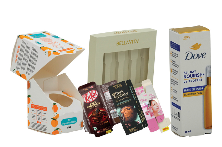
TCPL Packaging's winning samples
Bharat Containers (Nagpur) won for four variants of Fogg. The Fogg Oud Treasure featured the image of a treasure box and deep colours through a precise printing process.
The Fogg Wonder Woods featured the image of a forest with a three-dimensional effect, with a simple and elegant white background highlighting the brand name.
Fogg Evening Hues captured the beauty of a sunset with gradient hues transitioning from warm orange and pink to cool purple. Fogg Extreme Desire featured a vintage lamp with swirling smoke effects reproduced with precision.
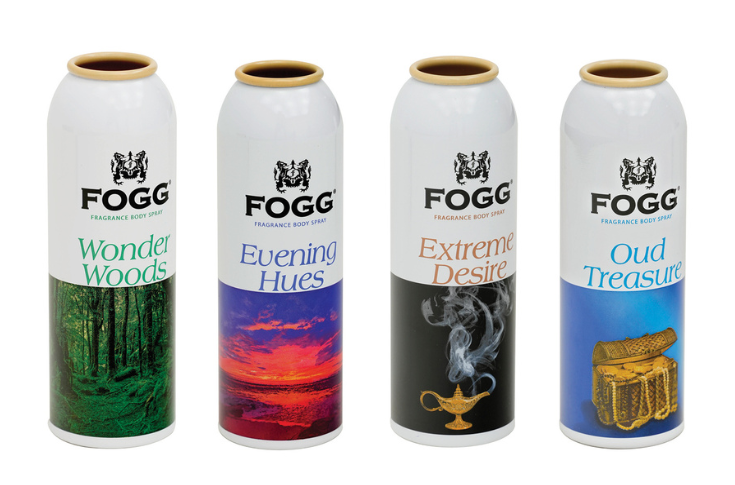
Bharat Containers' (Nagpur) winning samples
Packaging Converter of the Year (Pharma)
This category includes all printed packaging for the pharma segment, such as boxes for medicines, blister packs, bottles, labels, inserts, and outserts. Last year, Art-O-Print and Printmann Group shared the win.
Art-O-Print impressed the jury with their commitment to standards, regulations, attention to detail, and innovative solutions.
For Trichup Hair Serum, they added micro-emboss on the pack shot and microtext on a comb image, visible through an eyeglass. Printed on 350-gsm FBB using offset, it featured matte and gloss UV, embossing, and hot gold foiling.
For Propofol injection cartons, an in-built partition was suggested to prevent bottle breakage during transit; these were printed on 400 FBB board.
The Nykron package included a special pocket for tablets, visible from a window, printed on a Heidelberg CD 74 five-colour press on 300-gsm Ultima board, with embossing, film window lamination, and an in-built partition.
For Ropinirole Mylan, Braille was added to three panels on 300 FBB, involving post-press work on a Bobst Experfold and using three Pantone colours plus black.
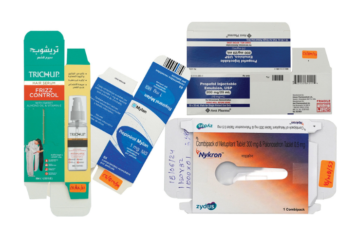
Art-O-Print's winning samples
Printmann Group produced the Diclofenac embedded carton with a leaflet and dosing card bound inside.
The Zolmist nasal spray carton, a five-panel carton, replaced a previous magnet with a sustainable locking mechanism. Post-press treatment included gloss lamination and silver foil stamping on the carton and both outer and inner panels.
The Diamicron foil incorporated security features like a guilloche pattern, microtext, and relief text to prevent counterfeiting, printed on aluminium foil using a combination of flexo and gravure.
The Hepbest carton featured metPET plus screen varnish on the front and back panels. During pre-press, the layout was designed to ensure strip laminations appeared on desired panels, printed on 270-gsm FBB.
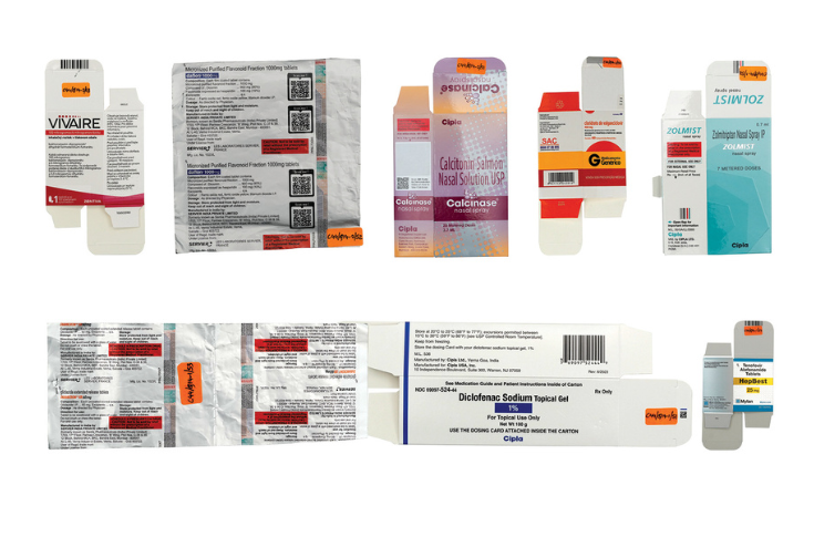
Printmann Group's winning samples
Packaging Converter of the Year (Rigid Box)
This category covers all printed rigid boxes and containers for mobiles, electronics, food, sweets, and more. The 2024 Rigid Box award was won by Trigon Digipack and Unbox.
Trigon Digipack provided samples printed on an HP Indigo 25K. They designed a sleek switch box with a metallic handle and slanted lid, and an innovative canister prototype with a divided interior.
For Livogen, the box visually represented how tablets flow from mouth to gut, printed on silver PP, two-mm kappa board, and folding box board and foam, keeping it minimalistic and easy to carry.
The Kaapi Kit for Cafe Madras was a sustainable box for a French press and coffee pouch, focusing on brand premiumisation and sustainability. Trigon redesigned the central seal pouch to a quad one and added foiling for a minimalist premium look.
For the Paush perfume box, Trigon recreated a low-resolution watermark JPEG into a vector graphic, added blind spot UV for a premium look, and incorporated a silk cloth for luxury. This job was printed on silver PP and two-mm kappa board, with a silver material cutout for a metallic effect and a velvet finish.
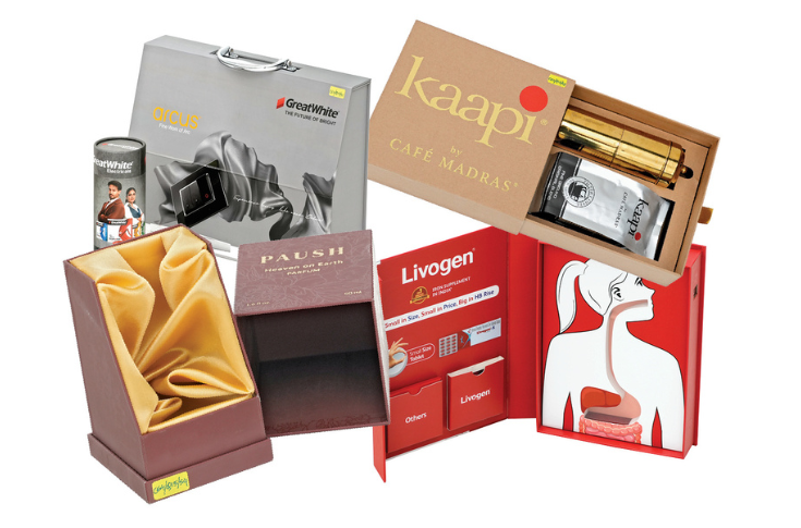
Trigon Digipack's winning samples
Unbox printed samples on a Komori Lithrone four-colour press with a coater, with one sample screen-printed.
The Merve perfume box order involved 18 SKUs with different names, colours, and foil, requiring gold foiling on the entire box as a highlight.
The EZE perfume box was challenging due to the client's desire for a stylish yet minimalistic box for round bottles; Unbox designed an opening that made it stylish despite its minimalist exterior. The logo had three different foils and required six foil stampings, with ivory metallic paper giving it a rich look.
For the Nakshatra Grah incense stick box, Unbox had a session with the client to understand planet mythology. The structure was challenging, matching three trays, and inner elements were manually assembled. Produced in 10 days, incense sticks rested on triangular cartons and foam compartments.
The Oksana wedding box held an invite, candles, and a tea set, designed to be compact, easy to handle, and reusable with detachable elements. It featured velvet lamination and gold foil stamping for a classy, festive look.
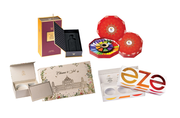
Unbox's winning samples
Packaging Converter of the Year (Paper Bag)
This category encompasses all types of paper bags, including those for garments, FMCG, alco-bev, gift packs, and eCommerce. In 2024, Lynx Designers and Creators and Ocean’s Deep Printers won this category.
Lynx Designers and Creators produced the duplex board small carry bag for ARQ Providers, featuring gloss varnish, matte lamination, gloss leafing, embossing, die-cutting, stripping, bag-making, and eye-letting, with a golden cotton thread as a special feature.
The Opulin Blue carry bag for LA Niche, printed on both sides of the board, stood out with its prominent blue colour and blue ribbon handles, giving an opulent look. Other post-press treatments included matte varnish, gloss leafing, die-cutting, stripping, and eye-letting.
The Forest Essentials small kraft carry bag highlighted a tree shape die-cut on both sides, with additional matte varnish, matte lamination, matte leafing, and embossing.
The Kama Ayurveda gold carry bag was printed on Cyber XLPac paper from ITC, with matte varnish, matte lamination, matte leafing, die-cutting, and eye-letting.
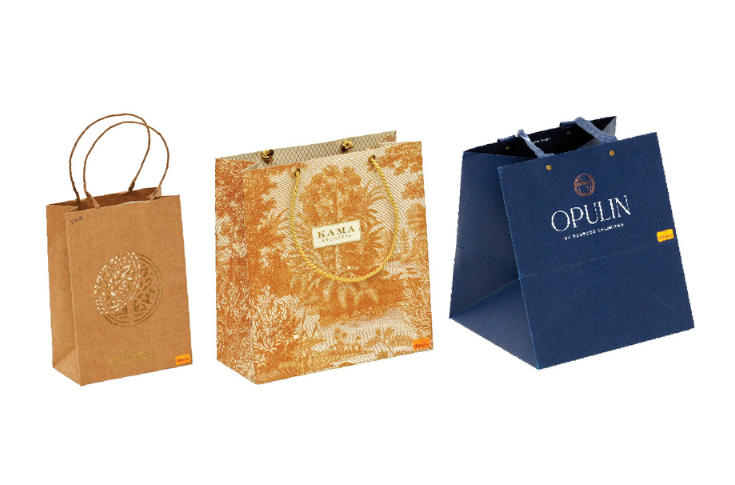
Lynx Designers and Creators' winning samples
Ocean’s Deep Printers’ winning samples showcased a premium shopping experience, elegantly conveying brand messages. Printed on 350-gsm white FBB on a Heidelberg SM 74, the Vrund and Miloni bag was a modern ivory-coloured paper bag with a geometric pattern, gold foils, and a luxurious golden thread handle.
The House of Abeer bag featured a metallic gold accent, giving a soft and sophisticated look. The Vishwanath Builders bag was a minimalist white paper bag, emphasising sophistication, with a special feature being punching on the top of the handle.
The job was enhanced with precise printing, a matte finish, clean punching, and expert pasting. The Fabrika paper bag featured high-quality printing, velvet lamination, Scodix UV, and foiling, complemented by precise punching and meticulous pasting for a luxurious and tactile finish.
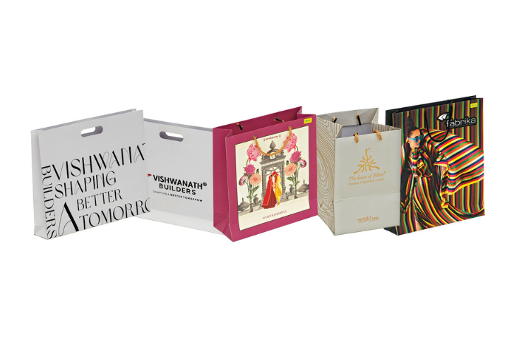
Ocean's Deep Printers' winning samples
The Awards Night for the 15th edition of the PrintWeek Awards will be held on 13 October 2025 at The Westin Mumbai Powai Lake.
To register for the awards, visit the official website: printweekindiaawards.com. For any queries or assistance, contact avinash.bhakre@haymarket.co.in or call +91 99303 51282.


 See All