

As the PrintWeek awards enter their 15th year in 2025, there is a renewed emphasis on bold and courageous approaches and innovations, encapsulated by the theme “Print and Packaging That Pushes the Boundaries.”
This year, the awards aim to spotlight the trailblazers and risk-takers in printing and converting, those who have challenged traditional methods with novel and fearless ideas.
The PrintWeek Awards feature 33 categories, including 10 Performance Awards, 19 Quality Awards, and three Special Industry Awards, all designed to celebrate the pinnacle of achievement in print and packaging. In 2024, the event received over 260 entries and 800 samples from more than 100 companies, including emerging talent from tier-II cities.
What it takes to win: Lessons from the Jury
Last year, the jury, critical in determining the finest in print and packaging, reviewed submissions for the book categories award, highlighting the best in book printing, via creativity, excellence, or out-of-the-box use of the medium. The jury to examine the samples included Ritesh Uttamchandani, Bhushan Kolte, Kiran Bhat, Dibyajyoti Sarma, Mukund Moghe, Rajnish Shirsat, and Ganesh Kanate. Here's an overview of what the experts on last year's panel focused on:
Rajnish Shirsat, book creator and CEO at BookMyStory Publishing, spoke about the impact of post-press processes on the quality, efficiency, and finishing of book production. He was happy about the quantity range of 15,000, he said, “15,000 makes a big difference with this kind of finish. When it came to big volume, we were always beaten by China. Not anymore, and that’s what makes me very happy about it.”
Mukund Moghe, deputy general manager (brand and production) at Tata Services, observed the sameness in coffee table books. He said, “It’s a repetitive kind of work.” Moghe said that the print industry has to become a solution provider and not a problem creator. He said, “Books shouldn’t just be books. They should also be utility items.”
Ritesh Uttamchandani, an independent photographer based in Mumbai, noted, “Printing and all of those things are 20–30% of the work. It’s the finishing, the cutting, the binding that matters. The ones that I really liked were able to minimise the margin of error. That is also because it is a mix of machine and manual processes.” He said, “It’s prevalent across streams — we tend to compensate for bad content with very expensive production. We tend to cloak it with that, and to a slightly refined eye, it shows.”
Ganesh Kanate, senior vice president at Glenmark Pharmaceuticals, noted that in many samples, functionality is the key and that utility is prioritised more than aesthetics.
Kiran Bhat, an Indian-American author, traveller, and polyglot, said, “Some books were extremely clumsy, hard to open, very heavy and very big. Some of the books were coffee table books, which you’re meant to read in an upscale parlour in Khar — it fits a different sociological purpose.”
Dibyajyoti Sarma, publisher at Red River, noted the presence of more players in book printing, and not just in the metro cities. He said, “Printers today are more conscious about the finishing and enhancements of the book, not just the printing. Earlier, printers would invest more in the printing machine and less in finishing. Now, printers are investing more in post-press, and everything is in line.”
Book Printer of the Year (Education)
In this category, books submitted should be science, technical, medical, and textbook types (books with mono-colour or two-colour printed inner pages and multi-colour printed covers).
In 2024, Brilliant Printers and Thomson Press (India) were the joint winners of the Book Printer of the Year, in the Education category.
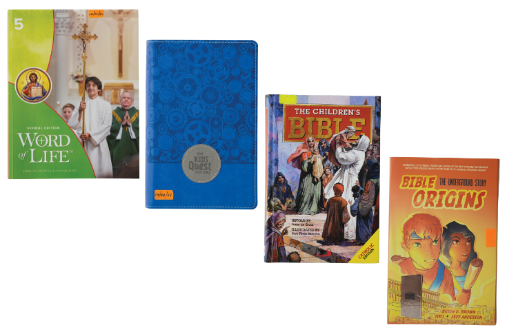
Brilliant Printers won the jury members over with the post-press processes on the titles. For the Bible Origins for HarperCollins Christian Publishing, dual materials were used for the bookcase, creating a fish-like design. The book came with a slipcase that had spot UV embellishment.
The Children’s Bible for St Paul’s Publications featured a hardbound book with a round-back finish. The job showcased the art of four-colour printing and various post-press finishes, including hot foil stamping.
The NIRV Kid’s Quest Bible for HarperCollins Christian Publishing was printed on thin 39-gsm opaque paper and was bound in flex board. Brilliant Printers used polyurethane for the bookcase.
Word of Life for the Augustine Institute featured perforation on all pages so that Sunday School students could tear out worksheets. Hardbound and printed on 80-gsm Super White Maplitho paper, the book highlighted Brilliant’s expertise in four-colour printing.
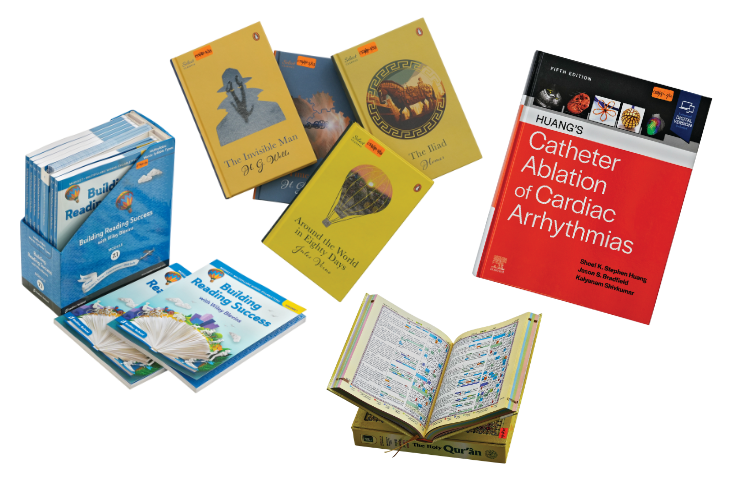
Thomson Press (India) impressed the Jury with the Holy Qur’an. This version of the text was in a box, whose top could be converted into a book rest, known in Islam as the Rehal. A perfect example of utility presented as value addition, the job involved die-cutting and post-press embellishments, such as gold foil, spot UV, round spine, and thermal gloss lamination.
Huang’s Catheter Ablation of Cardiac Arrhythmias, for Elsevier Health, was bound in a German case-making machine that specialises in heavy medical books. The book blocks were sewn with thread imported from Spain, matching the colour of the paper. The book’s hinge has a three-mm depth to add to its beauty.
Samples of Penguin Select Classics for Penguin Random House featured hardcover binding with a round spine. The finishing included grinding on the cover to give it a textured finish and a glossy effect on the cover image. The books featured coloured edges, the same shade as the cover.
The Building Reading Success module set for Sadlier School came with a three-ply corrugated slipcase that had 25-micron lamination for durability. It had extra flute fillers inside to protect the set of spiral-bound books.
Book Printer of the Year (Specialty and Trade)
This category includes coffee-table books, journals, magazines, and non-fiction works covering history, sports, nature, travel, entertainment and lifestyle.
Last year, this category was won by Replika Press and Archana Advertising.
Replika Press’ The Hobbit for HarperCollins highlighted its ability to handle four-colour jobs in which artwork reproduction was of utmost importance. The dusk jacket included foiling and embossing.
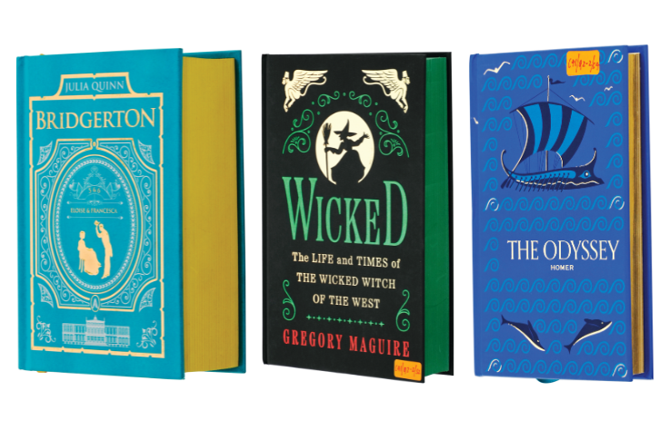
Wicked for HarperCollins, a black book that featured three different foils — green, red, and gold — involved several operations. Post-press processes included UV inks on the case along with a green-coloured edge to match the foil on the cover.
Bridgerton for HarperCollins also featured coloured edges. The hardbound cover had foiling and embossing.
The Odyssey for Union Square was printed on 90-gsm Chenming Snow Eagle matte art paper. Post-press processes included a section-sewn hardcover on a three-mm board with a round back, foiling, embossing, and gilded edges.
Archana Advertising’s samples were printed on rough gloss-fine texture paper.
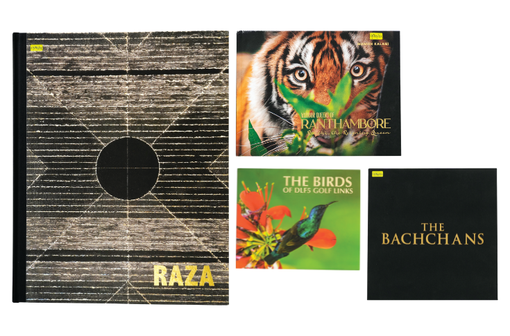
Warrior Queens of Ranthambore for Indore Treasure Town, photographed and designed by Manish Kalani, featured an aqueous coating and faithfully reproduced the sharpness of the photographs.
SH Raza: The Journey of a Master for the Vadehra Art Gallery is a large-format book.
The Bachchans: A Saga of Excellence for Om Books International contained more than a thousand photographs taken from display posters, newspaper clippings and such. In this job, the bulk of the work was the modification and correction of the pictures.
The Birds of DLF Golf Links for Nough and Crosses reproduces photographs of the birds that maintain the quality and clarity of the original photographs.
Book Printer of the Year (Print on Demand - POD)
This category is aimed at short-run (one or fewer than 100) digitally printed books.
In 2024, Thomson Press (India) won this Award.

Thomson Press (India) showcased with its samples its ability to produce limited copies of big books, which would otherwise require long-run offset printing and time-consuming post-press operations, on digital presses with a shorter turnaround time.
Mergers et al by S Ramanujam for LexisNexis were printed on 60-gsm super fine NS paper. The book contained gold foiling and a hardcover roundback. The cover is made of maroon PVC material.
The Oxford Encyclopaedia of the Music of India was produced with a three-volume box set created for the Oxford University Press. Post-press processes involved hot silver foil stamping, embossing, aqueous coating, and die-cutting on the slipcase.
The Big Shared Reading Book was printed in the A2 size for Creoville. The copy was printed on 80-gsm Bilt matt AP paper. Post-press work included manual side sewing with hard case binding.
The Zeiss Product Catalogue clip folder for Carl Zeiss India featured a spot UV and loop binding, apart from hardcover binding for the outer cover.
The Awards Night for the 15th edition of the PrintWeek Awards will be held on 13 October 2025 at The Westin Mumbai Powai Lake. The PrintWeek Awards 2025 has received the support of our esteemed sponsors – Bindwel (Platinum Partner), Canon India (Co-presenting Partner), DIC India (Speciality Ink Partner), Siegwerk India, Sona Paper (Paper Partner), Superbond Adhesives (Associate Partner), TechNova (Citation Partner) – whose commitment helps us celebrate excellence in the print and packaging industry.
Express interest in participating in the PrintWeek Awards here.
For any queries or assistance during the process, entrants can reach out via email at avinash.bhakre@haymarket.co.in or call +91 99303 51282.