
Amit Saurkar
Head - packaging development, MTR Foods
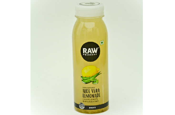
The bottle brilliantly deploys clear-on-clear label leveraging the colour of the product as a background. I love it when graphics are subtle and clutter-free. The quality of print reproduction of the label is up to the mark. The packaging development team can experiment with different textures, varnishes or foiling on the label to make it look like a premium product. They may also try shrink sleeve. Overall, the bottle design makes it a handy package.
Komal Dalvi
R&D packaging manager, chocolate, AMEA productivity, Mondelez India Foods
This package is quintessential for simplicity with clean graphics no label look. The cap of the pack is well designed. The vital parameter being ‘coldly compressed’ is not highlighted enough; the black ink on the cap is scuffed.