

Hubergroup revamps its brand image
Hubergroup has revamped its logo and relaunched its website to strengthen global connect.
23 May 2020 | By WhatPackaging? Team
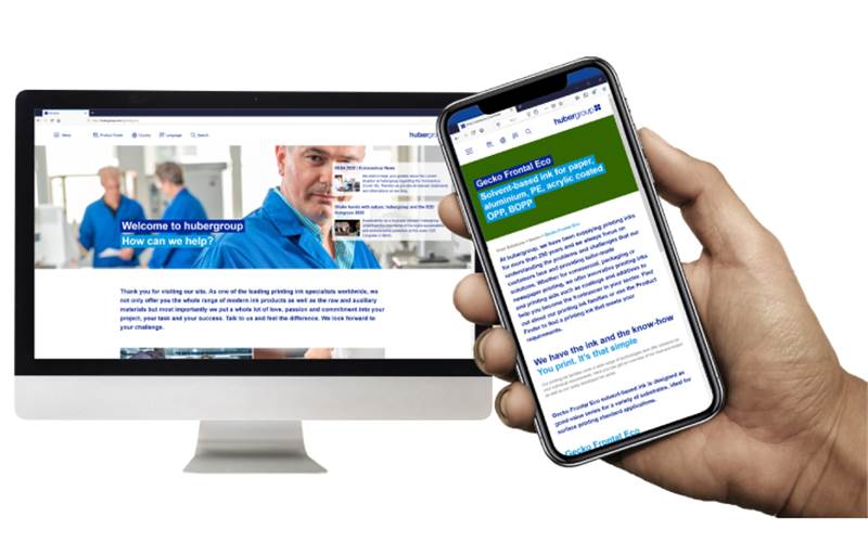
The website has a revised design boosted with a dominant reflex blue look
The company claims that its logo has been enhanced with global orientation. “The corporate logo is the central element of a brand. As Hubergroup, with over 30 locations worldwide, continues to grow in an integrated manner across its global footprint, this is also reflected in the new logo. Our group functions as a unit, which is now also visually represented in the new logo,” said a press note shared with PrintWeek.
Meanwhile, the company’s website has a revised design boosted with a dominant reflex blue look.
Hubergroup has its presence in more than 30 locations worldwide. Thus, the website’s content has been made available in a range of national languages of all its locations.
According to the printing ink manufacturer, the website comprises a new product finder feature to help its customers find solutions more quickly.
The website also features the company's individual contact representatives for each country to enable its customers to directly connect with local advisors.


 See All