

Nadia Chauhan: We want to disrupt the story again in a very big way
PrintWeek has an in-depth chat with Nadia Chauhan, joint managing director and chief marketing officer of Parle Agro, about the power of design in building businesses
21 Nov 2019 | By WhatPackaging? Team

Nadia Chauhan, CMO and JMD, Parle Agro
In 2015, Parle Agro placed design right at the centre of Frooti's marketing whirlpool. It ushered in a brave new world by first roping in London-based Pentagram to give the brand its new brand/packaging identity, followed by assigning the communication duties to New York-based Sagmeister & Walsh, a design partnership between two of the biggest names in the global design world – Stefan Sagmeister and Jessica Walsh.
The studio – which now operates as &Walsh under Walsh’s sole leadership, subsequently created a refreshed identity and communication campaign for Appy Fizz. The four-year old relationship between Parle Agro and (now) &Walsh still continues strong.
We have a conversation with Nadia Chauhan, joint managing director and chief marketing officer of Parle Agro, about this long-distance relationship, the role design has played in her work, and her wish to disrupt the market next year, among other things. Edited excerpts:
Parle Agro has been at the forefront of championing the power of visual language/ design in building brands and businesses. Did you have any apprehensions when you first appointed Sagmeister & Walsh as your communication agency?
Quite a few actually. Sagmeister & Walsh came on board by chance in a way. Initially, we had reached out to design studios across the world, including Sagmeister & Walsh, just for redesigning the brand identity and packaging. It wasn’t for the communication piece at all. At that time, I couldn’t even fathom that the communication could be led by someone from a different culture and continent. So when we had approached them, Jessica and her team were travelling and by the time I heard back from them, I had awarded the brand identity and packaging job to Pentagram. However, what I heard from them made me realise that there was value in pursuing it further so we went ahead with the discussion.
We knew that to be able to introduce the new packaging and design, which was a dramatic shift from where we were, into the country, it needed to be presented in the right manner. And that’s the brief we gave to them. When they came to India to present the ideas, I did wonder if I had gone nuts and was making a big mistake. Sometimes though, when you are feeling scared and not knowing whether what you are embarking on is right or wrong, it’s a great position to be in because you could be embarking on something very big.
So we didn’t shy away and tried to dig deeper to understand their thinking and By Payal Khandelwal ▾ approach and how the campaign would work in the long term. There was a moment in the entire conversation that really impacted me. We were introducing this new design, and didn’t want to do it in a conventional way and they said, ‘let’s just simplify – focus on the pack while making everything around it small'. That gave birth to this whole miniature world, which was very endearing for both young and adult audiences.
The layouts were very unconventional and there were no brand panels or slogans. It was just art. The big pack of Frooti with a story being told through this miniature world in the background blended so well together.
So was that the moment when you were sure?
Yes, and then the print shoot happened in New York and the film shoot in LA. Both these experiences further strengthened our belief that we were working with a very talented team. There was a moment of panic and nervousness when the packs first launched in the market. People were questioning our moves. However, on the other side, our sales had started going up even before we launched the advertising campaign. After we launched the campaign to announce the new design, there was no looking back.
People changed their reactions and found the campaign visually pleasing. In our category which is highly driven by impulse, people should be able to look at the product, like it, and want it. We don’t need a lot of messaging and Frooti is a brand that people already know well. We just had to present it in a manner that people want to associate with it.
The reason why we looked for agencies abroad was that everyone here started the conversation with us about nostalgia – about Frooti being a drink of their childhood. And I didn’t want to design the Frooti of the future by talking to people who are still stuck in the past.
Both Pentagram and Sagmeister & Walsh didn’t know how big Frooti was in the Indian culture or even to us as a company, so they worked without any baggage and took risks galore. It was then up to us to balance out the risks and see which ones were worth taking.

It's been a four-year long association with Jessica Walsh, who has now started her own agency. How has your work relationship evolved? Has anything changed logistically now that she has started &Walsh?
It doesn’t change anything for us at all. Stefan and Jessica have been working together for so many years, and Stefan doesn’t get too involved on the advertising and brand communications front. So it made more sense for Jessica to have an independent identity. Jessica and I are both very young, ambitious, and passionate about our work, and that’s our biggest point of connect.
We might have cultural differences or differences in terms of our understanding of the markets, but we have always had the same vision. We were both clear that we wanted to do something that creates a massive impact and brings about a change in the business and the industry. And once we had that understanding, our relationship only grew stronger year after year.
Even though it’s all remote, our communication is very strong. I think today WhatsApp has changed business communication in general. Besides that, we operate on a lot of collaborative platforms such as Basecamp, which helps our teams work together whether it is in terms of communication, feedback, approvals, costs, scheduling of meetings, etc.
We have also invested heavily on video conferencing facilities which allow us face-time once in a while, and then they also come and spend time with us once a year during which we set the vision for the whole year.
So geography clearly hasn’t been an issue!
Not at all. However, I’ll add that it’s not aseasy as it sounds. It is really important for both teams to understand the value of what we are doing, and hence, undergo a bit of inconvenience.
On the other hand, it makes us very efficient. Being remote forces us to communicate succinctly. Also, a lot of people in our team take pride in working with an agency from New York because it gives them great exposure.
Parle Agro has pretty much started a design dialogue in India from a brand’s point of view. What have been some of the changes you have seen in the last few years in this context?
It’s been phenomenal. I think that design is a universal language. In a country like ours where the cultures are so diverse, two things that unify us are music and design.
We are a very visual country and none of our design is subtle! From sarees to rickshaws to shops to trucks, everybody has design on them, and we decided to leverage that. Design is what people are responding to. Is everyone understanding the subtle messaging in the advertising we have been doing?
Perhaps not. But they are definitely connecting with the brand through its visual language. Design is a very powerful tool that works across industries, and we still haven’t completely leveraged its power. Design doesn’t just build brands, it builds businesses. I think India will start valuing the power of design when more and more people actually start giving examples of how design has helped build businesses.
It’s interesting that you mentioned design being a universal language. Frooti and Appy Fizz’s identities have a very global appeal to them. Was that a very conscious decision from the beginning?
From an Indian perspective, yes, but we were not really looking at a global market. I think, as a company we are simply a bit more evolved in terms of our tastes and preferences and how we see our design.
The outcome of that has given our brands a global appeal. When we worked on redesigning Frooti, the designers from London went to so many different stores in India. And even though we usually don’t have good lighting in stores here, we noticed that the ‘Frooti Yellow’ really stood out, and so we decided to not move away from that and just bring on new elements to make it stand out more in the clutter.
The identity is inspired from the stencil you see on mango crates.
And what about Appy Fizz?
Appy Fizz was designed in-house many years ago. We refined that identity with Sagmeister & Walsh and it had more to do with the branding challenge we had – we wanted to create a differentiation between Appy (non-carbonated) and Appy Fizz (carbonated).

It wasn’t as large a packaging project as Frooti. What have been some of the most interesting/challenging changes you have made in terms of structures of packaging for both the brands?
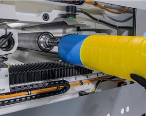
Pentagram is a multi-disciplinary design firm, and that proved to be a great asset to us. They not only have designers but also engineers who were able to understand the manufacturing process of Frooti and the need to create a bottle that will sustain that process and also deliver value to the consumer.
They were told that the bottles should be easy to hold, ergonomically designed, and have better branding panels, and a unique look. All our teams worked together to finally create the right engineered bottle which fulfilled all of our objectives.
How do you make sure that the brand stories/visuals for both the brands are being constantly evolved, while also sustaining the brand strategy?
It has been challenging. We are lucky and unlucky that we involve celebrities in our brand communication. We have them on board because it allows us great penetration in the market, and more importantly, it lets us take a lot of creative risks. On the other hand, when you have celebrities, a lot is defined by their presence.
Like when we started with Appy Fizz, we were working with a certain tone of voice when we worked with Priyanka Chopra and then we had to make a shift to Salman Khan which possibly shifted the communication too. Overall, we have three words which describe each of our brands and everything we do needs to fit into those set of words. Interestingly, we have now reached a point where people have seen our communication for a while and have accepted it, but at the same time, they are now used to it.
At this juncture, we are looking at great levels of disruptions. We want to really disrupt the story in a very, very big way. That also poses a challenge, of course. When you work so closely on a certain strategy and look and feel for a brand, it becomes very challenging to look at it with a completely fresh perspective.
We also don’t want to move away from the teams we have been working with because this is the journey we have taken together. We are still working with Jessica and her team on figuring out how to disrupt.
Lastly, your digital spends have increased by almost 100%. How are the brands performing on digital platforms?
They are doing very well. Our approach to digital is quite different. We like to get a lot of consumer generated content/consumer voice out there. We are currently doing a campaign on Frooti where we have reached out to a lot of interesting creative digital influencers, instead of the usual Bollywood influencers.
We have given them a brief, but they have complete creative freedom to do what they want. So they are creating their own content, keeping in mind our visual language. We are building communities for our brands on digital platforms and not just using them to advertise.


 See All