UCB Undercolors: How packaging can boost product sales
Packaging design can make or break a product. The packaging of United Colors of Benetton's Undercolors range of undergarments is an example how this can be achieved effectively. Three years after New Delhi’s Maatti Design conceptualised a carton for Undercolors, the product and design continues to go from strength to strength, raking Rs 100-crore for the company in the process. Rahul Kumar finds out.
28 Feb 2017 | By Rahul Kumar
A box is a box is a box, isn’t it? Absolutely not, especially if you are a packaging designer. For a packaging designer, each box is a work of art. More than that, however, a good pack is an integral part of the product it is created to protect. A good pack mimics the product and becomes an extension of it, adding to its shelf value. In short, a great pack can enhance the shelf value of a not-so-great product, and can take a great product to a few notches higher.
Take, for example, United Colors of Benetton (UCB). For a company focused on being different and trendy, you would think the lifestyle brand has everything covered. It has, with little help from experts.
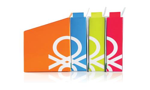
In 2014, UCB hired New Delhi-based Maatti Design to conceptualise and produce packaging for its new premium collection of undergarments, Undercolors. The rest, as they say, is history.
The design went on to win the Good Design Award in 2014 at Chicago. "What’s more, since the design was introduced, UCB’s sales figures have gone up from Rs 4-crore to Rs 100-crore in the last three years," says Kunal Sehdev, the second generation of the company, who handles the exclusive design arm of Maatti Design, Kuse. For, the goal of every packaging design is to increase sales.
Until recently, Maatti, which boasts a full-fledged printing facility, including a five-colour Heidelberg SM 74 installed in 2012, used to manufacture the boxes to be sold exclusively in the Indian market. Recently, however, the company has sent a consignment of boxes to Sri Lanka. There are plans afoot to export to Europe as well.
How to wrap undergarments
Coming back to the design of UCB’s Undercolors, Maatti was given only five months to accomplish the entire project. This included market research, design concept, client approval, proofing, first lot trial and final production.
With a slight background check on the brand, the Maatti team realised that for Benetton, colour has always been one of the vital elements, not only for their products but also for packaging and collaterals.
The design team headed by Kunal Sehdev brainstormed the idea to come up with six parameters for the new package to address.
One, it has to be cost-effective (at least in comparison to their current packaging).
Two, it must be production-friendly.
Three, it should be flat-packed for easy transportation and lower freight costs.
Four, it should be easy to assemble and convenient to access for packaging the product.
Five, it should have comfortable in-store usage and should result in minimal wear and tear.
Finally, it should maintain the ‘colourful’ identity of the brand.
The outcome of three months of the design process was a beautiful package, which was functional at the same time.
What makes this pack functional?
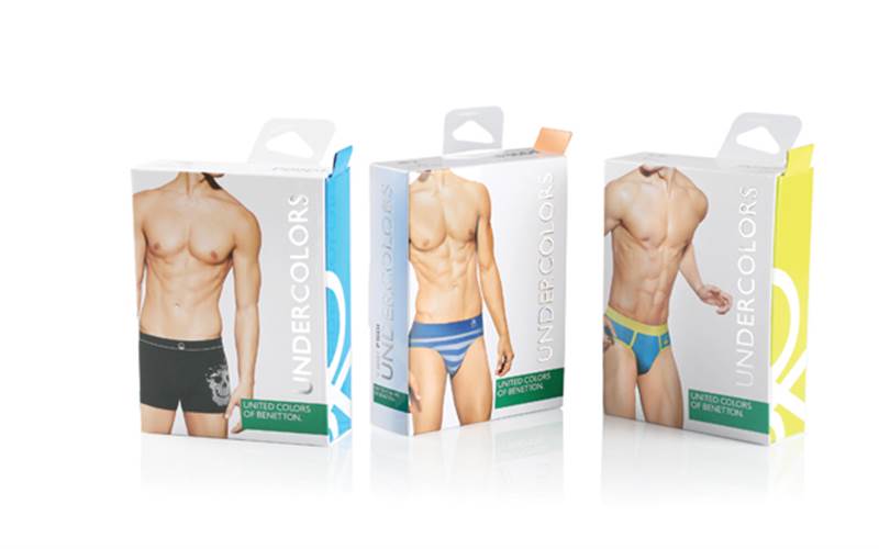
Firstly, the carton has a two-piece construction, such that the inner part can be tilted out at a corner pivot to give a view of the product and can be smoothly closed as well. It’s quite important for customers to view the undergarment that they are buying. The carton allows the customer to open the box very elegantly.
Further, making the process even more effortless, the pack is provided with a simple paper lip that can be pulled in order to tilt the inner part of the carton.
The pack comes with a hook, which is placed in an off-centre position in such a way that the box stands inclined at the point-of-purchase in stores.
The two-piece construction is such that both the outer and inner piece can be flattened, and thereby enables easy and cost-effective transportation.
From design to production
The six-colour job was produced at the company’s Heidelberg SM 74 press. “We used thermal plates with 200dpi to print on 350gsm ITC Carte Lumina. This was achieved via Kodak Prinergy workflow with Kodak Print Consol 2.2,” says Sehdev.
Even to an untrained eye, it is clear that the colours have been managed efficiently. The combination is CMYK plus pantone Cool Grey 8C, 192C, 381C, 181C and 15-5534TPX.
It is a complex job in terms of finishing. The post-press operations include die-cutting for outer piece, inner piece and lip, plus lamination, hot foil stamping, machine pasting and manual pasting.
The most difficult part of the job was application of hooks and achieving the desired objective of hanging. The challenge was in terms of the material used and pasting of the plastic material on to the paper box. We have then made slight change in the construction of the box that has helped the hook to remain stuck with the box and add to aesthetics of the box at the same time.
Maatti’s design philosophy
The first rule is simple – clarity. Know what you want and what can deliver. This is why Ramesh Sehdev, founder of Maatti Design, says the company is not looking for a long list of clientele. At the same time, the company is proudly expensive, because it serves the client to the best of its capabilities.
In a marketplace full of similar product, Kunal Sehdev says, striking design is the key. “A production house can have similar machines, raw materials and processes, but design aspects cannot be same,” he says, “A design is what makes you stand out.”
For Sehdev, the rule is simple. If you do not understand the design aspects of your product, it’s unlikely you are going to go very far in the business. “Entrepreneurs often complain that the market is going down. This simply isn’t true. The market always goes up. If you are losing your market share, it’s not the fault of the market. Others have grabbed your market share because they are more innovative than you are,” he explains.
This is where Maatti Design comes to the rescue. People come to us not for design but to learn how to use design effectively, says Sehdev.
This is the second rule. You need a combination of everything –freshness, newness in everything.







 See All