Behind the scenes: Tactabet
PrintWeek India looks into the making of Tactabet which is a Braille-Tactile alphabet book project, published both in Hindi and English, by Braille lifestyle magazine White Print.
22 Mar 2017 | By PrintWeek India
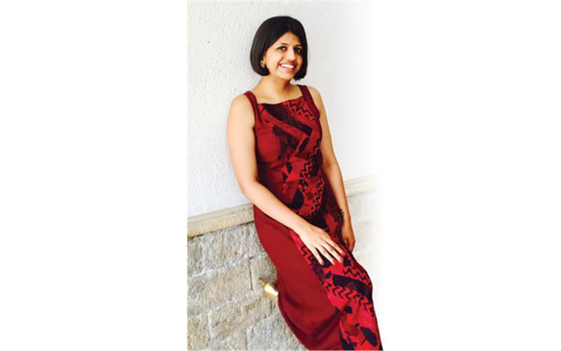
After about a year of publishing White Print, India’s first and only lifestyle magazine in Braille launched in 2013, founder and publisher Upasana Makati started thinking about her next steps in the Braille literacy world. For the next many months, she dived into the research process with various visits to bookstores and print presses and interactions with visually impaired people. She finally came up with the idea of starting off this project with the very basics. Early this year, Tactabet – a set of two beautifully produced Braille-Tactile books with English and Hindi alphabets – was released by Indian film actor Hrithik Roshan. The book is conceptualised by Makati, designed by Neha Talesara, and published by Chanakya Mudrak. The interesting story between the inception of the idea and the final release is what we tried to delve into.

“When we started White Print, we did a campaign called ‘B for Braille’ which is small effort towards Braille literacy, and I wanted to take that forward. With my White Print experience, I realised that people were hungry to read more and more, but the relevant stuff was either not available or wasn’t of good quality. So we decided to do a series of books to fulfill this gap, starting with the alphabets,” says Makati. The book is targeted at three main categories – visually impaired children, children with low vision, and adults with either of the two disabilities.

The third is a slightly unusual target audience for the book. After a visit to a hostel for blind working women in Andheri, Makati figured that there are a lot of blind adults that don’t know how to sign their names with alphabets, and Tactabet could help this category too.
“Out of the 16 women in that hostel, only four knew Braille. Moreover, the person in charge told us that due to demonetisation, there is more and more requirement for the visually impaired to be able to sign cheques and other such documents. That added a whole new dimension to the project,” says Makati.
When she had just started White Print, a Delhi based publisher had approached her to talk about a new Braille printing technology that they were experimenting with. While they did not collaborate at that time, the references that this printer provided stayed in Makati’s mind and resurfaced while she was zooming in on the Tactabet idea. This Delhi-based printer was Chanakya Mudrak which has been doing extensive research on Braille printing in India. With research, experiments, and iterations, the publishing house has now arrived at a technology called Poly Braille that produces spectacular results. Before Tactabet, Chanakya Mudrak has executed a series of projects for NCERT (National Council of Educational Research and Training) that includes innovative books targeted at children with different disabilities.

Says Puneet Arora, business development head of Chanakya Mudrak, “Poly Braille technology is absolutely new to India. This has been completely developed by us based on our in-depth research over the last few years. We had been talking to the visually impaired community, showing them samples, and doing a lot of iterations in the process before finally coming up with this. While the final product looks quite simple, there is a lot of intricacy involved. Even the slightest of distance between two cells can change the meaning of a word, or make it unreadable.”
Makati finally flew down from Mumbai to Delhi to meet Arora, and finally felt confident of executing the project with the quality she had envisioned. Then came the design aspect of the book, for which another person was added onto the team – Mumbai-based designer Neha Talesara. “I am basically an interaction designer and have been working on digital experiences. Tactabet was very different, mainly because it was a totally different medium that I was designing for,” says Talesara.
During the designing process, both Makati and Talesara decided to replace a lot of old words that are no longer relevant or used in contemporary conversations. For example, most of the existing Hindi alphabet books have ‹Yagna› for ‹Ya› and ‹Kshatriya› for ‹Ksha›. Tactabet, however, decided to go for ‹Yoga› for ‹Ya› and ‹Kshetra› for ‹Ksha›. Also, while the initial idea was only to put alphabets, the team decided to put words expanding the alphabets, with Braille on top of the alphabets, after a few rounds of discussions.

Maintaining visual consistency is something that Talesara found most challenging during the designing of both the books. “I made the illustrations for each alphabet in a way that they appear very simple in form, colourful, and have consistent visual style all throughout. Only after a few iterations and exploring different forms of each illustration, we would freeze on the final one that would gel with the overall visual style in the book.”

She further adds, “While designing, my approach was to step into my target audience›s shoes and design it in a way that they find it really useful. The illustrations are very simple so that when they feel it with their fingers, they get a clear idea about the shape of the object. We intentionally made the objects bright and colourful such that kids having low vision can also find it equally useful.” Talesara.
Arora echoes the thought about visual consistency, and adds that getting the right aesthetics was central to the project. “In India, whenever such projects are created, aesthetics are usually compromised. We were very particular that the books should be visually appealing. If you see the shapes of the objects in the book, they are quite simple but yet very visually appealing.”
Then came the printing part, for which Chanakya Mudrak used two or three different printing methods. “We can’t reveal all the methods since it’s a trade secret, but broadly, we have printed transparent Braille. A huge benefit of the methods we have used is that we could print on both sides of the paper. There is also a lot pre-press activity involved in the process; almost 50% of the entire production process is pre-press actually. The rest is taken care by more than two types of technology to achieve the height, spacing of Braille dots, etc. Also, the tactile part of printing is a separate form, but is achieved using similar methods,” says Arora.
The books are quite compact and bag-friendly, and a big reason for that was the high production cost involved. Talking about the commercials, Makati confesses that she was initially very apprehensive to price the books at a high cost to recover her investment. “The monthly magazine White Print (published by National Association for the Blind) is priced at INR 30 so this was a huge leap for us in terms of the pricing. If we had a corporate sponsor on board, we would have been able to change the pricing to make it more accessible. However, when that didn’t work out, we decided to stick to the current prices to be able to produce more such books in the future and to provide the high quality that we had envisioned,” she says. The English alphabet book is now priced at INR 1000 (print run: 75) and the Hindi one, with more number of pages, at INR 1800 (print run: 50).
Talking about the cost factor from a printer’s point of view, Arora agrees that it is quite expensive, but completely worth the value. “While printing anything we make sure that we understand the value of the document we are printing and then decide the investment and costing accordingly. For example, a marksheet will always need more investment and would be priced higher than a leaflet, because a leaflet is going to end up in the garbage but a marksheet needs to have a really long shelf life. With Poly Braille, we are producing something not only of immense value to the visually impaired community but also something that’s extremely durable. The “regular” Braille doesn’t have a life beyond one year or so, whereas Poly Braille can produce works that would easily last for more than 10-15 years.”
Tactabet is already receiving requests from schools and individual homes. Makati is looking at a few tie-ups in the near future with NGOs for a wider distribution of the books. She wants to continue the basic series first with books on numbers, animals, birds, etc., and then move onto leisure reading books in the future when the costs are not so prohibitive.
“We want to stand for Braille literacy. So the plan is to continue doing this as a series, especially now that we have a great set-up in place. We need people and companies to support us on a long-term basis though for this project. And we also want the government to collaborate with us,” says Makati.


 See All