

Pantone reveals Cloud Dancer as colour of the year
Described as a "billowy, imperial white," Cloud Dancer acts as a counter-narrative to the noise of the modern world. The shade has been described as offering "oxygenating serenity" and a "promise of clarity."
10 Dec 2025 | By Prabhat Prakash

The colour is expected to influence upcoming trends in home decor, fashion, and industrial design
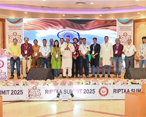
In a move signalling a shift toward minimalism and clarity in global design trends, the Pantone Colour Institute has unveiled Cloud Dancer as the Pantone Colour of the Year 2026. The announcement was made during an exclusive event that also showcased how major global brands, including Motorola, Porsche, and Heinz, are leveraging colour standardisation to solve complex supply chain and branding challenges.
“In an era obsessed with urgency and hyper-productivity, a need is emerging to reclaim time,” the presentation noted. The choice of an airy, unperturbed white urges designers and consumers to "declutter" their minds and spaces. The colour is expected to influence upcoming trends in home decor, fashion, and industrial design, pairing effectively with a new suite of pastel and neutral companion tones like Fizzy Pink and Cocoa Cream.
Sam Shalgaonkar, senior sales manager, South Asia at Pantone, emphasised that colour is no longer just a finishing touch but a gateway to new market territories. Shalgaonkar noted, "By expanding the application and usage of a colour, a brand can unlock a very new creative horizon."
Shalgaonkar highlighted that through the Pantone Colour Licensing Programme and strategic consulting, brands can ensure their visual identity "resonates with customers worldwide." His address set the stage for a deep dive into how standardised colour systems allow brands to transcend traditional marketing channels, creating a unified voice across diverse media and merchandise.
Ankita Kothari, business development manager for India at Pantone, provided a technical perspective on how global giants are navigating the complexities of cross-substrate reproduction, a critical concern for the print and packaging sectors.
Kothari illustrated the rigour required in modern branding through the case of Porsche, which worked with the Pantone Colour Institute to develop Turbonite. She explained the challenge of maintaining the integrity of this metallic grey with bronze undertones across disparate materials: "absolute precision" was required for metal, thread, leather, and resin interiors. "It’s our colour standards that actually allowed them to translate one shade consistently across different materials," Kothari stated, noting that this consistency is what makes a product line feel "visually unified."
Kothari also touched upon the functional power of packaging in the Heinz case study. Addressing the issue of "ketchup fraud" in the hospitality sector, Heinz used a Pantone-matched control label on bottles, allowing consumers to visually verify the authenticity of the product inside. Kothari described this as a shift where colour becomes "a tool for brand protection and authenticity," solving a tangible supply chain problem through packaging design.
She further cited IWC Schaffhausen’s Top Gun watches and Valentino’s Pink PP campaign as examples where monochromatic colour stories were executed flawlessly across retail interiors, garments, and ceramic hardware, creating immersive brand experiences.
Providing the brand perspective, Shivam Ranjan, global head of brand at Motorola, outlined the tangible return on investment (ROI) derived from the tech giant’s four-year partnership with Pantone.
Ranjan revealed that Motorola has successfully pivoted from a functional tech manufacturer to a "lifestyle tech" brand, a strategy driven largely by colour material finish (CMF). "In terms of our product purchase today, 87% of consumers are actually looking into the colours as a reason to buy our products," Ranjan disclosed.
He noted that 65% of Motorola’s portfolio is now "colourful," moving away from the industry standard of black and silver. This strategy extends beyond the chassis to the user interface, with Motorola introducing "Pantone validated" displays and cameras to ensure digital colour fidelity matches physical reality, a crucial feature for the creator economy.
Ranjan also used the platform to announce the integration of Pantone’s newly revealed colour of the year 2026, Cloud Dancer, into the upcoming Motorola Edge 70. He emphasised that innovation now lies at the intersection of technology and fashion, citing the use of non-traditional materials like vegan leather and wood finishes in their devices.
The session concluded with a consensus: in an increasingly visual marketplace, the scientific management of colour is a critical differentiator, driving everything from brand recognition to supply chain security.


 See All