

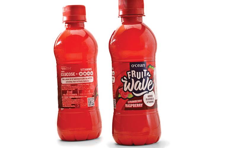
Private view: Ocean Fruit Wave
The fruit drink is packed in a vibrant red bottle
24 Sep 2019 | By WhatPackaging? Team
Deepa Naik, Head-packaging development, Hershey India
 The fruit drink is designed especially for kids. This is clear by the vibrant bottle and label colour that smartly camouflages the colour of the fruit drink.
The PET bottle is formed and coloured through a two-stage stretch blow moulding process.
The neck profile and the 28 PCO regular cap are the ones used in mineral water and juices bottles.
The bottle is covered with a well-printed BOPP wrap-around label. However, the registration is not sharp, and the text is not readable.
The usage of QR code on the label is an interesting addition that runs the world cup promotional campaign.
 The bright and eye-catching red bottle and cap, gels with the fruits used to manufacture the drink.
The pearlised label that comes with a good graphical representation is a useful add-on to the bottle.
The highlight on the glucose and vitamin contents will help in brand distinguishment
One scope of improvement according to me is that the ‘MRP’ and 'Pkg code', printed in black is hardly visible. An alternative colour usage can definitely help.


 See All