Print History: Fiona Ross - Type Design
How a career in type design led to the making of a type historian
23 Sep 2020 | By Murali Ranganathan
The Murty Classical Library of India is perhaps one of the most ambitious translation publications projects related to India. Established in 2014 under the aegis of Harvard University Press, it aims to publish five hundred books related to ancient Indian literature over a century (about five books a year). These books are in a variety of languages – Tamil, Sanskrit, Hindi, Persian, Punjabi, to mention a few – each with its associated script. Every book, produced to the best specifications, is designed such that the original text and the English translation appear on facing pages. When the Murty Classical Library also decided to commission a family of newly designed fonts for each of the scripts to be used for printing the books, they turned to Fiona Ross.
Having worked in the field of type design for the last forty years and more, Fiona Ross has long been recognised as the go-to person for typeface design of Indian scripts. She is also a specialist in other Asian-origin scripts such as Arabic and Thai. These scripts, though very disparate in many ways, are grouped under the negative rubric ‘non-Latin’ to distinguish them from the Latin scripts which are used for European-origin languages. Perhaps it might be simpler to group them as ‘Indic’ and ‘Arabic’ scripts.
The Linotype years
During the 1970s and earlier, when there were no formal courses on typography, most people who found themselves involved in type design had a background in art or design. Fiona Ross was, however, a specialist in languages with training in German, Sanskrit and Pali. Her entry into Linotype was just a matter of chance as her long-time collaborator John Hudson narrated in 2014.
In 1978, she was working in the library of the School of Oriental and African Studies in London when her husband, Rod, showed her an advertisement in a newspaper. It was for a position coordinating non-Latin typeface design at Linotype, and was illustrated by a tree of languages and writing systems. Fiona pointed to this illustration and said ‘Well that’s not right... and they got that wrong...’, to which her husband replied ‘You should apply for the job.’
Fiona Ross joined the Department of Typographic Development at Linotype (UK) as a research assistant at a time when type design was in a state of ferment. Hot metal composing (using Linotype and Monotype typecasting machines), long a thing of the past, was still widely in use, especially in India. Phototypesetting, first introduced in the 1950s, was being widely used in the 1970s and 1980s. Meanwhile, digital typesetting was already making its presence felt and would become mainstream in the 1990s. The challenge for type design companies like Linotype was to adapt, and eventually in many cases, newly design Indic scripts for use with these new technologies.
One of the first issues which Fiona Ross wrangled with at Linotype was the input method for typesetting Indic scripts using a keyboard. As Ross recalls in a 2002 talk, “The keyboard was large, and the compositor needed to combine different elements to form all the required characters. This also incurred a great deal of font changing, which rendered Devanagari slow to key and slow to process.” It was evident that a fresh approach was needed for inputting Indic scripts in a digital context, which could support a lot more characters than the previous technologies.
We soon found that the concept of using software to select contextual forms could be used to an even greater extent for Indian scripts than for Arabic. This concept, and the notion of writing software to merge fonts, led to the invention of Linotype’s phonetic keyboard for Indian scripts in 1978, which effectively revolutionised keyboarding practices for Indian scripts. Based on the Indian phonological system, the phonetic keyboard simplified the keying of texts whilst optimising keying speeds. It also enabled all Indian scripts to use standard keyboards.
The History of Type
An important part of print history has been the history of the types used to create print artefacts. However, most print historians have generally not equipped themselves with the technical know-how and practical experience of working with types. This has led to the marginalisation of type history in the broader print history narrative. As a type designer who realised early on “the need to undertake research for the practice of type design,” Fiona Ross was particularly well-positioned to bring a fresh perspective to the history of type.
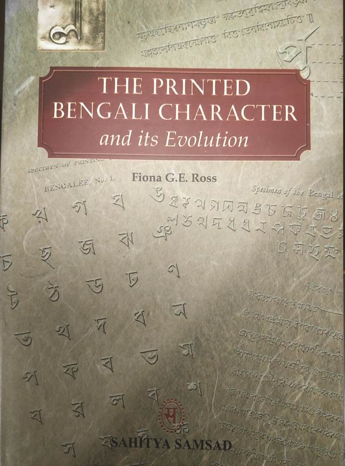
Printed Bengali Character and its Evolution (Kolkata, 2009)
Just as she was settling into her role at Linotype, a brief was received from Ananda Bazar Patrika in 1979 “to produce a text typeface with a complementary bold fount for its daily Bengali language newspaper, which was to be printed by offset-lithography in Calcutta.” When Linotype decided to design a new typeface for digital composition from scratch rather than tinker with existing designs which were geared towards older technologies, the research for the project was undertaken by Fiona Ross. It provided her with the opportunity to do a ground-up study of the evolution of Bengali type over a period of two hundred years. Tracing the journey of Bengali type from 1778 when Charles Wilkins designed and produced the first Bengali fount, and the seminal contributions of the type foundries of the Serampore Mission Press and the Baptist Mission Press during the early decades of the nineteenth century, to the professional designs of the London type founders Vincent Figgins and Richard Watts that became standards for Bengali type, and the contributions of Indian foundries, Ross went on to study the transition to Linotype and Monotype, before examining the phototypesetting of Bengali text in the 1970s.
Besides contributing to the practicalities of designing a new Bengali digital typeface, this project was also part of Ross’s doctoral studies at the School of Oriental and African Studies. It resulted in a landmark publication titled The Printed Bengali Character and its Evolution (UK edition, 1999; India edition, 2009).
This study of Bengali type history can serve as the model for the study of typefaces in other Indic scripts. Fiona Ross has also written extensively about other “non-Latin” scripts including Arabic and Sinhala as also the transition from metal type to digital letterforms.
Her engagement with the history of type relating to ‘non-Latin’ scripts is best reflected in the exhibitions she has curated over the years. Working on the archival collections at the St. Bride Library, London and the University of Reading, her exhibitions have sought to not only explore the patterns of type development but also illuminate the methods by which these types were designed.
RAPID FIRE WITH FIONA ROSS

Who are the print historians whose work has impressed and influenced you most?
Among others, with respect to South Asia, these are Graham Shaw, Bapurao S Naik, Robin Jeffrey, Abhijit Gupta and Vaibhav Singh. With respect to history of type design and type technologies, the most reliable for my interests have been Walter Tracy, Lawrence Wallis, Charles Bigelow, Jonathan Seybold, and Fred Smeijers.
Which of your books/publications do you consider the most important?
The most important is still perhaps my book The Printed Bengali Character and its Evolution, (Richmond, 1999), the second revised edition (Kolkota, 2009) of which is already out of print; there is a strong demand for a new updated edition. Again, the text is not merely relevant to Bengali but is equally pertinent to other scripts.
How has the vocation of print history changed over the decades?
With regard to print history itself and within the South Asian context there has been considerable development over the last few decades with the production and publication of an increasing number of reliable histories. It is particularly encouraging to see the work of younger scholars emerging in this field, and those who have a keener focus on key actors frequently overlooked in the histories of print cultures, i.e. the type designer, the type manufacture, and the typographer.
What is on your plate now?
As part of my academic work, I have several ongoing projects, e.g. I am leading a Leverhulme-funded project: ‘Women in Type: a social history of women’s role in type-drawing offices, 1910–1990’. As part of this, I am writing an article tracing the development of the Linotype Devanagari digital fonts (the first Devanagari-script digital fonts). Additionally, I have three on-going design projects.
Women in Type design
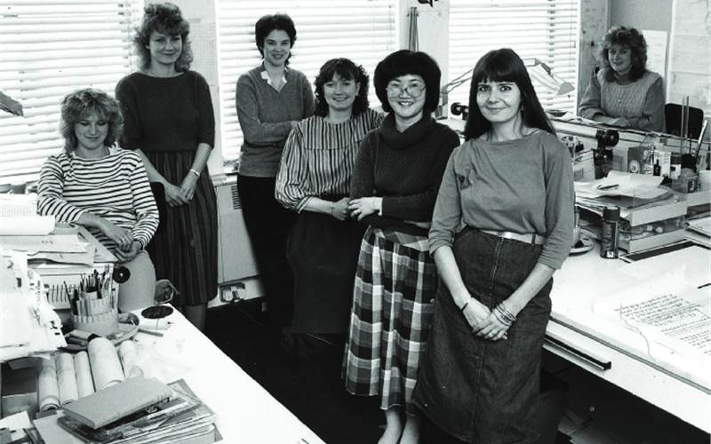
When Fiona Ross joined the Typographic Department at Linotype in 1978 as a research assistant, she was not storming a male bastion. In fact, the type design departments of the leading type firms, Monotype and Linotype, were principally staffed with women from their very inception in the early years of the twentieth century. Most of them worked in the drafting department. But as Ross recalls in a 2017 interview with typekit.com, the reception at Linotype was not all rosy: “Linotype was unused to women graduates – there were not that many graduates at Linotype when I started – and we had to deal with some unwelcome attention and remarks on a daily basis, particularly at the beginning of my time there.” However, within a few years, Ross became the head of the Department of Typographic Development at Linotype and went on to build an all-women type design team. And as she recalls, “Against company expectations, we women continued to work together for many years – over a decade.”
Narratives of type history have tended to gloss over the presence and contributions of women as leadership positions were traditionally male-dominated. As part of her continuing engagement with type history, Fiona Ross is currently excavating the archives to understand, document, and highlight the important roles which women played in the development of the type.
Collaboration and recognition
In spite of her significant achievements in the world of type, Fiona Ross, a rather self-effacing personality, has always preferred to remain in the background; she would rather let her work do the talking. Over the years, she has worked with a range of collaborators; in fact, “It is the way I have always worked,” she noted in an interview with femme-type.com.
I recognise my limitations; I recognise that individuals possess different talents/skills and pooling these together has worked well in my design work. Many of the design projects I work on have extensive character sets, challenging software requirements (and I like to exploit software to render scripts accurately) and depends on teamwork. Needless to say, it is good to have different sets of eyes on the work.
Fiona Ross designed the first Bengali font for Ananda Bazar Patrika in partnership with Tim Holloway while her collaborator for the 2015 assignment for the same client was Neelakash Kshetrimayum. The family of Murty Fonts, for which typefaces have been released for Bangla, Kannada, Sanskrit, Gurmukhi, Hindi and Telegu, was designed by Fiona Ross and John Hudson. The phonetic keyboard was designed by Fiona Ross and Mike Fellows.
Be it type design or type history, she has worked with many of the leading practitioners over the years, as also mentored and guided numerous others. Vaibhav Singh, who has curated two major exhibitions of type with Fiona Ross and was also guided by her during his doctoral studies, remembers “her sense of open-minded enquiry, collaborative spirit, and unassuming personality.”
She is one of the most self-effacing and generous of scholars that one can imagine. As a life-long teacher and researcher who wears her learning lightly, she has been a source of inspiration to several generations of students and practitioners alike. Her emphasis on research-based practice has been transformative in both industry and academia, and there are few who have championed high quality for South Asian typefaces as well as in typographic research the way that she has.

Fonts co-designed by Fiona Ross for Linotype (now Monotype)
Her clients echo similar sentiments. Tim Jones, Director of Design and Production at Harvard University Press (HUP), describes the experience of working with Ross in 2014.
Fiona has taught me and everyone else here at HUP so much about the complexities and challenges of typeface design and has shared a great deal of her unmatched knowledge of the history of non-Latin typography. … Fiona’s dedication to research and fidelity is inspiring, and her artistry seems unparalleled. That she is such a delightful and thoughtful person on top of it all is extraordinary. We feel very lucky indeed to be part of this effort alongside her.
Over the years, Ross has played an active role in the Association Typographique Internationale (AtypI), the global organisation for all things typographic, delivering keynote lectures, curating exhibitions, and as a judge. A recipient of major typography awards, her work has been recognised as outstanding by her peers, industry bodies and clients.
From her eighteenth-century cottage in the picturesque region of Cotswolds in England, Fiona Ross continues to exert a strong and visible influence on daily life in large parts of Asia. Ranging from fonts for Indian languages designed specifically for use on mobiles to popular typefaces such as Adobe Devanagari and Linotype Bengali which are widely used in advertising, newspapers and posters. The impact and presence of the typefaces designed by Fiona Ross in everyday life in India are constant and pervasive.
FIONA ROSS CHRONOLOGY
- 1954: Born in London, United Kingdom
- 1975: BA in German, University of Kent at Canterbury
- 1978: Post-graduate diploma (Sanskrit with Pali), School of Oriental and African Studies (SOAS), London
- 1978: Joined Linotype as a research assistant in the Typographic Department
- 1985: Head of the Department of Typographic Development at Linotype
- 1984: Co-designed the Malayalam typeface Linotype Manorama for Malayala Manorama Group
- 1988: PhD in Indian Paleography from SOAS, London
- 1990-96: Typographic Consultant to Linotype
- 1999: Publication of the UK edition of The Printed Bengali Character and its Evolution
- 2003: Started teaching at the University of Reading, Department of Typography & Graphic Communication for the MA in Typeface Design
- 2009: Publication of the India edition of The Printed Bengali Character and its Evolution by Sahitya Samsad, Kolkata
- 2012: Co-curated the exhibition ‘From hot-metal to OpenType – the type design process for world scripts’ at ATypI Conference, Hong Kong
- 2014: Co-curated the exhibition ‘Making news: type technologies in transition in newspapers across the world’ at ATypI Conference, Barcelona
- 2014: Awarded the Society of Typographic Aficionados (SoTA) Typography Award at the TypeCon conference in Washington DC in recognition of her contributions to the field of type design
- 2018: Awarded the Type Directors Club (TDC) Medal for her outstanding contribution to typography
- Present: Consultant, type designer, and visiting lecturer, professor in type design, Department of Typography & Graphic Communication, University of Reading, associate designer to Tiro Typeworks, Canada





 See All