

Down memory lane
Printing guru, Purnendu Sen, one of the jury member for Awards 2013, is overwhelmed with the quality of print entries. He recalls the early days of Indian print, when quality was a road less travelled. WORDS: Purnendu Sen
08 Oct 2013 | By PrintWeek India

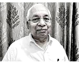
Sen during the Jury Day of the PrintWeek India Awards at The Leela in Mumbai: “I must admit that the publishers, printers and above all the consumers were oblivious of quality”
Last month, on 26 August, I was invited by PrintWeek India to participate as a member of the jury for grading the products to be subsequently chosen for the “PrintWeek India Awards”.
Very well organised, with breakfast, lunch, tea, all available, photo sessions and TV shoots thrown in between, made the event even more exciting.
Personal interactions with the media group handling mind products, namely writers, copy creative personnel to shopfloor productionwalas handling pressmen, are ever so interesting. After a long time I saw that same love-hate relation, which is so unique to the working of media operations. In the midst of it, I wondered, how can you not love working in media?
Initially, I was a bit sceptical with anything ‘Awards’. These days from films to industry to products to health service to education and even coaching classes, there are ‘Awards’. But within an hour, I was at home looking through some of the finest works of design and production of books and other print products.
The day whizzed past rather fast; and suddenly we were heading off to our respective abodes.
On my way back, I travelled in ‘rewinding’ mode, reminiscing about things that happened towards the end of 1960s and the very beginning of the 1970s, thinking about industry practices, quality standards, quality process, the systems and so on.
My mind veered to the ‘Old Lady of Bori Bundar’ in the publication gravure department, where the country’s most prestigious magazines like Illustrated Weekly, Dharmayug, Filmfare and Science Today, among others, were printed. Print orders were more than half a million copies every week, with a maximum of 96 pages, line saddle-stitched.
By the time I could get hold of the bearings of the place, I realised I was walking into a horror of quality. I realised kerosene was used as solvent instead of toluene and other similar group of solvents which was ‘recommended’. The 60inch wide copper cylinder used to get oxidised and turned black at the edges, with pressmen pouring kerosene on the run.
I realised two happenings were most important. One, the keeping aside of some two to three thousand copies, called ‘office copies’ which meant these copies would only go to the bosses’ cabins. And second, another bunch of about 300 copies each for the colour advertisement was set aside, which was called the special advertisers’ copy. This would be repeated as many times, depending on the number of colour advertisements in an issue.
I learned how, out-of-registration, out-of-alignment advertisement pages were corrected by manually shifting pages from one copy to another and then saddle-stitched again, offline. That was the ‘real jugaad’.
The rest of the time in the shift, the quality that really went out to the reader was of no consequence; and advertisers had no choice given the might of the Illustrated Weekly, which was edited by Khushwant Singh.
But suddenly, India Today appeared on the scene as did colour television; and with it media buyers became aware of their strengths. This is the time my problems began. I had to face the onslaught from the advertisers’ creative and production combine, some delivering choicest words; and the nightmare of waking up in the middle of the night, the ‘Only Vimal’ ad dream sending shivers up the spine.
In those days, the printer’s choice was really restricted. You had to make do only with papers imported by domestic players. The Indian ink industry was in the junior standard of quality school, I would say. The objective was only one: finish the edition. However, I must admit that the publishers, printers and above all the consumers were oblivious of quality.
Suddenly, we were in the mid-80s and there was an emphasis on colour, colour and colour. By then, huge investments were coming in. Along with it came awareness about quality. (Readers must not misunderstand. I am talking only about newspapers and magazine products; and not about high quality commercial jobs).
We started an industry forum of laying standard operating procedures (SOPs), which brought SQC, Kaizen and a host of gadgets for measuring quality. Huge modernisation of pre-press and surface preparation, colour management, ISO – was the norm. Modern ink and pigment production started becoming available.
And with all this came – the Awards.
But I see there is still no fullproof method of having a true representative sample being established. Comparisons are still not 100% apple to apple. It is still “office copy” or should we say “Award copy”!
This reminds me of the great Hindu teaching – “We all go back to where we came from.”


 See All