

KV Shridhar picks his 10 favourite print ads
PrintWeek India spoke to KV Shridhar of Sapient India about ideas that have caught his fancy. Here is what he had to say.
02 Sep 2014 | By PrintWeek India

Shridhar: "Its so sad to see print advertising today is restricted to a transactional messaging medium"
“In this showcase of great print ads, I have tried to bring in work from two different generations and across the world. There was a time print was valued and the written word used to be more valued than restrictive visualisations.
Written words till early eighties used to make us cry, angry, laugh or even shred a tear of joy. Then television took over the job of building emotional connect with the consumers. Print was reduced to an impact medium where Art Directors reinvented print to a whole new visual storytelling medium.
Hope you’ll enjoy the ads. It's so sad to see print advertising today is restricted to a transactional messaging medium.
Lets celebrate the dying craft of writing and silent story telling by gifted creatives.”

This ad was created by DDB in 70’s for VW Beatle, simple but impactful communication is based on common sense with more miles per gallon why VW Beatle make more sense compared to gas guzzling American cars

Bill Bernbach’s strategic mind at work, it again works on common sense and it answers: “Why should you go to a No 2 player?” 70’s is an era that saw dominance of print work by DDB.

A modern classic again from DDB and VW, created by the London office of DDB in 2004 talks about the toughness of the new Polo.

“With the most powerful detergent, stains have no chance of survival” was an enormously powerful thought. Must applaud the Art Direction for sticking to basics. This master piece was created by Saatchi & Saatchi in 2007.
Another classic ad from DDB again from the 80’s, what can an old man ask from a grown up son? It’s a classic case of art director and writer rolled into one to conceive an idea like this.
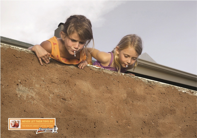
This again is a modern day classic created by DDB South Africa in 2008. I love this ad because of the brilliant insight, If you were to keep the toys away from kids; this may happen. How true! We all must have behaved the same way. Love the way Energizer urges parents not to let the toys die. Or face the consequences. As they say a picture is worth thousand words, indeed this one demonstrates its worth: a whole childhood dairy.
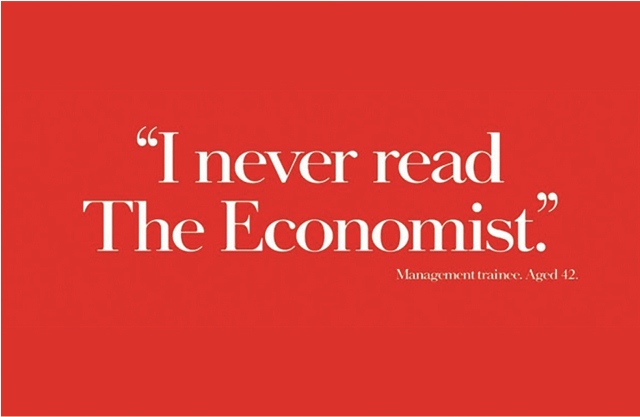
One of the most iconic writing for any brand ever. What this brand does is; understand its readers well, often when you get to talk to intelligent audiences you tend to be overtly cleaver and end up by being dumb and the trick is to be so cleaver that every one should understand. This brand respects the intellect of its readers, to me this is one of the finest pieces of copy writing, love the way the Art Director holds on to the twist. Created by the legendary agency Abbott Vickers BBDO London in 1980.

This simple yet iconic poster was conceived by a 19 year old art student, Created by Ogilvy Shanghai in 2012. The Coke sharing theme and the iconic ribbon was integrated seamlessly as if it always existed and we failed to see. Simply, genius piece of graphic design.


 See All