

Colour Management - Part Six
Kiran Prayagi, print technologist and chairman, Graphic Art Technology & Education demystifies colour management in a series of articles. In this fifth article, he discusses the importance of greys.
28 May 2013 | By Kiran Prayagi

Colour Management - Part Six
From the earlier articles in this series it is clear that all the colours we see have only three basic colours red, green, and blue in case of additive colours or three secondary colours cyan, magenta, and yellow in case of subtractive colours. White, grey, and black are only the presence or absence of colours, also sometimes called psychological primary colours.
See figure 1. So why to look at or consider greys ? It very important to understand that in colour reproduction these greys are reproduced not with single emulsion film (black and white photography), nor with the single phosphor (black and white television or computer monitor), black and white scanner, nor only black ink printing on white paper on printing machine.
See figure 1. So why to look at or consider greys ? It very important to understand that in colour reproduction these greys are reproduced not with single emulsion film (black and white photography), nor with the single phosphor (black and white television or computer monitor), black and white scanner, nor only black ink printing on white paper on printing machine.

In colour reproduction these greys are reproduced using three secondary colour dyes, cyan, magenta, yellow in photographic film or in print, or with pigmented inks on printing machine and with three primary colour phosphors, red, green, blue on television or computer screen or with sensors in digital camera and, of course, in the human eye. Greys produced with these colours help to exercise an excellent control over the colour reproduction in any process.
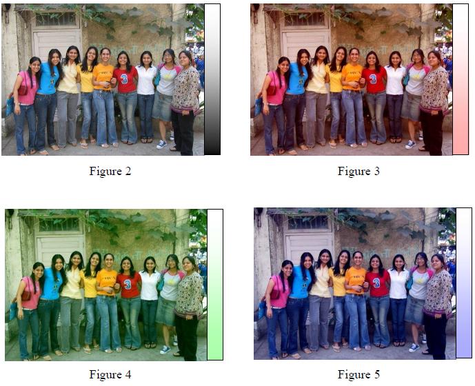
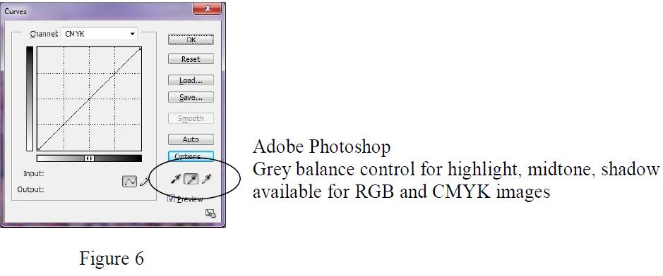
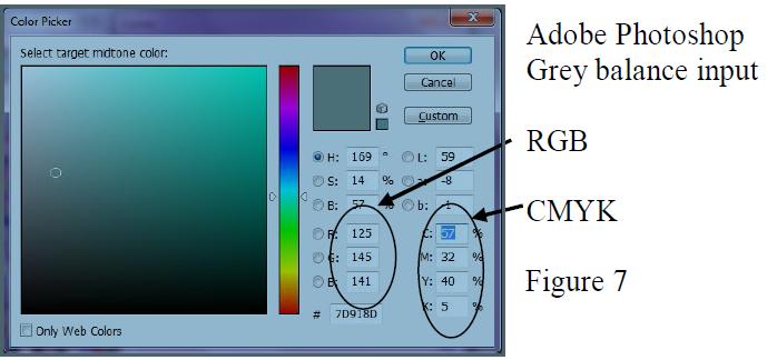
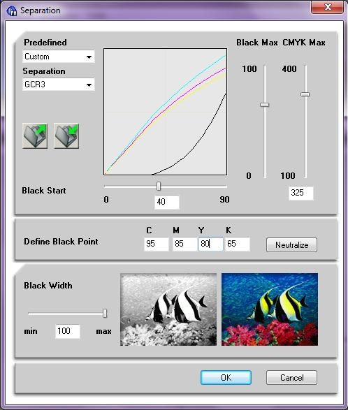
White is presence of all the colours of the spectrum or three basic colours. Black is the absence of all the colours of the spectrum or three basic colours. Whereas the grey is partial presence of all the colours of the spectrum or three basic colours. In greys even any small imbalance of colours make it appear coloured towards the presence of strong colours. See figure 2 (good reproduction), 3 (red bias), 4 (green bias), 5 (blue bias). To illustrate the effect colour bias is exaggerated in these examples. It can be seen that grey scale on the right and greys in the picture (ground in the front) show more pronounced effects than the coloured tops worn by the girls and comparatively much less in the extreme white and black.
Most photographers when shooting tabletop pictures include patches of grey scale to see if the film processing has been faulty and whether it has introduced any colour bias in chemical processing. Greys give immediate indication than the coloured areas. Similarly, in film photography while shooting in unfavourable lighting conditions or using a colour film not compatible with the lighting conditions it is a normal practice to make use of CC filters (colour compensating filters) so as not to produce pictures with colour cast. In digital photography now cameras are available where ‘white balance’ can be automated. This means that all three basic components of white light striking the camera are generate signal with equal strength and, therefore, do not give colour bias in the pictures.
In colour television or computer monitors three major controls are provided. Colour, brightness, and contrast. When colour controls are completely turned off the monitor looks black and white. These various shades of greys seen are generated from three colour phosphors, red, green, blue. Any defective or miscalibrated monitor shows colour bias towards the presence of strong colour generated by a stronger analogue or digital signal. In colour scanners, whether conventional drum or now flatbed, a similar setting like white balance in digital photography is provided. Some call it ‘input calibration’, that is white, grey, and black in the picture to be scanned should be seen by the scanner as they are without any bias towards any colour. Unfortunately, this is not paid due attention by many in the reproduction or photography industry which results in extra work in photoshop software and loss of details.
Like input calibration, output calibration or producing greys with three colour dyes in photography or pigment inks in the printing processes is very important. This is called ‘output calibration’. For good results ‘input’ and ‘output’ both the calibrations must be achieved, only one will not help.
In photography, the proportion of three colour dyes is balanced to give greys. In gravure printing this is possible sometimes as the process works on the volume of inks deposited on the substrate. In colour television or computer monitors the analogue or digital colour signal strength is adjusted to produce equal intensity of three colour phosphors to produce grey. In printing industry the tonal values in the print are achieved with the help of dots. These dots vary in size in case of AM screening or form clusters in case of FM screening techniques.
The process of tonal value reproduction is binary, in the sense all areas carry the same amount of ink, unlike photography or gravure printing. The tonal values perceived by the eye depend on the area covered by printing ink. In this case it is the area covered by three secondary colour inks, cyan, magenta, yellow combine to give grey effect provided these are well balanced in their dot sizes. However, unlike photography or television and computer output it is not possible to get good greys in dark tonal values in the printing processes due to its binary nature. This is overcome by the addition of black ink to three colour inks.
Thus to reproduce grey using coloured dyes and inks or coloured phosphors on television monitors is the most basic and first step in colour reproduction. This holds true in conventional drum scanners, new flat bed scanners, Photoshop, see figure 6 and 7, or any other similar software as well as new colour management systems, see figure 8. If not done, it is the guarantee for faulty colour reproduction.
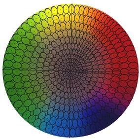
As stated earlier in this article, any colour bias is first visible in the neutral grey areas and not so easily in saturated colour areas. This provides more latitude in colour reproduction for saturated colour areas than grey areas. See figure 9. Ellipses marked show the latitude possible without affecting visual differences in colours. It can readily be seen that saturated colours have wide latitude whereas greys have very little latitude.
In photography, the proportion of three colour dyes is balanced to give greys. In gravure printing this is possible sometimes as the process works on the volume of inks deposited on the substrate. In colour television or computer monitors the analogue or digital colour signal strength is adjusted to produce equal intensity of three colour phosphors to produce grey. In printing industry the tonal values in the print are achieved with the help of dots. These dots vary in size in case of AM screening or form clusters in case of FM screening techniques.
The process of tonal value reproduction is binary, in the sense all areas carry the same amount of ink, unlike photography or gravure printing. The tonal values perceived by the eye depend on the area covered by printing ink. In this case it is the area covered by three secondary colour inks, cyan, magenta, yellow combine to give grey effect provided these are well balanced in their dot sizes. However, unlike photography or television and computer output it is not possible to get good greys in dark tonal values in the printing processes due to its binary nature. This is overcome by the addition of black ink to three colour inks.
Thus to reproduce grey using coloured dyes and inks or coloured phosphors on television monitors is the most basic and first step in colour reproduction. This holds true in conventional drum scanners, new flat bed scanners, Photoshop, see figure 6 and 7, or any other similar software as well as new colour management systems, see figure 8. If not done, it is the guarantee for faulty colour reproduction.
As stated earlier in this article, any colour bias is first visible in the neutral grey areas and not so easily in saturated colour areas. This provides more latitude in colour reproduction for saturated colour areas than grey areas. See figure 9. Ellipses marked show the latitude possible without affecting visual differences in colours. It can readily be seen that saturated colours have wide latitude whereas greys have very little latitude.


 See All