

Colour Management - Part Eight
Kiran Prayagi, print technologist and chairman, Graphic Art Technology & Education demystifies colour management in a series of articles. In this eighth article, he discusses the greys and tones.
18 Jun 2013 | By Kiran Prayagi

Kiran Prayagi, print technologist and chairman, Graphic Art Technology & Education

Once the importance of ‘greys’ and ‘tonal separation’ is understood it is very important to establish the relation between the two. To achieve this it is necessary to take scientific and systematic approach to the subject. For clear understanding, as mentioned in article seven, better to look at black and white first and then to colour reproduction.
Figure 1 indicates the black and white reproduction where original (x axis) is plotted against reproduction (y axis). Original can be black and white artist drawing, photograph, digital file, etc. When graph is at 450 every tone in original is matched in the reproduction, curve A. This is called ‘facsimile reproduction’. This is best studied from the ‘grey scale’ reproduction. (grey scale here is used in its original meaning a ‘scale of grey’ e.g. Kodak scale and not the new terminology where it means black and white pictures.

In practice, due to limitations in achieving high print densities because of ink, paper, halftones, and printing processes the densities achieved are somewhere up to 1.60 – 1.80 without losing the details in deep shadows, under good printing conditions. Curve B in figure 1. Newly available high pigmented inks may print up to 2.2 to 2.5 black density.
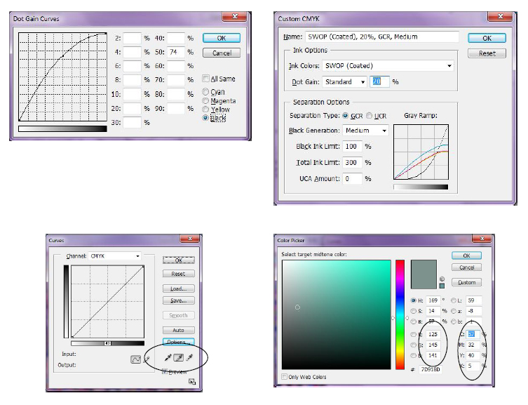
In colour reproduction these greys are reproduced using three secondary colours, cyan, magenta, and yellow. Greys produced with these colours help to exercise an excellent control over the colour reproduction in any process. The greys are reproduced as indicated in figure 2, if reproduction is facsimile. It is very important that greys are formed throughout the scale from extreme highlights to deep shadows for good colour reproduction of the entire picture. Figure 3 shows how the actual reproduction may take place where three-colour combined density is raised using a black printer. Note that black printer starts where three-colour combination can no longer produce greys thus adding black to convert brownish tinge in the shadow to produce grey. To select greys for figures 3 and 4 graphs the charts shown in figure 4 and 5 are very helpful.


Figure 4 is the chart to select ‘greys’ from highlight to shadow at every step of the curve in figure 3 for CMY inks. In each of the ten blocks cyan dot percentage is constant for a particular block and magenta and yellow varies in different directions. This chart gives precise dot percentage values and the differences necessary in CMY to achieve grey balance. Figure 5 is the chart where three-colour varies in one direction and black addition varies in another direction. This helps in deciding the point at which black ink should start printing as well as ‘total ink weight’ required to print for particular printing conditions or process.

The values obtained for both are different for different printing conditions and different printing processes, whether AM or FM screening. This is a pre-requisite for any process of colour colour reproduction in the printing processes whether analogue or new digital printing processes using new colour management concepts. Without this UCR and GCR (now-adays called ‘ink optimisation’) does not work effectively.
In analogue photography the same principal applies for grey balance. However, Kodak based their colour balance not on greys but on ‘flesh or skin tones’ mostly European. The reasoning given is 80 percent of the photographs have people included so the dyes are balanced for skin tones. Agfa and Fuji follow grey balance principles. This can be seen in IT8 test target prints and transparencies used for colour management work. Grey scale in Kodak target appears warmer than in Agfa and Fuji.
Figure 6 is a grey balanced picture and figure 7 is where the grey balance is upset. Sometimes grey balance and tonal values are purposely thrown off balance to improve imperfections or colour cast in the original pictures or to create special effects, such as posterisation.

Where black printer starts to convert brownish tinge in the shadow area to grey it is called a ‘skeleton black’ and this does not dirty the light or light pastel colours in the print. In case of UCR and GCR (ink optimisation) black starts right from the highlight areas and is called a ‘full scale black’. Figure 8 skeleton black and figure 9 full scale black.
Adobe Photoshop has following possibility of programming both the grey balance and tone reproduction. When an ICC colour management profile is made it is advisable to embed this information as part of the profile.


 See All