

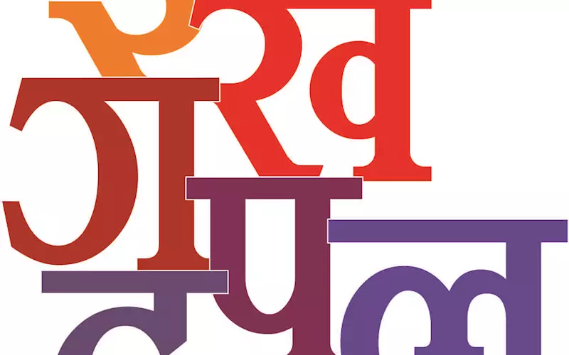
Unicode is the future for Indian fonts
Be it the masthead or headline of your daily news-paper, to the look of the captions and the body texts, fonts are the face of a paper, one that will invite the readers to read. A good typeface ensures the battle is half won. Or, is it? Rahul Kumar and Dibyajyoti Sarma talk to font developers to know the issues that dog the written word.
01 Oct 2014 | By Dibyajyoti Sarma & Rahul Kumar
Unicode is the future for Indian fonts
First thing first, how significant is the role of the font in print? “A good font or typeface plays an important role in the readability of the text. Also, a well-balanced font gives a uniform gray tone to a newspaper and patches of dark gray areas in the text are avoided. For newspapers, a font provides a ‘signature’ and their readers get used to seeing the font and feel quite uncomfortable if the font is changed,” says MN Cooper, chairman and joint managing director of Modular Infotech.
After the masthead, what personifies the brand is the font typeface. Says Sanjaya Gupta, managing director of 4Cplus, “If you delete the masthead and hold a survey, chances are the reader will be able to identify the newspaper just based on the type design. Also, using different typeface for headlines, sub-headings, body text and captions enables newspaper designers to make the content attractive and easy to read.”
There was a time when very few typefaces were available in the market, like the Times New Roman. Now, however, the market is flooded with varied and bold fonts. Each newspaper now carries distinct typefaces. One of the reasons is that newspapers have been expanding and growing in India, says Gupta. “This growth has come from new markets and additional publications. With many publications now available in each market, fonts have become a key differentiator,” he says.
According to Cooper of Modular Infotech, the library of fonts can be classified into functional classes, such as text fonts for running text; bold fonts for emphasising certain points; headline fonts to catch readers’ attention; stylish fonts for ceremonial purposes and decorative fonts for advertising agencies. “There can be many more classifications and each of these classifications illicit different reactions from the reader,” he says.
Talking about Indian newspapers, especially regional-language newspapers, what are the important factors one should take into account before selecting a typeface, especially in terms of design and print compatibility? To begin with, the font should be aesthetically pleasing, should have a personality so that it can communicate the nature of news or a mood. “It should be technically compatible with the existing setup, should print sharp without using more ink,” Gupta says. “A good body text font should have the ability to pack in maximum words in the least space without becoming illegible or difficult to read.”
Cooper says the most important factor is readability. “The font should be balanced. It should not be very condensed so that characters appear to be cramped and at the same time it should not be expanded so that the reader has to move his eyes to read short text lines. The font characters should have uniform ‘blackness’ to give a good gray tone to the final print. The font also should not have many ‘vertical conjuncts’ so that line spacing is uniform.” At the same time the language composing rules should not be violated, especially in vernacular fonts. “Proper anchoring of vowel signs (matras) and inter-character spacing play a very important role in readability of the text. Use of horizontal conjuncts may be encouraged for traditional texts. Also it conserves the print material.”
Yashpal Bindra, director sales at Summit Information Technologies, adds, “It is also important that font takes optimum space and is clearly visible even in small point sizes. Space is at a premium in newspapers.”
Newspaper publishers have been the real customers of typeface design since the advent of printing. All major fonts, like Times New Roman, were designed for newspapers. According to Gupta, in India too, newspapers have been trying to differentiate their product offering by getting bespoke fonts developed. “The designs are printed and then tested with reader surveys cutting across demographic segments. Focus group discussions are also conducted. The findings help a publisher fine-tune the font most suited to his target segment,” he says.
4Cplus has designed typeface for Bhaskar Group, Jagran Group and Hindustan. “Now, with digital publishing gaining popularity, we are developing custom-designed screenfonts for Indian languages as well,” Gupta adds.
Before font development became competitive, and before printing became computer-assisted, developers like Linotype and Monotype dominated the market. They are still the respected typeface design companies. “Linotype did pioneering work in India, especially on Bangla and Devanagari,” Gupta says. Bindra adds both the type foundries have designed popular and high quality fonts, though Linotype fonts have more following in the newspapers, particularly the regional ones.
The portability issue among different English fonts is far less than that in Indian languages’fonts. How much this can be blamed to coding differences? Bindra says Unicode has sorted out the problem, but its adoption by newspapers is happening at a slow pace. “Once the Unicode adoption is complete, such portability issues will cease to exist,” he says. Cooper argues that the issue exists because there is no standardised encoding for Indian scripts. “We have not focused on this issue. Therefore, a non Indian agency had to step in and codify Indian scripts as part of Unicode (which has many shortcomings). Even today, we do not have a working standard on 8-bit fonts,” he says.
He adds that every font manufacturer has his own standards for font encoding and they end up writing conversion programmes which convert encoding of one manufacturer into the encoding of another. “The font manufacturers keep different encoding to combat piracy. For a newspaper, it is important to archive the text for legal reasons and for future use, and hence the encoding of text is very important,” he says.
According to Gupta, for Indian languages, coding differences, lack of a common standard, input keyboards and mapping of different companies have made interoperability impossible. “Regional language newspapers require converters and a lot of manual proofing to remove conversion errors. These issues are not there in English as the keyboard layout and glyph placement is standardised,” he says.
So, what are the issues that may arise from using non-Unicode fonts? The fact remains that there is no other acceptable standard for Indian scripts. “If Unicode fonts are not used, it will be difficult to have an Internet edition of the newspaper,” says Cooper. “A good workable encoding standard is useful if a newspaper is outsourcing data entry to other private parties. Also it is needed for good information archiving.”
Bindra says, non-Unicode fonts are non-portable as well as can’t be used in digital and mobile media. “Non-Unicode was a compulsion of our past and should be done away, as technology today allows us use of Unicode,” he says.
Newspapers get content from many sources like wire services, reporters, freelancers, syndicated content, user generated content from portals and even social media. If the input source is using a non-Unicode font, other than the one being used by the newspaper, then the matter may turn to junk characters, says Gupta. “The second challenge is in repurposing the content post-printing, to news portals, apps, syndication, etc. which requires Unicode. Also the type design in Unicode is better when printed as compared to non-Unicode as many conjunct characters are formed better in Unicode,” he says.
Publishers pay attention to output-input and different source mediums. Says Gupta, “Making text, especially Indian language text, on a small mobile or tablet screen is a challenge. We have screen fonts that we have developed exclusively for broadcasters and mobile apps,” he says. According to Cooper, if the publisher wants to spread information and reach out to more readers, then the internet is a very good medium. Bindra of Summit, on the other hand, says it’s important as it defines the character of a newspaper’s website like its print edition. “However, newspapers are still not putting enough emphasis on it,” he points out.
Now, how big is the font market in India and globally? “The global-size would be difficult to estimate for us, as there are so many languages and the licencing norms vary,” admits Gupta. “In India, most of the Hindi newspaper publication houses are our customers and using 4C-Lipika. We also have a strong presence in East and West Indian newspapers.”
Bindra says, “We operate only in the Indian language fonts. We have no idea about the market of English fonts worldwide. However, the Indian fonts market is plagued by rampant piracy.”
Are there any differences between fonts for print and other electronic devices or the samefont works for all the display? Digital fonts have known standard formats, says Cooper. “Not all devices and operating system (OS) support all formats. It is important to know these before you buy a font from a font manufacturer.” Gupta, however, accepts that there are differences. “Even print fonts are actually printed to see the print quality for sharpness and other features, since it is not possible to decide changes based on the screen.”
What are the new developments? Increased Indian language usage, particularly on mobile platforms, has resulted into demand for Indian language fonts on the new platforms, says Bindra. “As more and more content is made available on the digital and mobile media, more variety in Indian languagefonts would be required by content owners and consumers.”
Gupta adds, “We see regional-language newspaper publishers moving to Unicode as a significant change in the industry. Due to incompatibility with new systems, new releases of desktop publishing software publishers, which may not support old fonts and the ease of a Unicode standard, are compelling newspapers to embrace Unicode. Also, it is making digital publishing easier and error-free.”
| Company Profiles |
|
Modular Infotech Established: 1983 Number of fonts produced: The company has over 3,500 fonts in all Indian scripts. Of them, about 1,500 are Devanagari fonts Staff strength: About 60 people (Three persons for font development and manufacture) Headquarter: Pune, Maharashtra Summit Information Technologies Established: 1991 Number of fonts produced: The company has over 180 font families in all Indian languages Headquarter: Gurgaon, Haryana 4Cplus Established: 2000 Number of fonts produced: The company has fonts for 9 Indian languages scripts. It does not believe in adding typefaces just to increase the number, and provides a limited number of quality fonts for the newspaper publishing, television and digital media. Its 4C-Lipika has maximum font typeface families for Hindi at 44 families. Each family may consist of normal, bold, bold-italic and italic fonts. Besides this, the company has designed more than 100 custom-made typefaces Headquarter: Registered office in New Delhi, but development facility is located in Vaishali, Ghaziabad in Delhi NCR. |


 See All