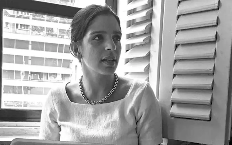
We speak to Sahai about some of the work Please See// has created in the last seven years. Edited excerpts:
Could you tell us a bit about the beginning of Please See?
Both Avinash and I were working in the US for a while, but we always knew that we wanted to come back at some point. Then about seven years back, while visiting Delhi for a couple of months, I ended up meeting Bobby Aggarwal who owns Portside Café. He asked me to join him for a meeting with the PR agency, and I came out of it disheartened because of how they were trying to retrofit the brand into some kind of an equation. I saw so much potential there as it is such an interesting brand. I had a conversation with Avinash right after the meeting when I realized there is so much to do here. When we presented our ideas to Bobby, he wanted us to do the execution. That’s pretty much how it all started.
How did The Bombay Canteen project start?
When they came to us they weren’t sure of the name, so we confirmed the name, designed the logo, and created a strategy for them. And while today you can define the food they serve, at that time, there was no definition for it. They were recreating Indian food. Who can think of a thepla and pork together? The whole idea of taking something you know, pegging everything on something that’s real, and adding a twist to it. That’s where the strategy started.
We started on nostalgia which is easy to relate to, but created it in a different way. The first thing we sent out was ‘Daaru Dabba’ which was essentially a really simple, reinvented form of Indian cocktail kit.
With The Bombay Canteen, we have always reinvented things which are Indian in their ethos. There is so much beauty in our country, but I don’t think we have done more with it. It’s remained flat. For example, we just appreciate a block print for what it is, but I am happy to see that today people are finally changing the print to make it contemporary. Things are slowly changing.
Could you tell us a bit about the takeaway potli you created for The Bombay Canteen?
The Bombay Canteen is a really fun brand to work with because everybody in my team gets to actually use their hands and get off computers for a bit. The idea behind this box was to recreate the good old potli. We created more than 40 versions to make sure that the size and format are perfect.
The printing part is usually always tough. Infrastructure and good techniques are not so easily available, especially for small to medium size businesses. We had to make only 200-300 of these potlis, and to make sure we create quality with this small quantity and a low budget was very difficult. What we finally came up with was the most cost efficient, 100% natural, and reusable version. After building the prototype, we worked with a company in Gujarat to manufacture the final product.
Do small print runs become a problem for you since you often work with mid-sized brands, especially restaurants?
When it comes to printing, we do a lot of
jugaad. So many times, my team is in Crawford Market trying to figure out sourcing and cost.
For the Canteen Cocktail projects, we wanted to push the boundaries from a design point of view. But when it comes to the execution, it’s always tough. For this project though, our budget was better since it’s sponsored by Diageo. The first cocktail menu was to celebrate the city of Bombay, so each cocktail was named after an iconic art deco building in town.
We also wanted to make sure that there is more purpose to the book so we interviewed the watchmen, liftwallahs etc. of these building to get insights to write a little fun anecdote about them. The book also features various cocktail recipes.
There are so many things in India we can celebrate but we don’t. As communication designers, our job is to push these boundaries. The second book celebrates the aamchiness of Bombay. Since this was going to be released in January, we decided to turn it into a calendar. So we make sure that these become collectibles in some way and not just something that ends up in trash.
We often work with local printers and local papers to make sure that it’s cost-efficient. We have to be very practical. We work with Reliable Printers. And we also work with Majestic Printers, with whom we just did some stuff for O Pedro. They hold their head in their hands every time they see us because they know we would want something different. However, they always end up helping us. So with print partners, it’s always a tussle but when they see the end results, which sometimes also include awards, they feel proud of the work too.
How much does sustainability factor in your work?
We are currently in the process of setting up a directory of sustainable mediums. I have someone on my team, Khushboo Gandhi, who is leading this. We are compiling information on all the businesses that are using sustainable mediums. We definitely want more and more clients to become sustainable, because otherwise, the world is ending!
We have just found out about ‘Malai’ - a newly developed biocomposite material made from recycling coconut waste, which we think has a feel that’s comparable to leather and paper. This will be especially great for restaurant menus where using paper is not practical and leather is expensive and not sustainable.
India was essentially a very sustainable country. You can see some of those age old sustainable traditions in Indian villages even today. We want to get inspired by that, and work on forms that are readily available. We take a lot of inspiration from the outdoors, and in fact, we make sure we indulge in some outdoor activities/sports with our team once a year. This is not only for inspiration, but also to understand different natural mediums. In this industry, it’s so easy to create noise, but how do you cut through that clutter and create a sustainable ecosystem - that’s what we are interested in.
Storytelling is increasingly being recognised as an important aspect of packaging, and you have done it well with some of the brands you have worked with.
Yes. What we work with is a seed branding philosophy. Everything starts from a seed thought, and the story emanates from it. The story is far more important for us than just creating a logo. The story goes into everything.
The thing that stuck with us is that packaging is what people associate for longer. How can packaging do more than just scream out the name of the brand? How can we talk to somebody with it and make them feel something? It’s an important piece of communication and we want to use it efficiently.
Another part of our seed branding philosophy is that we give as much importance to verbal language as visual. That is what creates the personality of the brand. So for example, in Organica’s case, the seed was based on the golden ratio which states that everything natural is built in a particular ratio. And that idea went into the communication as well – in creating the identity and packaging of the brand.
Is there more room for innovation when you work with mid-size brands vis-à-vis big brands?
Every business has its own challenges and you get to do something interesting with each of them. We really try to push the envelope as much as we can for each brand. Even for Parle, we did this gift box during Diwali and we made it as interesting and premium as possible. It’s just that when you work with business owners, you can take better decisions to create more powerful communication. It’s mainly because there are no layers so the decisions are way quicker.
Sometimes a brand is more experimental when it’s not the main bread and butter brand. For example, Portside Café is Bobby’s side business. His main business is exports. And that’s why we have been able to do many experiments, including shooting a collection at Tihar Jail.
And we have been very lucky. No matter what the size of the business is, we have had the opportunity to work with good people. Our biggest learning has been that the people who are running the brand will always know it better than we ever can. What we have to do is understand their business goals and help them communicate those better.
We get involved in the strategy phase too, and always make sure that we are not only involved in the look and feel of the brand, but also in how the business is done. That’s the space where both Avinash and I really want to be.
When you work with Indian restaurants abroad, how do you make sure that you create something that defies Indian stereotypes?
I think we are able to do a Canteen Cocktail project because India is redefining itself. People now understand that India is not a cliché. However, it has been a challenge.
When it comes to restaurants, it’s also about the people behind them and what their vision is. If they know a different India, then our job is easy. They need to have similar ideas, otherwise they will not be able to carry forward the brand because it would not be authentic to who they are.
Indian people who live outside have this sense of nostalgia about India – but they can carry forward the conversation. People are open, but you still have to start from a place that everyone is familiar with.
Could you tell us about some of the projects you are currently working on?
Last year, we worked on O Pedro which is a new restaurant by The Bombay Canteen guys. We have been doing a lot of work with Foodhall. They just launched at Chanakya Mall in Delhi where you can see a lot of our work. They will soon be opening a new store in Bandra, Mumbai. We have also branded their chocolate brand Xocolatl57.
Another project that stemmed off the Canteen Cocktail books is ‘Art Deco Bombay’ which is our own labour of love. We are also working on the third edition of the Canteen Cocktail book. Then there are some projects that are currently under wraps.
Payal Khandelwal is an independent journalist and editor of The Floating Magazine (thefloatingmagazine.com)


 See All