

Too Yumm: Snacking sans guilt
RPSG Guiltfree Industries wanted a fitness-conscious spin to its new range of healthy snacking products, and Pune-based Elephant Design delivers a mouth-watering packaging design. Rushikesh Aravkar in conversation with Elephant Design’s co-founder Ashwini Deshpande
18 Dec 2018 | By Rushikesh Aravkar
Brand brief
The Indian snack market has an array of brands operating in the indulgent snacking space. However, there is a trend towards more responsible or smart snacking and not just calories. This is manifesting itself in the form of sub-segments such as light/diet snacks (bhel, chivda). Even existing players that are seen as strong on taste are trying to position themselves as healthier with low cholesterol, less oil type of claims.
Brands that have positioned themselves purely as healthy snacks have met with limited success (for example, Aliva and Baked Lays). We believe the opportunity is to play in the wider spectrum of ‘healthier than’ rather than just ‘healthy’ – this would enable a brand to target a wider segment of consumers looking for guilt-free snacking without any compromise on taste.
RP-Sanjiv Goenka Group was venturing into healthy snacks that align with contemporary sensibilities. To announce its mission and intent, the company was named Guiltfree Industries. Since Indian consumer doesn’t want to compromise taste over health, the brand was named Too Yumm to announce how this healthy snack was also tasty.
The early products from Too Yumm were spiced makhana and khakras. In keeping with the contemporary aspirations, the Indian superfood was named after its international name: Foxnuts. Flavours like Wasabi added to the global appeal. Being described as Wheat Thins gave khakras the modern appeal.
The objective was to create a delightful, uncomplicated brand for young generation – a brand that is light-hearted, un-layered and easy to engage with.
Guiltfree Industries sought a packaging specification that would make the product break the clutter, provide the desired barrier properties and give the pack a premium look. The key design challenge was to make the “healthier than” promise a driver of preference (rather than an inhibitor) in a category that’s predominantly driven by taste.
Target Group
Young, fitness conscious people who seek a healthier lifestyle, but are not willing to forgo of their taste-buds. People who are exposed to a variety of options and prefer ligher snacks that make them feel in control of their health despite frequent consumption.
Research
Extensive user research was carried out to arrive at filling, sealing, transport, display and ergonomic convenience before designing a profile cut standee pouch.
Research highlighted certain issues while opening and eating snacks from a pouch:
- Opening and tearing becomes cumbersome and irregular. This was solved by providing a notch for tearing.
- Small mouth of the tear makes it difficult and messy to take the snack out each time. This was solved by making the pouch wide-mouthed.
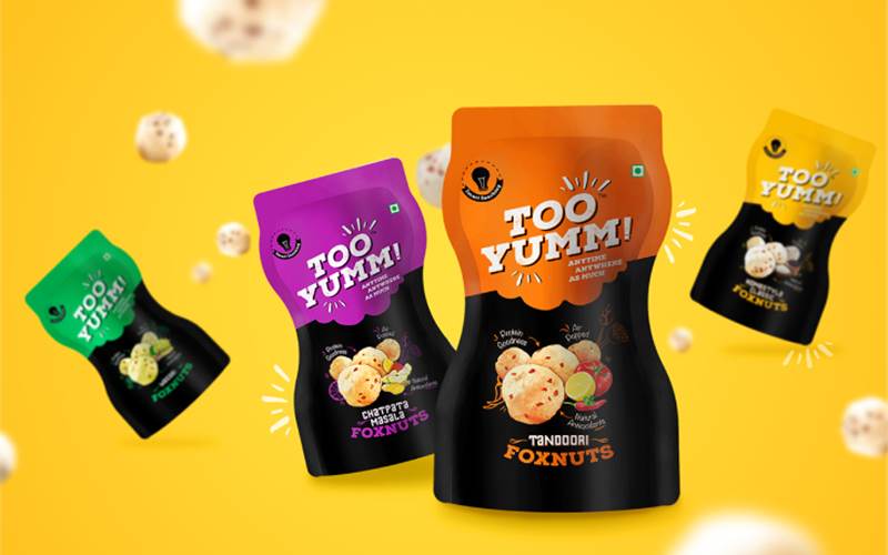
- Hourglass shape provided better grip apart from providing a sublime fitness quotient.
- Standee pouch made it easier to place it anywhere without fear of spilling.
Packaging specifications
The profile cut standee pouch format was first of its kind in snacking category, making it innovative and highly differentiated. The packaging features registered matt lacquer on the surface to highlight the product shot and brand name. It is a four-layer extrusion laminated plasma MetPET-based structure that provides the required shelf life and a bottom-gusseted pouch with a laminate thickness of 115-micron that ensures the pack stand tall.
Result
Too Yumm Foxnuts became the flagship product for the brand. It was followed with several new product launches – however, the foxnuts shaped standee pouch always remained at the core of what Too Yumm brand stands for.
As of October 2018 Too Yumm offtakes according to Nilesen are upwards of Rs 25 crore a month, which is remarkable as the communication supported launch transpired in December 2017. It was the fastest brand in India to achieve a monthly sale run rate annualised to 100-crore, then 200-crore and intend to get to a much higher figure within the next six months.

Our results in the Nielsen RMS panel is as follows (as of October 2018)
- Monthly offtake of Too Yumm: Rs 25-crore
- National market share in salty snacks: 1%
- Share in the lead market Kolkata is 8.3% in Western snacks and the share is close in the other top metros
Anupam Bokey, vice president marketing (CMO) of RPSG-FMCG says, “Too Yumm was launched during Indian Premier League 2017 and the Pune team proudly wore the logo on their attire, as did the Atlético de Kolkata soccer team at Indian Super League. The packaging has already won the prestigious India Star Packaging Excellence award and is winning many hearts across the country. We have also won the Food Innovator award of 2017 from Annaporna Gold for fastest growing start-up snacks brand and Silver for best-integrated marketing campaign for the launch of Multigrain Chips - at the Indian Marketing Awards 2018, conducted by Exchange4media. Too Yumm brand equity is the second highest in top metros India and its brand difference and loyalty is the highest. This is a huge achievement as Too Yumm has surpassed decade old large brands within Too Yumm’s first year of existence.”
Strategy
Packaging
The pack structure for these snacks required excellent barrier properties to retain the crispy mouth feel and keep moisture away through the desired shelf-life. The hourglass shape is inspired from the fit torso. This unique profile with matte black and bright accents and a notch detail make opening and holding a delight and requires minimal effort.
Design
Keeping the product shot to a minimum with mouth-watering depiction of tasty ingredients and conversational handwritten messages about how or why healthy, added to the drool appeal. A bite mark was added between the division of colours to increase the impulse pick-up.
Colour
As snacking is a very crowded space, it needed the well-deserved premiumness and pronounce differentiation against other brands. After deliberating on the snacking cues and visual equities of existing brands, matte black was introduced as a base colour for all the packs. Apart from cuing a premium position, it gave us the opportunity to use pop colours without getting lost in the sea of other snack packs. Clear division of black and bright variant colour also suggests “suitable for day and night consumption”.


 See All