

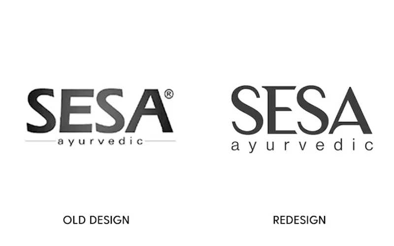
Sesa’s brand revamp with a new packaging outlook
When FMCG brand Sesa wanted to redesign its brand identity, it reached out to Mumbai- based Bizongo to create packages that assure a brand recall while catering to new audiences
27 Nov 2020 | By WhatPackaging? Team
Sesa Care is a leading Indian manufacturer and exporter of Ayurvedic hair care products. The Mumbai-based company combines Ayurveda with modern manufacturing practices to deliver high-quality hair care products.
Sesa has been in the market since 1996 with more than two decades of expertise in the hair care segment. In a view to cater to a new market created by the consumer requirements of hygiene amid the Covid-19 pandemic, the company decided to enter into the hand rub product segment.
According to Ashish Bhargava, chief executive officer of Sesa Care, to back this portfolio expansion, a relook of its existing packages and brand logo became crucial to cater to a wider range of customers. “Sesa is a heritage brand that enjoys strong recall and loyalty in the Ayurvedic anti-hair fall segment. As we expand our portfolio and enter into newer segments, reimagining the identity of Sesa was key to appeal to a wider set of audience,” says Bhargava.
When Sesa approached Mumbai-based packaging design and development specialist Bizongo, it came up with a sophisticated and contemporary design to target younger consumers and serve the product well even in export markets without losing its unique personality. Sachin Agrawal, co-founder and COO of Bizongo, says, “I am delighted with the new brand identity that our in-house design team created for Sesa. It fulfils the challenge of retaining aspects that made it such a popular product while including changes in the logo and packaging design to make it more aspirational.”
Here is how Bizongo conceptualised and designed the packages...
Sesa+ Ayurvedic Strong Roots oil
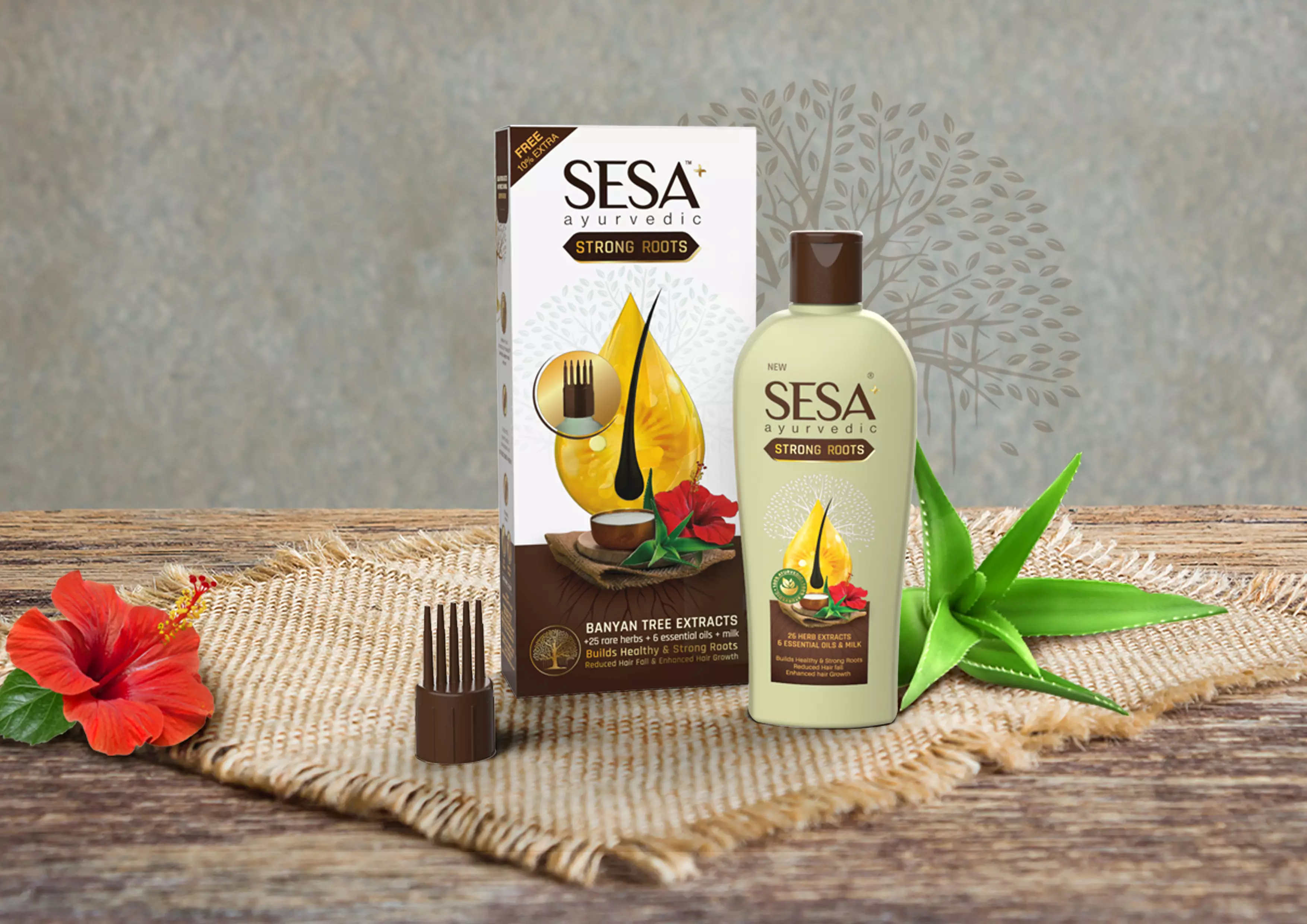
Bizongo conceptualised and designed Sesa’s Strong Roots Ayurvedic hair oil sub-brand identity and packaging for a premium experience. The product was designed to appeal to the middle class and upper-middle-class consumers to widen its reach.
The traditions of Ayurveda and goodness of natural ingredients were to be highlighted through graphics. The colour palette with pastel green and brown gives the brand an elevated feel in the category. According to Bizongo, the idea behind the selection of colours was that green symbolises natural aspects whereas brown connects to the earth.
Key propositions of the ‘Banyan tree extracts’ were highlighted through blown-up print enhancements over the label. The imagery of the ingredients was composed over a jute mat to give an ayurvedic look and feel.
Strong Roots Ayurvedic shampoo and conditioner
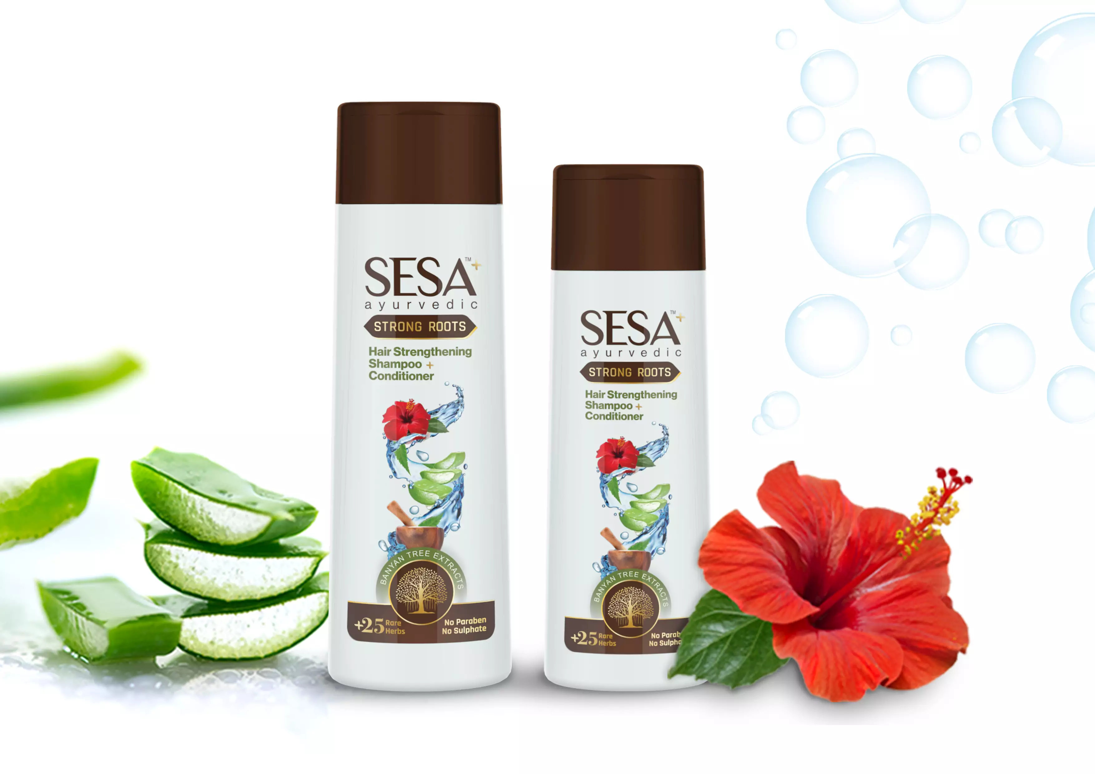
Sesa was looking to add a new product under the Strong Roots portfolio. Similar to the Sesa+ Strong Roots oil, the shampoo is made from 26 natural herbs. The intent was to highlight the natural aspect of the shampoo, hence the colours green and brown were used for the bottle. The imagery showcases the key ingredients of the shampoo with drops of water to bring in freshness. The transparent label with gold foiling adds a premium feel to the product. The USP of the product was highlighted through icons and print finishes on the front of the pack.
Sesa Ayurvedic hair oil

The focus was on creating a balance for the design to be modern yet traditional, clean yet detailed and to work wonders in both mass and premium markets. The result was a cleaner pack, optimising the use of existing design elements and introducing new icons for the product claims such as 100% natural. The print enhancements were explored in a way to highlight primary information and callouts while retaining the identity and ‘Sesa Lady’ on the label.
Sesa liquid hand rub

The overall visual was designed keeping in mind the category, the target audience, and easy communication of the product attributes. The project was a quick turnaround of 48 hours and focused on keeping the design clean and minimal while communicating the product usage and result instantly.
The colour palette chosen was in accordance with the colour of the product and the colours that dominate the hand-care and sanitiser category. Blue is a colour dominant in the hygiene category and the transparent nature of the liquid ensures the communication of cleanliness and purity. And the addition of green ensures connection with the natural aspect of the brand Sesa said Bizongo.


 See All