

How the Hubergroup makes a calendar look special - The Noel D'Cunha Sunday Column
Team PrintWeek India received a parcel from Hubergroup. It contained the group's calendar 2019. Each of the 12 pages was loaded with high-quality design and top-notch UV finish.
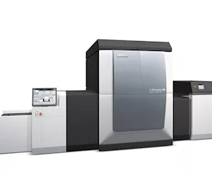
We decided to find out 'behind the scene activities' in the making of the calendar on a KBA Rapida 106-6 + LTTL with cold foil system.
In this Sunday Column, Roland Schröder, product manager for UV at Hubergroup shares about making of the calendar
14 Apr 2019 | By Noel D'Cunha
How was the idea for the Hubergroup calendar, born?
The idea was born during brainstorming sessions of the calendar team. Various suggestions were created and evaluated. Each year, we focus on key technical aspects. We gather a group from around the company, including managers, directors and application specialists. Top management makes the final decisions based on the final choices the group makes typically.
When does the process typically begin?
We begin this process in January. Then we have our first concepts ready in March or April. Printing is done in August, or September at the latest. We have been producing this calendar for 50 years. Some years the process moves faster than others.
Describe the concept and design phase ...
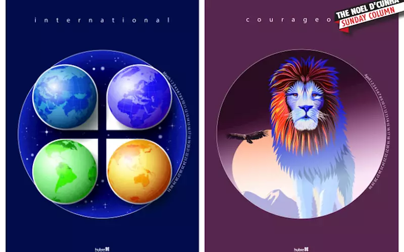
For 2019, we wanted to create a modern art calendar that was different from the previous ones. Our first step was to create the graphic design, and after all the calendar pages were designed the finishing elements were determined. This year, we had artists hand-draw all of the art, and then scanned in the images. Our theme was Sharing Time & Common Strengths. Once the artwork was completed, we began the harder work of determining what finishing elements to use, including cold foil and unique approaches with varnish.
Roland Schröder, product manager for UV at Hubergroup
Team involvement?
This is a huge team effort, with Hubergroup staff, our artists, and our printing partner, Koenig & Bauer. Within the theme, we gave our artists free rein to exercise their creativity. But we also wanted to highlight examples of printing and finishing techniques; so that most print shops could produce, as well as some that would be stretch goals for many shops, such as cold foil or double coating.
The aim of any promotional material is to create something which can be reproducible. This calendar is at a technically high level involving deadlines and material usages…
We have been producing our calendar for 50 years and have a lot of experience in handling and implementation. As stated, creative work starts in January, printing takes place in August and September. Clearly, since it is a calendar, there is a strict deadline since we want to be able to start distributing the calendars in the October timeframe.
Any challenge?
Although we begin the process in January, there are often changing internal and external conditions that might change some of the content. For example, we want to introduce a new ink or pigment which we would like to feature, or some more advanced finishing technology becomes available. And since we have a longer lead time in the process, we can make those changes before the final design is approved.
You had KBA as your printing partner. What’s special about this partnership?
About three years ago, we entered into a strategic partnership with Koenig & Bauer. We print the calendar with KBA. This is due to the fact that, although we have plenty of customers who have the capability to do the work, we wanted an agnostic source for printing so as not to play favourites among our customers. This has worked very well for us. Everyone knows who Koenig & Bauer is, and many of our customers are also their customers.
Which machines were used to print and finish?
The KBA Rapida 106-6 + LTTL with cold foil system and the KBA Rapida 106-6 + L were used.
Any special inside info which we should know?
We used standard printing and varnish offset plates; there were no special plate requirements. Koenig & Bauer gives us great advice about which is the best press to use for the specific applications each year, advice about finishing techniques such as cold foil, and marketability of some of the designs. We also source ideas for other suppliers/advertisers about how their products could be incorporated into the calendar. The key is to produce the calendar at the highest possible quality level.
What were the pre-press challenges?
In the pre-press, the biggest challenge was to implement the recesses for the different varnish separations in detail.
For example?
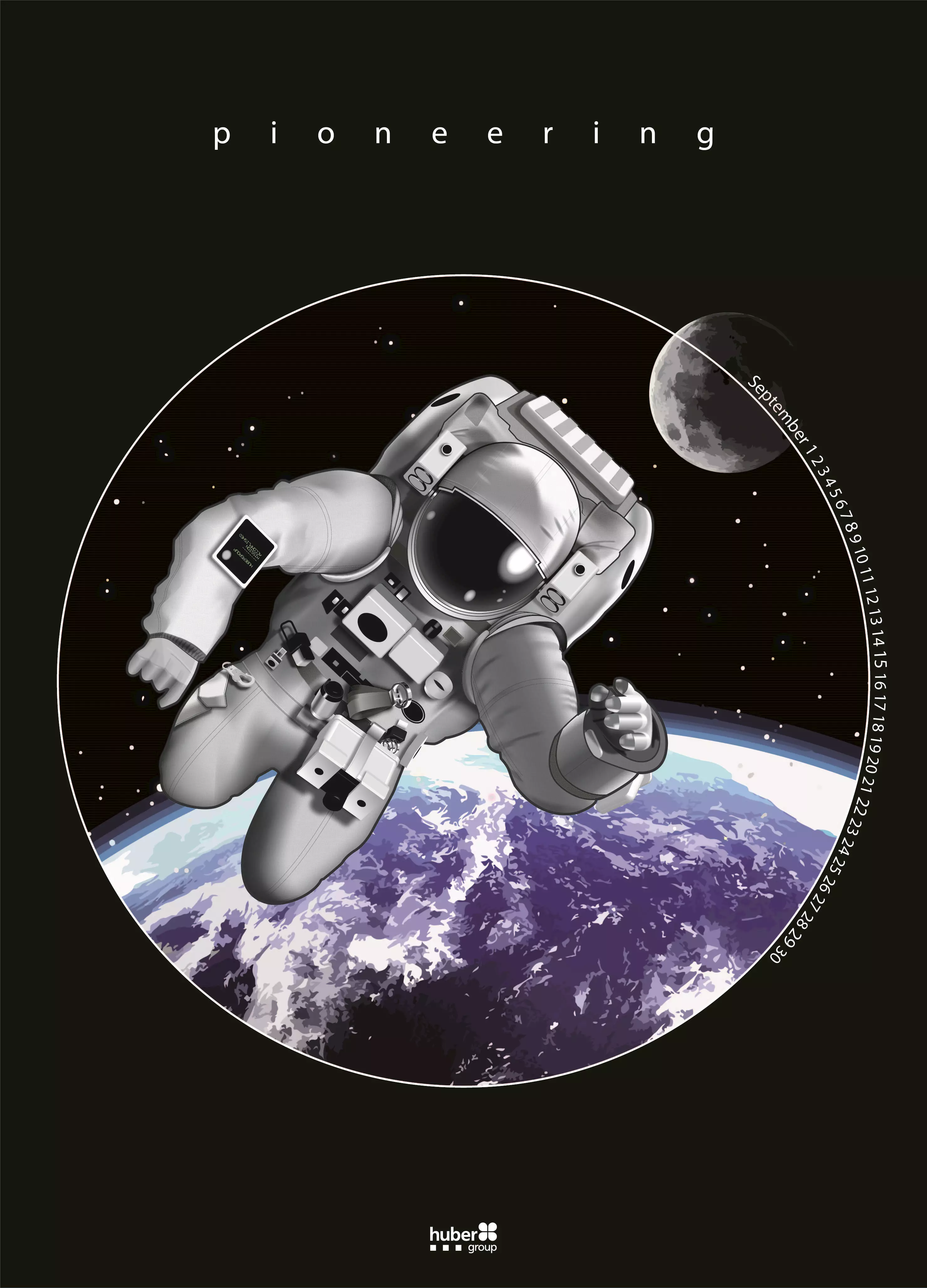
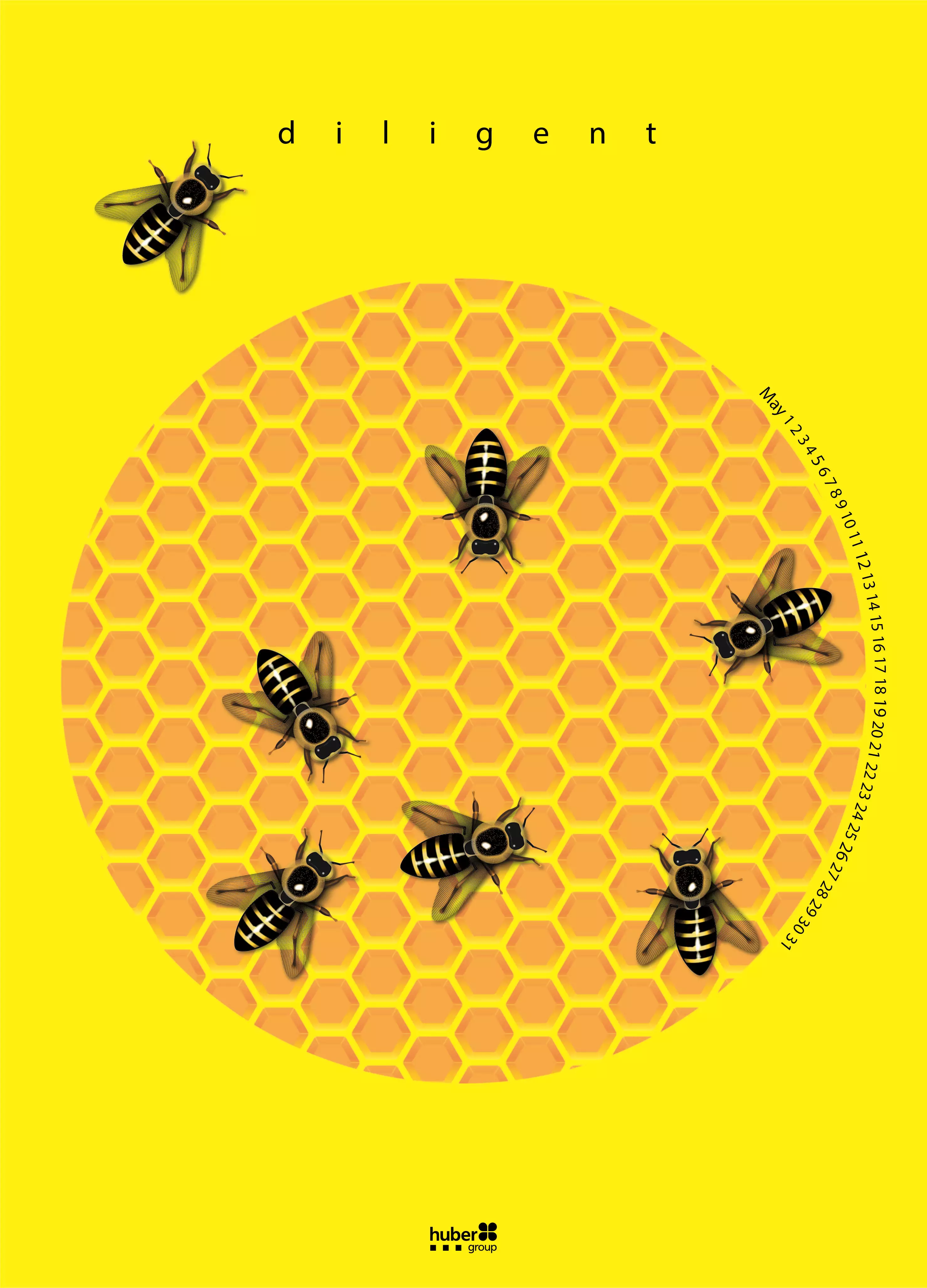
The month of April is a good example of recesses. With the lion image, in the face of the lion, you see a lot of structure. This was produced with two different varnishes, with the last varnish on the full surface of the calendar sheet. The biggest challenge for the designer was to be able to define layers in the file that could denote down to the level of individual hairs on the lion where the varnish needed to be applied. The September issue with the Astronaut was another example of highly detailed design and specialised varnishing that requires a great deal of skill from the designer.
And on the press?
The challenge was to reproduce the complete possibilities of ink and varnish applications. Again, all of the fine lines and detail can be challenging to produce.
And ink, of course, your speciality…
The substrate is a standard product our customers use very often. All the ink and varnishes used are developed and produced by Hubergroup or engineered with Hubergroup partners.
How did you decide which ink, whether UV or convention was to be used?
That was the easiest part of the project – finding the right inks from the Hubergroup portfolio, and to decide whether UV or conventional inks are best suited for each piece of art.
Finishing is often the most interesting part of a project, isn’t it?
Yes, it was. Most images have haptic effects. In addition to the lion and the astronaut where you see the haptic effects, the May image with the bees included Honey-scented oil-based overprint varnish. If you rub your hand across a bee, you smell honey. Or in June, the cold foil effect is stunning, and gives brands good ideas for how they can enhance their packaging with a cold foil effect. All inks and varnishes are specified on the final page of the calendar.
What was the response? Hubergroup produced 12,500 of the 2019 calendars…
With our increased focus on finishing, the feedback was even more positive. Yes, we produced that many, and by the middle of December we were running out because of the demand. Customers look forward to receiving the calendars and though they may not love every piece of art we use, they do love the calendars overall.
What according to you is the best thing about the Hubergroup Calendar?
With our calendar, we can show new possibilities of reproducible finishing every year and thus give new inspiration to creative people and printers. Customers look forward to getting the calendar every year.
Sunil Jadli, corporate communications department of Hubergroup in India, said, “The calendar is much appreciated, especially by our sheetfed customers who now eagerly look forward to the annual ritual of receiving it. It is also an effective marketing tool for our sales team where product applications can be presented during customer visits.”
 See All