

It’s raining packaging design, hallelujah!
WhatPackaging? gets design professionals in India to talk about their recent favorite packaging designs.
31 May 2017 | By Payal Khandelwal
Kinder Joy has captured an entire tale with their offering of a chocolate egg
We spoke to a few design professionals from studios including DY Works, Elephant, Beyondesign, Design Stack, Studio Eksaat, and Wow Design about packaging design. We asked them to pick packaging designs (either self-created or created by another studio) that appealed to them the most in the recent times, and in the process we have gathered ten interesting brand packaging stories. Read on:
Priyanka Bhasin and Anoop Patnaik, founding partners, Design Stack

Priyanka Bhasin
SoulTree is an Ayurvedic range of beauty and wellness products. Inspired and rooted in nature, the proposition of truth is central to the brand: from its organic and ethically sourced ingredients to its eco-friendly and in-house manufacturing processes. Our challenge was to capture and communicate precisely our positioning of purity and goodness, of the “truth inside”.
Nurture is the focus of the SoulTree word mark, where the arm of the ‘r’ extends protectively to create a canopy of shade akin to a tree. We also created the SoulTree seal, a three-leaved herb. Rendered in a fingerprint style, it represents the three SoulTree truths – ayurvedic, organic and ethical.

Anoop Patnaik
Our brand refresh (re-branding) of SoulTree marries the traditional with the contemporary, so that the new identity works internationally as much as it does in India. The brand colours of turmeric, mehendi, indigo and vermillion firmly place SoulTree in India, while the copper adds an authentic Ayurvedic touch. The overall look and feel vaults the brand into a more premium category.
Within the months of the re-branding, the company saw a substantial surge in sales, validating the potential of design’s direct impact on business.


Samira Gupta and Dhritiman Deb Pillai, co-founders, Studio Eksaat

Samira Gupta
Muji: The purpose of design is to first be functional and then beautiful. A perfect example of clean, effective and simple design is Muji, a Japanese brand which has perfected the fine balance between functionality, beauty and simplicity. The packaging is minimal and to the point and the products themselves are devoid of any adornment that is unnecessary.
Bueno Kitchen: Bueno is a food based start up in Gurugram which was looking to enter an already saturated food delivery market. Our brief was to create a strong, memorable and impactful brand identity for Bueno which can cut through the clutter of numerous food delivery companies in Gurugram. Although the logo was already developed, Bueno did not have a voice or unified look. The client needed a design which was scalable across various platforms (print and digital).

Dhritiman Deb Pillai
After spending considerable time researching the Gurugram market, we realised that every single food brand used photography to sell their product. To be able to cut through that we created a template with shapes, patterns and leaves inspired by the colours, textures and shapes of vegetables, fruits and leaves. These were then put together in various compositions to create the look for Bueno.
The packaging created celebrated food through bold colours, textures and patterns and ended up standing out amongst all other brands.

Deepti Kshirsagar, founder and design director, Wow Design

Deepti Kshirsagar
To begin with, I love graphic design and packaging design is very close to my heart. While I have been enjoying working on multiple Indian FMCG brands in India, I look upto a number of international brands for inspiration.
Fossil is one such brand whose packaging design has had me hooked even before I had fully entered into the branding and packaging design domain. And it still continues to do so. Their approach to packaging has played a large role in making the brand iconic. Their vintage design packaging tins are much revered and possess a collectible value equivalent to the product they offer. Fossil continues to keep up their unique packaging design legacy by introducing theme based design editions thus living upto their aspirational value till date.

Bhavika Shah, founder and creative director, Beyondesign

Bhavika Shah
Nutrova: When working on the packaging for Nutrova, a brand of health supplements, our primary inspiration was the target audience. Nutrova, having products for healthier skin and hair, appeals famously to people of all age groups, but specifically to women in their mid 20s to early 40s. The Nutrova consumer is smart, educated, urbane and informed. We had to make sure that our design not only reflected these qualities but also assured consumers of the product’s safety and reliability. We ensured that our final design catered to a population of all age groups and genders and showcased Nutrova’s many strengths - their commitment to health, honesty and reliability. A clean, minimal look made for a medical and professional packaging, but the pop of color breathed life into it for our dynamic consumers.

Girnar Tea: Tea has always played a large role in the Indian subconscious – starting conversations and breaking barriers for centuries. Our version of ‘breaking bread’ is drinking tea. We wanted the Girnar Tea packaging to reflect all that tea stands for, especially for Indians – warmth, home, family, relaxation and love. A warm palette of hand-painted water colours bring to mind the colours of tea. The brush strokes are evocative of the movement of tea swirling in a cup. The hand-painted aspect gives the entire look a homely, earthy and cozy feel. We wanted the packaging to be approachable, amicable and understandable to everyone – whatever be the age, socio-economic group or gender. There are, after all, very few products as commonly used across the country as tea.

Ashwini Deshpande, co-founder and director, Elephant

Ashwini Deshpande
I am so soaked in packaging design that it is very difficult to single out one example.
From the ones that we have worked on, I would put the following as some of my favourites:
Paper Boat: The name itself evokes happy childhood memories and creates a positive backdrop to approach the brand. I like the packaging because of the simplicity and innocence achieved through a unique shape, cap, substrate, treatment, colours and all the visual elements that align with the brand thought of being pure and joyful.

ASAP bars: The name is an acronym of something we are faced with everyday in our busy lives where everything is needed ASAP or worse, yesterday. But the descriptor tells you it is about “as simple as possible” in a tongue-in-cheek way to infuse a much needed smile in the hectic day. The packaging has a playful squirrel named Simple that assures that only the best grain has gone inside the tasty granola bar. There is a transparent window to showcase the drool-worthy bar and its healthy tasty ingredients. This is barely a one year old brand, but is going places.

Britannia Breads: Creative story-telling through packaging is usually the prerogative of start-ups or small brands or limited editions. But we managed to tell the story of bread through packaging for this very large, mainstream brand that took the leap of faith in design. There are a lot of misconceptions about the ingredients that go into breads. The packaging design, in this case, has solved this beautifully by boldly calling out what the specific variant is all about - whether 100% wheat or multi-grain or fruit. It all comes to life through an unmissable product window. With the same challenge of being a large scale mainstream brand, I also like the change we brought about for Tata Salt packaging.

Ashita Sarin, vice president, DY Works
Packaging design is like wearing your personality inside out. It communicates who a brand is, what its core offering is, and what impact it has beyond being transactional. I work in design thinking and am spoilt for choice when it comes to my favourite pack design. It’s like being asked to choose only one new country to travel to – favourite amongst many gems.

Akshita Sarin
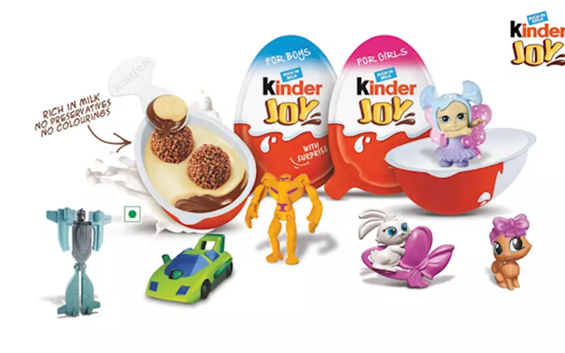
However, in the recent past, I would have to say that the Kinder Joy creation is one of my favourite packaging designs.
Innovative in concept, borrowing from the idea of the Easter egg and the hunt associated with the occasion, Kinder Joy creates the same sentiment amongst children – anticipation, surprise, joy, delight and celebration.
It wins with children on many counts. At a distance the colour and shape are interesting, almost exciting to them. With the promise of a toy inside, the opening of a Kinder Joy egg is a ceremony in itself. Often not easy to do themselves, at least initially, children reach out to parents to get help, getting to a stage where close observation allows them to navigate these themselves.
The anticipation of the toy and what it conveys – the new Hot Wheels collection, the Barbie that everyone in the school has, instructions on how to make a lovely bracelet – are all mesmerising. All of this, the toy and the instructional leaflet, is neatly wrapped up in the structure of the pack. Part of a larger community of collectors, the ownership of a Kinder Joy toy, even if fleeting, is regarded as an achievement amongst the friend circle.
Some children consume the white and milk chocolate, and some are lost to it at the hands of a magic toy. I would say this is where pleasure steps in for the parents – most frequently finishing up for their children so this doesn’t go to waste.
What is amazing is the fan club created around the brand – an app for children to download and play on, the Kinder chocolate kids’ art championship, the Golden Egg Hunt – all ensuring that children are wedded to (the fun offered by) the brand.
For me, it brings me back to my days of Charlie and the Chocolate Factory. After I read that book as a little girl, I opened every bar of Dairy Milk for years with the same anticipation –nervousness, excitement, and the hope of sheer happiness.
Kinder Joy has captured an entire tale with their offering of a chocolate egg.


 See All