

Pragati’s Calendar 2018/19: A testament of the times gone by - The Noel D'Cunha Sunday Column
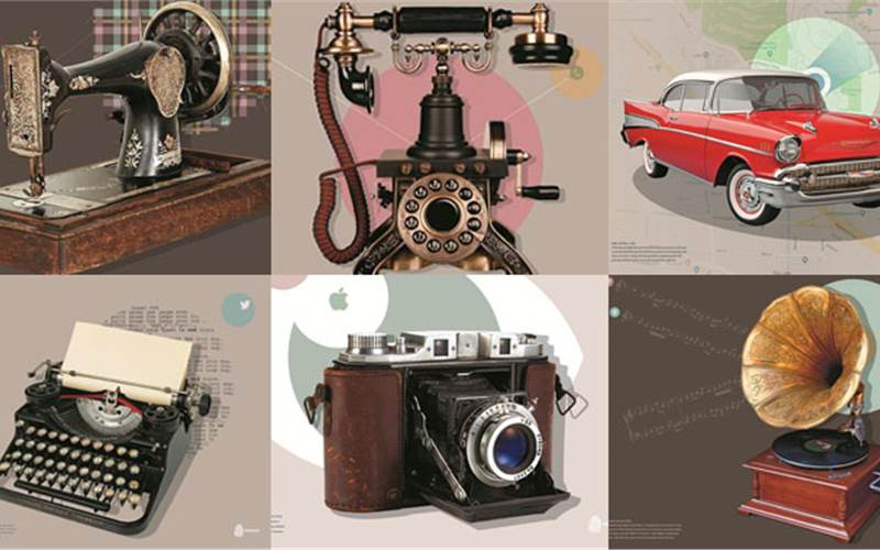
The PrintWeek India team unfailingly receives Pragati’s annual calendars. And this time, like in the previous years, Calendar 2018/19 – Analog bygones Digital icons showcased the best in printing and post-print works.
This year too, the “wow” factor stuns you. Plus, it provides a look at the real impact technology has on our living.
In this Sunday Column, Pragati’s director Harsha Paruchuri shares the process
02 Jun 2018 | By Noel D'Cunha
Pragati’s Calendar 2018/19: A testament of the times gone by - The Noel D'Cunha Sunday Column
Kudos on yet another masterpiece. The calendar seems to remind us that we, as humans, should be motivated by our memories… What’s the message?
We’ve tried to juxtapose some "golden oldies” with their digital equivalents (or replacements). We think they not only capture the sea change in technology, but also really capture the difference in the thought process of consumers from that period to the current. It also shows something that’s been lost with the need for speed and instant gratification - for example, driving for fun, without a fixed destination, or bespoke tailoring.

What was the print run?
The print run was 4000. It took us about two weeks to proof and try different things. Once we knew what we wanted, it took about a week to 10 days to produce.
Putting a creative twist on the retro theme would have been quite a task – some amount of R&D?
All the techniques used are things that we use extensively - so the R&D was not in how to do it, but what combination of techniques to use to bring out the subject best.

But every page of the calendar is a retro mix incorporating modern ingredients and flavours. What challenges did you have to overcome? What are the things that you liked?
There were no major challenges. Apart from the objects and the embellishments, I really liked the uniformity and smoothness of the flat greys tints used on every sheet.
From idea to prototyping, and getting it right. How many prototypes and finished dummy did you have to create?
We generally do the first proof of all the sheets - and sometimes use two or more effect options to see which works better. Based on the first proof, any additional corrections are done to the images, as well as to the embellishments and we proceed for the final production run. So really only one initial prototype, which had a couple of options for some pages.

How did you select the paper/board to see if it was strong enough?
Gravure and MetPET indicated the use of a paper with a smooth surface - so we used SAPPI Magno Satin 350gsm for 4 of the sheets. For the two sheets with foiling and overprinting, we felt a more textured paper would give a good contrast to the pressed hot foil - so we used 270gsm Iris for those.
The calendar is a masterclass in various printing processes. What is the thing to watch out for when so many processes are involved?
When there are multiple processes - the most important thing is to ensure consistent register from the first sheet to the last sheet - from the very first process. If the sheet is sitting inconsistently at either the front or side lay in any of the processes, all future processes are compromised.

Can you elaborate on the tactile finishing?
The most visible tactile finish imparted by the micro-embossing which is used extensively on all sheets. But also, there is the high-matt UV varnish on the backgrounds which gives a different feel when touched - similarly, the glossy and semi-glossy areas also look and feel different — these are the subtler tactile effects.
Special papers give that naturally unique feel that sets them apart from all other ordinary papers. What did you use?
All the papers used are widely available and used in the Indian market - four of the sheets are regular art card. I think those sheets show that even regular art card can be made to look out of the world with finishing options.

What has been the feedback from friends and customers?
We’ve had a very good response - every couple of years, we have a design that not only showcases print, but also provokes thought. The credit for that entirely goes to the designer - we can take credit only for the showcasing of the print techniques. This year's calendar is one such, and has gotten a very good response from the design and print connoisseurs for both the showcase of print enhancement techniques as well as the thought-provoking contrast depicted in both technologies as well as consumer patterns.
Have you thought of any concept for the next calendar, has the work begun?
Not yet - usually we start around the end of the year, which gives us three to four months.
 See All