

Colour Management - Part Seventeen
Kiran Prayagi, print technologist and chairman, Graphic Art Technology & Education demystifies colour management in a series of articles. In this seventeenth article, he discussed colorimetry.
20 Aug 2013 | By Kiran Prayagi

Kiran Prayagi, print technologist and chairman, Graphic Art Technology & Education
Colorimetry deals with the objective description of the physical correlates of colour
perception. It provides direct comparison of colours in a quantitative and measurable way.
Colorimetry is fundamental to ‘colour management’ in any colour reproduction system, such
photography, printing, television, and also including paints, textiles, as well as all colour
related applications.
Articles 2 and 5 in this series outlined the human visual system and how it works.
Colorimetry system of measurement is based on those principles.

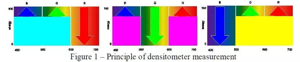
Colour patches as shown in figure 1 are distinguished by the human eye and each one gives a
different perception. However, if one uses a densitometer to measure then some of the patches
would show the same density and, hence densitometer is not a useful tool to express
numerical values of these patches. Densitometer measures one third of the visible spectrum,
i.e. a group of 100 nanometers. See figure 2 and article 10. This is where an instrument called
colorimeter is useful that measures at three specific points of the spectrum coinciding the peak
sensitivity of the three colour sensitive cones in the eye. See figure 3.

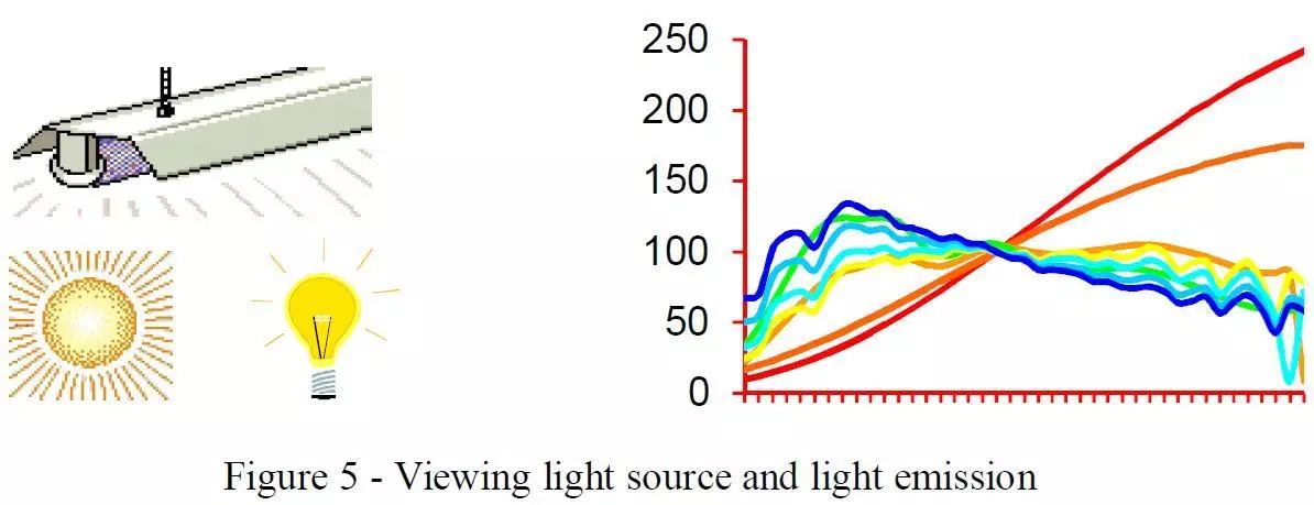
Any visual perception or visual stimuli as called is governed by following three basic factors,
but in case of light sources only observer and light source and not the object reflection or
transmission. See figures 4, 5, 6.


The three colour sensitive curves of the human eye correspond to red, green, and blue (basic
colours) perception and are designated as x, y, and z respectively. The visual spectrum
normally from 380 to 780 nanometer is considered. The amount of three primary colours for
final visual stimuli is represented by following equations :
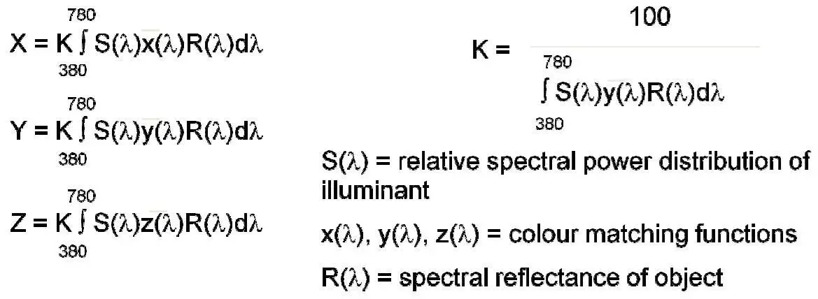
X is total visual stimuli of red perception
Y is total visual stimuli of green perception
Z is total visual stimuli of blue perception
K is constant based on green cone sensitivity as this has sensitivity throughout entire visible
spectrum
The visual stimuli derived this way is called X – Y – Z tristimulus values and are then further
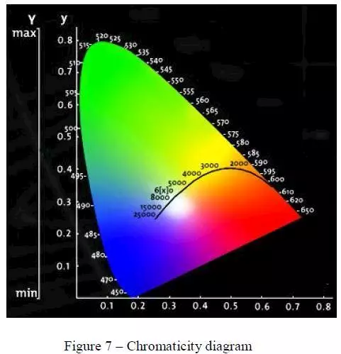
calculated to derive x-y-z chromaticity co-ordinates to plot on the CIE diagram to provide
visual representation of colours. CIE stands for Commission Internationale d’Eclairage
(International Commission on Illumination) founded in 1931, the objective was to develop the
quantitative system for colour measurements and match the way human eye sees it.

These chromaticity co-ordinates, i.e. small x-y-z are calculated from the X-Y-Z (red, green,
blue) values obtained earlier and also represent red, green, blue that can be plotted on xy
chromaticity diagram for visual representation of colours the way human eye sees it. See
figure 7.
When small x-y-z values are added together the result is 1, i.e. unity is obtained which
represents white, same as red + green + blue = white as additive principle of lights. When x-y
values are plotted the following diagram is the result. When x and y are small the falls in blue
region, large x and small y falls in red region, and small x and large y falls in green region.
The curvature of this horseshoe diagram indicates values of the spectrum locus from blue at
450 nanometer to red at 650 nanometer. The saturation of colours is increased as one moves
away from the centre. The diagram is useful to plot light sources, computer and television
monitors, printing inks, paints, plastic, textile as well as artist colours.
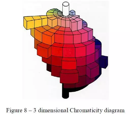
As all colour systems are three dimensional, the variations of light and dark colours in shown
by many layers of chromaticity diagram placing one above the other. At top is the light end
and at bottom is the dark end. The centre axis being white on top, grey in middle and black at
the bottom. See diagram 8.


 See All