

Colour Management - Part Eighteen
Kiran Prayagi, print technologist and chairman, Graphic Art Technology & Education demystifies colour management in a series of articles. In this eighteenth article, he continues his discussion on colorimetry.
20 Aug 2013 | By Kiran Prayagi

Kiran Prayagi, print technologist and chairman, Graphic Art Technology & Education
Last article 17 gave introduction to Colorimetry as it was adopted by CIE in 1931. Since then
the objective has been to develop and prefect the fundamentals and scientific approach to
measure, match, and describe colour the way human eye sees it. The major problem with the
1931 CIE chromaticity diagram, also called xyY is its non-uniformity. See figure 1.
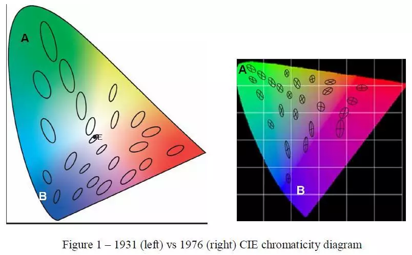
Figure 1 illustrates 1931 vs 1976 chromaticity diagrams. The ellipses plotted show those
colours appear appear to have visually similar differences between them. For example, two
colours each in A (green colours) and B (blue colours) show same visual differences but when
plotted on 1931 CIE digram green colours are plotted with longer distance and blue colours
plotted with shorter distance. Thus the plotting of colours does not coincide with the visual
appearance. Threfore, a new algorithm is worked out and in 1976 more uniform diagram was
devised called ‘uniform colour space’ or UCS. From the formulae explained in the last
month’s article UCS is calculated as follows.
Further, the diagram is made easier to read and at the same time to coincide the human colour
vision. But the logic behind it needs to be explained first. In article 2 the principle of trichromatic
(3-colour principle) vision was explained which makes it possible to achieve all colours by combination of red, green, and blue. However, yellow though can be obtained by combining red and green the human eye perceptually visualise this as a basic colour and does not see as combination of two colours. Therefore, perceptual or psychological colours are known as red, green, blue, and yellow. Why this is so is clear from the scientific explanation below.
After generating visual signals from red, green, and blue cones in the retina in the human eye
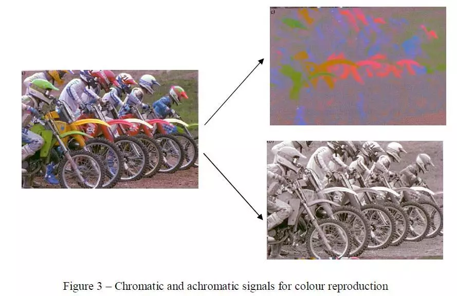
it goes through a lot of complicated interconnections of visual signal processing and ultimately the signals are delivered to the brain in a what is called ‘complementary manner’. This gives rise to ‘complementary vision’. See figure 2.

As can be seen from complementary colour vision in figure 2, the actual signals received by
the brain are red or green and yellow or blue and are called ‘chromatic signals’. The third
signal received is black and white and is called achromatic signal’. This way chromatic
signals do not carry any scenery details but all details are carried by achromatic signal. This
keeps the data travelling to the bare minimum and is good example of ‘data compression’.
Figure 3 illustrate this example. This is exactly the same way ‘colour television’ transmission
takes place so as to keep transmission bandwidth to minimum. This also enables to receive
colour transmission on black and white television with achromatic signal only. In printing
industry, the technique is used in what is called 100 percent ‘grey component replacement’ or
GCR, now a days called ‘ink optimisation’.
From the explanation above it can now be seen why the further modification of CIE
chromaticity diagram was done so as to represent, measure, and express colours the way
human eye sees it, i. e. red, green, blue, and yellow. See figure 4.
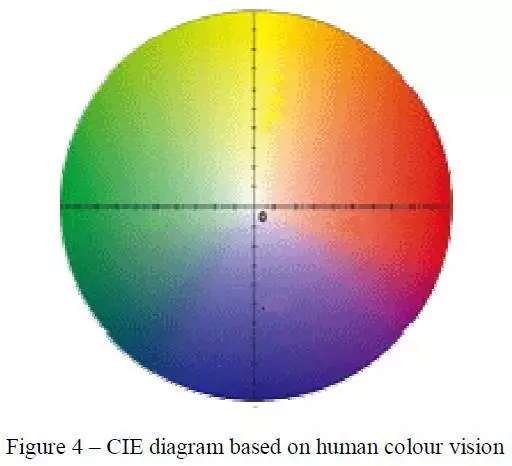
Comparing figure 2 and 4 it is clear that red and green are complementary and falls on
opposite side, therefore, no colours can be produced as reddish green or greenish red. Same
goes for yellow and blue. So the possible colours are reddish yellow, reddish blue, yellowish
green or yellowish red, greenish yellow or greenish blue, bluish green or bluish green.
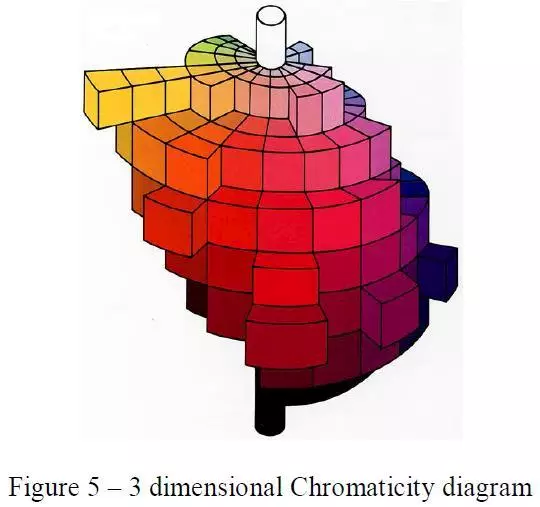
The third dimension is lightness and darkness of colours. See figure 5.


 See All