

Colour Management - Part Twelve
Kiran Prayagi, print technologist and chairman, Graphic Art Technology & Education demystifies colour management in a series of articles. In this twelfth article, he discusses perception art and reality.
22 Jul 2013 | By Kiran Prayagi

Colour Management - Part Twelve
Before going further it is thought that some important aspects of ‘Colour’ from perceptionpoint of view can be explained as to avoid some disappointments from implementing colourmanagement. This is called ‘appearance modelling’, i. e. deceptive colour reception even afterperfect scientific work on colour reproduction.
This paper was presented by Professor Ranjan Raguvir Joshi at the first‘Colour Conference’ by Graphic Arts Technology & Education in February2004. P Professor Ranjan Joshi is a ‘visual communication and literacy’expert of a very high calibre.
‘Beauty lies in the eyes of the beholder’ this is the world famous quotation. To whom is itapplicable ? Artist, Client, or the Printer ? I think it applies to all the three, and then onlyDesign Awareness can bring in quality and excellence in the professional practice.
Colour is the strongest visual element, which must be handled with apt care in the business ofaesthetics. The lesson I got nearly four decades ago from my artist father, late professor Raghuvir Joshi - perception of colour depends upon three major factors. He taught to seethe word ART as follows.
A for absorption of the light rays by the object being perceived by our eye
R for reflection a refraction of the same light rays
T for transmission of light rays in context to object being perceived
In short this word ‘ART’ is nothing but a science of colour. Physics, chemistry, physiology, psychology, psycophysics, etc. all in one. Psychology because it is our brain that interprets thelight signals and gives the experience of colour reality.
As an applied artist one has to see two major factors, first communication and secondreproductions in multiple impressions on substrate using Ink, technology, and science. Allthese must be compatible with the creative activity and the artist. Perception and reality is allconnected with the game of the optical illusion. The appearance of colour could be defined ifwe try to understand the seven factors that bring apparent changes in colour perception whichperhaps could lead to rationalization of some aspect of colour management and a game ofoptical illusion.
1. Colour change by Juxtaposition
This is placing two colours side by side to produce the effect of a desired colour. A singlecolour seen independently may show a particular hue or tonal value, but the same colour ifseen in relation with another colour may appear different. A patch of green colour when seenagainst deep ultramarine blue will appear - more yellowish green than its original colour butsame patch will appear blue green when seen against bright red. Here the original colourappears to be tinged with the complementary of the background colour. This is called theapparent change of colour by juxtaposition. Even a neutral grey will appear to betinged with the complementary of the background colour. The hue of a colour is changed thisway.

A particular tone of a colour will be changed apparently when seen against a darkbackground. The colour appears lighter against a dark background and dark against a lighterbackground. A grey will appear darker against white background and lighter against blackbackground.
2. Colour change due to Spreading Effect
This is exactly opposite of colour seen against contrasting backgrounds. A colour seen againstblack background appears brighter than the original colour. The black appears to be addedvisually in order to give appearance of more intense colour. The same colour when seenagainst white background appears less saturated as if white has been added visually to make itlighter tone.

3. Colour change due to Simultaneous Contrast
When two or more colours are seen simultaneously, i.e. at the same time, appearance ofcolour is changed which is called simultaneous contrast. It is governed bytwotypes of changes - change of hue as well as tone.

4. Colour change due to Successive Contrast
When an artist paints a picture by selecting certain sequence of colours he does it with a subconscious mind. With his intuition and experience he makes his colour selection.
When this pattern is seen by anybody, the most attractive part is observed first and then hisgaze is transferred to another part of the design.The appearance of this area is naturally affected by the after image of the first part. Thisappearance of changed colours is called the successive contrast. The change ofcolour and tone is Simultaneous Contrast is more intense than in Successive Contrast.
5. Colour change due to Viewing Distance
Two or more colours, if seen from a distance of 10 feet or more will look different ascompared to view from a shorter distance.
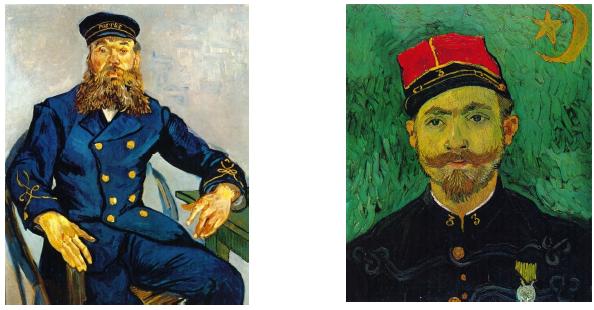
Red and green stripes placed alternately, from a distance, will show more yellow in the greenstripes because the images of red and green rays are overlapped in our eyes and thus givingthe sensation of yellow. Similarly yellow will completely disappear from the blue and yellowstripes if seen from a distance and will appear white. The impressionists painters used thisprinciple of additive colour mixture in their paintings to get the illusion of light in theirpaintings, and before this, artists painted the shadows either in black or browns and thehighlights in white. In impressionist paintings shadows and lights were in complementarycolours. Airy and colourful lights as well as shades were the result of that method of painting.
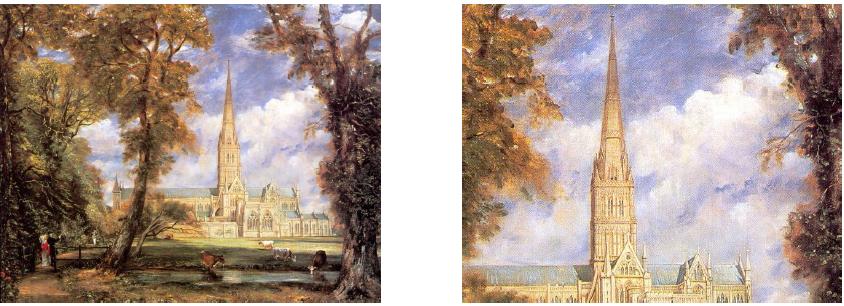
6. Colour change due to Size Factor
When a picture is reduced or enlarged a change in the appearance of colours takes place. Asmall miniature painting that is pleasing in colours will cease to be so even when enlarged.very attractive but if the same were enlarged, it would look over powering and kill othercolours too.
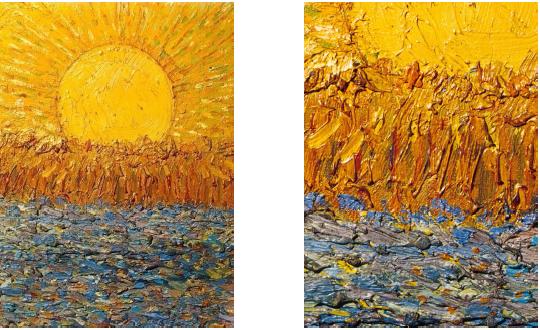
7. Colour change due to Texture
The appearance of colour will depend on the type of surface to which it is applied. Thesurface could be smooth, glossy, matt, or rough. In each case, the same colour will lookdifferent. Rough texture when seen in normal light will show two tones, lighter tone of theraised surface and darker tone of the sunken surface. The same surface when painted withsome colour will show the sunken areas are tinged with the complementary colours and thusproduce a rich colour in the whole. Modern artists use different methods in applying coloursto canvas or paper, to create a variety of textures of the ground.
This article wish to focus on yet another aspect, i.e. theory & practice and its colourdisparities. The work shown here are ‘Artists Primarry, Secondary, Tertiary and QuaternaryColour Pairs’ when painted on different surfaces with different mediums colours appearsdifferent. The main reason, of course, the ingredients involved in them. The other factors suchas Opacity, Absorbency and Reflectance of the surface being used play a role.We cannot afford to use the original material when a question of its mass reproduction arises.I think this is where colour Management plays very important role to retain the aesthetics ofthe original work. I invite all scientist and technologist to look into this area for bettercommunication and art.


 See All