

Orbango’s edgy bottle
When Orbango, a Mumbai-based juice bar, decided to sell its product in customised packaging, designer Jigna Shah Oza, was tasked to design and develop a “fresh packaging” that captures the essence of fresh juice inside. A case-study by Abhishek Muralidharan
09 Feb 2019 | By Abhishek Muralidharan
The packaged fruit juices market is a cluttered space. Valued at Rs 1100-crore, the Indian packaged juices comprises of three segments: fruit drinks with maximum 30% fruit content, fruit juices with 100% fruit content, and nectar drinks with almost 30-90% fruit content.
The fruit juices segment, which claims 30% market share, is governed by strong brands like Dabur’s Real and Real Active juices, Patanjali juices, ITC’s B Natural, Hector Beverages’ Paper Boat, and PepsiCo’s Tropicana among others.
However, fresh juice in a bottle idea is a unique concept. That’s what Orbango was banking on when it decided to package and provide freshly-squeezed juices. Quite so, its tagline is Get Fresh-n-Go.
Oza says, “The product still had to stand apart from competition or substitute beverages of all kinds. Since the brand is not from an MNC or a large food company, there were not going to be heavy marketing spends to build the brand. Hence everything about the brand had to be hard-working. The simple one-line brief to me as a designer was – people may hate it or love it, but the moment they see the bottle they should talk about it. And I understood that the fresh juice product packaging had to be nothing else but fresh.”
Shaping it up
Oza adds, “Most people don’t differentiate between one bottled water pack from the other. As most packaged beverages are ambivalent as far as their designs are concerned. But people do know the Coca Cola bottle. With Indian consumers, visual appeal carries more weight than the written word. Hence we were clear that the shape shall have to be worked upon to catch people’s fancy.”

Now, one thing was clear: shape had to be a differentiator. However, for any project to be commercially viable, creative innovation has to be balanced with the feasibility of production and supply chain logistics.
“Now, practicality and functionality are multi-pronged. Apart from aesthetic appeal and innovation, the design thought has to factor in variables like – feasibility of manufacturing, ease of transport, ease of mass production and user comfort like the ease of handling. And most importantly there had to be economies and costs to be kept in mind. The design challenge was to present and make something that had not been seen before yet not complicate life in execution. This was not an easy job considering India does not have an eco-system that allows for experimentation but rather vendors who ask for samples which they could copy.”
Oza had to consider form and substrate both. PET was an obvious choice of material given its ease of manufacturing, scalability, costs and possibility of shapes. Oza spent time understanding the science and logic of caps and closures.
The bottle design which was executed painstakingly and by challenging the masters of the field does wonder for the brand. It helps in free marketing as it becomes a talking point among customers. We thank and commend Jigna for delivering stupendously on the brief.
-Kamal Oza, director, Koppersmith Ventures
She says, “There was a lot of experimentation on the actual shape. Things that one may like in 2D may not be appreciated in 3D. Also what the designer designs in 3D, has to be feasible to produce. From the original designs, we took 3D models of some shapes that the brand managers had loved. From those 3D models, we had a unanimous winner – that all loved instantly.”
The next stage was volume planning and the critical step of designing a mould. Oza explains, “Finding the right vendor partners were a key to our success. They made it possible for this complicated design to come alive. It took some of the best brains in the packaging manufacturing companies to get this into reality and they only did it because of the team's passion and innovative spirit.”
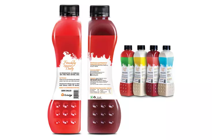
“Next in line was the labelling solution. Designing with unique colour themes based on the flavours was one thing and application of the solution on the bottle which is a mix of straight, edgy, groovy and circular shape. We had to do a lot of trials and errors to get the right shrink sleeve solution. And it required some mathematical precision to get the text alignment and shape hugging labelling correct.”
The shrink sleeve is produced by Mumbai-based Huhtamaki PPL, the cap by Chemco, and the bottle by Vikas Engineering.
Design elements
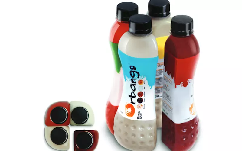
The Orbango juice bottle with an edge on one side and a curve on the other make it unique and clutter-breaking. A conversation starter the first time a consumer sees it, says Oza.
This peculiarly shaped bottle allows it to be sold as a single bottle or a pack of 4 which fits like four slices fit into a pizza. The 250ml plastic pet bottle has a very firm and easy grip – making it convenient to carry.
The circular grooves at the bottom add character to the identity of this bottle.
“The impression is wholesome, yet easy to handle. In fact consumers, especially kids, re-use and do not wish to part with the bottle.”
The shrink sleeve label design is colourful and unique for every flavour with the ingredients depicted pictorially. According to Oza, the idea is to make the freshness appealing and stand tall among the competition.
“This packaging – shape and look – is quite a breakthrough in the juice and beverage category. Together the brand has a fresh, playful design that grabs and engages the customer in a new way. Everything the brand is doing is original, fresh and appeals across age groups,” says Oza.
The proof of the pudding is that this packaging has bagged the World Star Award 2019 in the beverage category. It has also won the India Star and Asia Star award and Design and Pool Awards 2017. “And the best part is that brand does well in the market and has created a niche for itself without spending much on marketing,” signs off Oza.

With more than 17 years of experience in designing and advertising space, Jigna Shah Oza has worked on award-winning packaging design projects. She has a flair for colours, a detailed eye for design and an elaborate understanding of the brands' needs


 See All