

Understanding typefaces
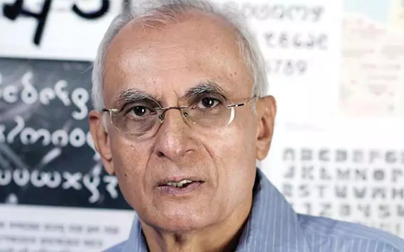
Prof Mahendra Patel is a retired senior faculty of NID, Ahmedabad. He worked on type design projects at Atelier Frutiger, Paris in 1971 and has worked on type design development projects in Devanagari, Tamil, Bengali, Gujarati, Kannada, Malayalam and Tamil scripts. Patel received the Gutenberg Award in 2010
25 Apr 2018 | By PrintWeek India
Understanding typefaces
Difference between typeface and font family
Typeface is an old technology of the hot-metal before computers came in. In hot-metal, we used to cast types and assembled cast letters to make a text. Here, individual people had their own styles. This style is typeface. It’s the individual identity of a type.
Fonts, on the other hand, are designed in an outline format as data for computers. Even fonts are known by individual names. For example, Futura is a font for future. Helvetica is a font from Switzerland. Baskerville is a font designed by John Baskerville.
These names have nothing to do with the characteristics of the fonts. Nowadays, professionals try to give names which somehow indicate the font’s use and distribution.
Font family refers to different types of text variants within the same style, such as fine, light, bold, normal, or in terms of grid, condensed or slant, upright or italics. That’s a family.
Now, there is a trend to create a family across styles, following the general characteristics. These are called font styles, such as serif, sans serif, pen, mono, decorative and so on. In India, we have classic pen form and mono line form.
In typography, a serif is a small line attached to the end of a stroke in a letter or symbol. A typeface without serifs is sans serif, from the French sans, meaning without.
Type designers as authors
During the days of hot-metal, it took two to three years to design, engrave and cast a type. It required precision. As it was a skilled job, the sense of ownership was very high. Foundries used to sell the types and you could not recreate them. So, the makers of the fonts used their names, like Garamond, Baskerville, and Bodoni.
Things became easier with photography. But it still required high sensitivity of optical understanding. Today, you can design fonts on your computer. However, the lifespan of fonts is shrinking. Earlier, a font would last for hundreds of years. Nowadays, a font is hardly popular for more than 10 years before a new font arrives. So, the sense of ownership is not what it was like earlier. Instead, today we have branding, where companies are customising fonts.
In India, Vijay Sagar made elegant fonts for hot-metal. Then Monotype created a very good Devanagari font. All the other fonts were influenced by these two. The first visible effort to create an Indian font was RK Joshi’s Mangal. It was a breakthrough. I have also developed a Devanagari font for Linotype. There is also Girish Dalvi’s Ek Mukta.
Why the variety
The communications market is always in need of change. There is always a need for something new, something different. So there are experiments. Sometimes, there is a fusion between serif and sans serif. Sometimes serif is used as design element, not as functional element. These can create variants of different identity. There are also lots of decorative styles available.
Functions of fonts
A font has three basic functions — readability for comfort and ease of reading; display for emphasis, for titles, signage, etc and visually attractive, fancy for decoration, for wedding cards, for example.
No font is either good or bad. It depends on typography, how you use the font. For example, while Comic Sans is now considered ugly, it will work well if you use it in children’s book or to represent handwriting. So, success of a font is determined by its use, technology, subject and users.
This study of what font is appropriate and what is not is called typography. It depends on readability and legibility balance. Serif fonts are more appropriate for heavy reading representing large chunks of texts.
Fonts itself are neutral. You can make fonts work with the help of design, use of colours, alignments, capitalisation, spacing between letters, lines, and so on. This is how you create the intended effect. For example, if you use a sans serif font and use pink, it would represent something feminine. If you use the same font, make it bold and add harsh steel blue, then it becomes industrial.
Helvetica, which is popular among designers, is a font driven by graphic construction on horizontal and vertical axis. So, it is a drawn font and different from written font. Fonts like Verdana and Gill Sans, for example, are also graphic but are more humanistic. These fonts not only consider legibility, but also consider the flow of writing. On the other hand, Futura is a geometric font, where the emphasis is on geometry rather than graphics. So, Futura works better for an architect. The same way Helvetica works well in signage, and Gill Sans in texts.
Finding the perfect font
Here is a task. For texts, create a 10- or 12-pt text of around 800 words and make your users read it and study the user response and preferences. For display, you have to understand how does it relate and distinguish. Are there enough distinctions? This can be achieved by playing with sizes, capitalisation, colour, underlines. For this, you need to be design sensitive and understand type families and typography.
Challenges of font design
There should be consistency in design. You may have design understanding and knowledge, but may lack design skill and sensibility. You need to bring harmony in contrasting elements, which requires a thorough understanding of typography and harmony in seemingly different letter fonts, in spacing, styling, alignments, stoke treatments, joint treatment, and so on. The users wouldn’t notice them, but they would immediately benefit from it.
It needs dedication and commitment.
These interviews appeared on Audiogyan, an Indian podcast hosted by Kedar Nimkar. So far, the podcast has 64 posts and more than 65,000 listens. You can listen to the full version of the podcast at audiogyan.com


 See All