

"Printers need to adapt to how the content consumption has changed over the years," Ruchita Madhok and Aditya Palsule
We speak to the co-founders and principal designers of Mumbai based Kahani Designworks about some of their recent work
20 Feb 2018 | By Payal Khandelwal
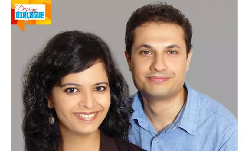
"Printers need to adapt to how the content consumption has changed over the years," Ruchita Madhok and Aditya Palsule
Born in 2012, Kahani Designworks often ventures into unusual spaces. While starting out, they chose to focus on art and culture sector, which is traditionally not very receptive to brand building exercises, and often works with monstrously stringent budgets.
Over the years, thanks to some policy changes and its own innovative approach, Kahani has managed to create some really interesting work in the space through communication design, publication design, branding and exhibition design. Its portfolio includes names like Focus Photography Festival, Dr Bhau Daji Lad Museum, Piramal Art Foundation, The State of Architecture exhibition (for which it scooped several awards), Mumbai Art Map, Kochi Biennale, and ART India magazine.
In 2014, Kahani also started a unique studio project called Storycity to “encourage cultural engagement in Indian cities”. Storycity, which has so far focused on Mumbai, is mainly a print project under which they have covered various aspects of the city including information on museums, quick city guides, design heritage, seaside history and hidden green spots. Storycity is also a platform through which the studio experiments with various design and printing techniques.
We talk to Ruchita Madhok and Aditya Palsule to know more about their recent projects, their Storycity experiments, and their experiences with printers, among other things.

How did you both land up in design?
Aditya: My parents were in advertising, so I have always had an idea of how the creative industry works. I did try to do engineering, but it just wasn’t for me. I eventually went to a design school, worked for some time, went to London, and then eventually met Ruchita and we decided to set up Kahani.
Ruchita: I wanted to be an artist when I was a kid. By the time I was 13-14 years old, I started reading Art India magazine and realised that Fine Arts was not for me. At the same time, I met professor SM Shah, a senior designer from NID (National Institute of Design) who was working on an identity project with my father’s company. He looked at my work, which had a lot of calligraphy and drawing, and asked me to consider graphic design as an option. So I went to NID where I fell in love with exhibition design. I did my foundation and then studied exhibition design.
My final student project there was a museum gallery that I worked on with Eureka Moment Design. However, the exhibition industry in India is very fragmented. Once I graduated, I had to work as a retail designer and do trade fairs for a bit. I then escaped to London to study performance art and scenography. I also got the opportunity to work at Victoria & Albert Museum. That was like a dream combination - I was working in the department of theatre and creating exhibitions for the museum. When I came back to India, I decided to work in the arts sector, even though people told me that I was being mad as there was no money in the sector. But I went ahead and we started Kahani, where the focus has always been on the art and culture space. And we have been very lucky.
We have been a part of some really good projects. Also, around the time we started out, the Indian government changed some of the rules regarding the purchase of art for public display which have a lot of impetus to private foundations to display art for the public. So it’s been good!
You recently worked on the exhibition design for 'Likeness without Reference: Cultures of Forgery' about real and fake art for Piramal Art Foundation. Could you tell us a bit about the project and its making?
Aditya: We had a limited time and budget to put up this exhibition. We approached it in terms of what we could do with the graphics in the space; how they could add layers to the space. We worked closely with the curators to understand the theme, idea and representation of the subject.
Ruchita: The theme of the exhibition was to explore reproduction, originality, and printmaking within the context of art. An artwork exists as an original and as prints – what does that mean? What does it mean when Husain has commissioned serigraphs of his paintings? How do you value that? So for us, print became an important medium to communicate the concept of reproduction. The whole visual language was built around the prints of works, and we used a halftone technique to really blow up the images. We exploited that language of print, brought colour to emphasise certain parts of certain paintings. So the language of the show is derived from print productions – particularly screen printing and offset.

Publication design has been another major area you have focused on, and have done a variety of projects under it.
Aditya: For me, print has always been an interesting medium to work with because it’s very tactile. The print publication is a very interesting way of building content, in terms of both technique and experience. It’s not just about the paper – there is the font, size, feel, printing, so many permutations and combinations to work with. When it comes to print design, we are always looking at new printing techniques. Sometimes, we work with a really old printing method and put a twist in that to produce some fantastic results.
Ruchita: Yes, absolutely. And we get involved in all these processes. We prefer to be at the press when something is being printed. We actually have very close relationships with some of the presses that we work with. And that relationship is really important for us. For example, for the arts mediation handbook we created for the Kochi Biennale Foundation, we worked very closely with our printers, Jak Printers, to create this really flexible folder where the pages could be taken out and photocopied as everything in it was open-sourced. The printer's team was part of the ideation process from day one.
In the culture sector, budget is always a constraint but we have learnt to work backwards. Every rupee has to work hard, as most of it is public money. We have to experiment and play with things a lot to do interesting stuff, even under those constraints.
We also do a lot of short-run processes. There are times when our clients just need a run of 300 copies. I definitely think the role of print publications has changed a lot over the years as far as marketing and communication are concerned.
Aditya: Yes, because earlier print was a dominant medium. Now it’s so fragmented and clients tend to split up their budgets and capacities according to where the demand is. A lot of our print projects have gone from large to small volumes on demand. Clients often need flexibility and a quick turnaround. While technology has caught up, printers aren’t realising this, and a lot of them are losing commission because of not wanting to do short runs. Printers need to adapt to how the content consumption has changed over the years.
As designers, what are some of the other specific challenges you face when it comes to printing?
Ruchita: Cost parity is a big challenge. For example, just within indigo printing, we work with four presses across India and get wildly different quotations from them for the same job.
Aditya: As designers, when we recommend printing to a client, we always recommend it on the basis of both quality and cost. The emphasis is on quality but not at a very high cost. Unfortunately, a lot of printers tend to focus only on cost. Clients are spending money (mostly public money in the culture sector) on a physical product and quality expectations have gone up. Printers in India need to understand this. Also, they need to do the quality control themselves. We shouldn’t have to worry about it.
In fact, we are working on a couple of publications which are not being printed in India, purely owing to questions of finishing and binding quality. We are seeing better output when it comes to these aspects of China and Singapore.
Ruchita: Of course, another challenge is the Indian tax regime. The 18% GST on printing has turned off a lot of our clients from printing. We are thinking twice before publishing Storycity. I hope it is overturned. The duties on paper are atrocious. I can use the same imported paper from Singapore for 15-20% less cost. That’s crazy!
I also wish we had more sustainable paper. Look at the amount of cotton textile waste we have; there is so much you can do with that. We have experimented with recycled paper with some decent results. We also always ask our clients if something really needs to be printed, as there is a huge environmental cost. If yes, then how can we balance the environmental cost? The Mumbai Art Map – which is created four times a year and distributed for free – is printed on 100% recycled paper.

You have been doing a lot of interesting paper and printing experiments with Storycity too. Could you tell us about some of these recent experiments?
Aditya: With each Storycity project, we constantly look at interesting print techniques which can add some value to the project. Each one is printed with a slightly different process.
Ruchita: Last year, when we did the second edition of City by the Sea, we went to the same press and asked them to raise the quality with finishing, binding and cutting. There was so much learning as we moved from the first to second edition. For the Storycity map, on Nature’s Trail in Mumbai, we worked with Excel Arts which specialises in screen printing. We found a paper supplier in Jaipur that works with textile waste and is completely child labour free. The paper is developed for offset printing, but we used it for screen printing. It worked out great and was quite cost-efficient too.
Aditya: Also, that project was completely handmade. In fact, a lot of back and forth happened with the press as all the artworks were hand-drawn. Nobody transfers hand-drawn to print directly anymore. The drawings were done with 0.2 mm Rotring pen, and the digital transfer was ruining the details. It took us about a month of reverse engineering to get this sorted. That’s why a printer’s enthusiasm is important.

What's your long-term vision for this project?
Ruchita: We would like to do Storycity publications for other cities. If we were to set up a different Storycity division, we would have enough material for it for the next five years! There is just so much to see in India but no definitive maps or accessible resources. Our target audience is the creative community, people who want to know where they could go, but not be told what they should do. Our itineraries are very flexible and anecdotal in nature. We also have a selfish reason to continue doing Storycity- which is to learn about our design history.
Aditya: Interestingly, a large number of people who are buying Storycity are locals. They just want to know about their own city and its heritage. Therefore, the broader idea behind Storycity remains the same - it helps people engage more with their cities.
In terms of work, what are some of your main plans for this year?
Ruchita: We are looking forward to continue with Art India magazine’s redesign, which we have recently taken up, as a long-term collaboration. We are working on an artist monograph, which is very exciting. Then, there is quite a bit of new work in the digital space as well. It’s all work in progress.
 See All